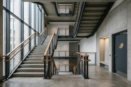
For most of the last thirty years, the architectural render has been a photograph of a building that does not exist yet. A single, carefully chosen viewpoint. Golden-hour light, because nobody photographs a building at noon. A couple of figures in the foreground, deliberately blurred. The whole discipline of visualisation grew up around one question: which frozen moment will sell this project?
That question is starting to feel a little dated. Not because the still render is dead, but because the people we present to no longer look at buildings that way.
The client who scrolls
Think about how a planning committee member, a developer, or a young couple commissioning their first house actually consumes images now. They scroll. They watch fifteen-second clips of kitchens on their phones while waiting for the kettle. They have been trained, by every app they own, to expect things to move. When we hand them an A3 board with three beautifully lit stills, we are asking them to work in a medium they left behind years ago.
I noticed this properly during a review for a small mixed-use scheme in a market town. The practice had produced six very good renders. The committee spent most of the meeting asking what was around the corner of each one. What does it feel like to walk from the car park to the entrance? Where does the sun go in the afternoon? The stills answered none of it. A thirty-second walk-through would have.
The problem, historically, has been cost. A proper animated fly-through meant a specialist studio, a render farm, a two-week turnaround and a fee that only a large commercial job could carry. For the ordinary practice doing house extensions and school refurbishments, motion was simply not on the menu.
What changed in the last two years
The shift has come from an unexpected direction: not from faster rendering engines but from a new class of generative tools that take an existing image and extrapolate movement from it. Feed in a single render, a photograph of a site, or even a hand-drawn perspective, and the software produces a short clip in which the camera drifts, the light shifts, trees sway, a figure crosses the frame.
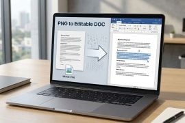
The workflow is almost embarrassingly simple compared with what visualisers are used to. On a platform such as Image to Video AI, you upload the still, type a sentence describing the movement you want (“slow push-in towards the entrance, late afternoon light, a person walking out of the door”), and a few minutes later you have an HD clip of anywhere from a few seconds to half a minute, in the same proportions as the image you started with. Under the hood these services run several different video models and let you pick between them, which matters more than it sounds: some are better at architectural stillness and camera drift, others at people and foliage. There is no 3D model to rig, no camera path to keyframe, no overnight render. The output is not a substitute for a fully modelled animation, and nobody serious is pretending it is. But for a very large proportion of what practices actually need, which is to give a client a feeling for a space rather than a millimetre-accurate survey of it, it is more than enough.
What interests me is less the novelty and more how quietly it has slipped into everyday workflows. Talk to visualisers under thirty and the tools are simply there, sitting alongside Photoshop and Enscape, used without ceremony.
Three ways practices are actually using it
The first is the obvious one: the presentation. A still render becomes a slow cinematic drift across the facade, dropped into a slide deck or sent as a link the night before a meeting. Several practices I have spoken to say the biggest effect is not on the client at all but on the internal team. Seeing a scheme move exposes awkward proportions and dead corners that a flattering still angle had been hiding. The render, in other words, becomes a design tool again rather than a marketing one.
The second is the competition entry. Anyone who has done a design competition knows the arithmetic: enormous effort, tiny odds, and a jury flicking through hundreds of boards in a single afternoon. Ten or fifteen seconds of motion, played from a QR code or embedded in a digital submission, is a cheap way to make a scheme linger in the memory. Jurors are human. Movement catches the eye in a way a static board does not.
The third, and to my mind the most interesting, is the site photograph. Long before there is a model, there is a site visit and a camera roll. Animating a photograph of an existing street, courtyard or derelict shed, so that the camera moves gently through it, turns a survey record into a piece of storytelling. Community consultations in particular respond to this. Residents who glaze over at a plan will lean forward for a clip of their own street with a proposed tree line drifting into view.
The honest limitations
It would be dishonest to write this without the caveats, because there are real ones.
The tools do not understand geometry. They understand pixels. Ask for a camera move that is too ambitious, a full orbit, say, and the software will happily invent the back of the building, usually wrongly. Windows multiply. Columns appear where none were drawn. For a conceptual mood piece this is forgivable; for anything a client might mistake for a design commitment, it is not. The discipline required is the same one visualisers have always needed: know what you are showing and what you are merely suggesting, and be clear with the audience about the difference.
Prompting is a skill of its own, and a slightly odd one for architects. We are used to specifying things precisely; these tools respond better to a director’s note than to a specification. “Gentle dolly forward, morning haze, leaves moving in a light breeze” gets you further than a paragraph about lens length. Most people find the knack within an afternoon, but the first few attempts are humbling.
And there is a cultural question that the profession has not really faced yet. Architecture has always had an uneasy relationship with seduction. The photorealistic render was already accused of flattering schemes beyond what would be built. Motion, with its music and its slow drifts through impossibly clean lobbies, raises the stakes. A moving image is more persuasive than a still one, and persuasion is not the same as truth. Practices that lean on these tools would do well to use them to explain rather than to dazzle.
A return to the sketch
Here is the part I did not expect. Talking to people who use image-to-video tools regularly, several described going back to hand drawing. Because the software can take a loose watercolour or a marker sketch and animate it with the same ease as a polished render, there is suddenly a reason to present in a looser register again. A moving sketch has a warmth that a moving photoreal image lacks, and it makes an honest statement about the stage the design is at: this is an idea, not a promise.
For a profession that has spent two decades chasing ever more literal realism, that is a quietly encouraging turn. The technology that was supposed to make everything look like a film trailer may, in some hands, be bringing back the drawing.
Where this leaves the still render
Nowhere near retirement. The hero image will remain the thing that goes on the website, the awards submission and the cover of the monograph. Stills reward contemplation in a way video does not, and a great deal of architecture is about contemplation.
But the still render is no longer the only affordable option, and that changes the conversation in the studio. The question is shifting from “which moment do we freeze?” to “what do we want people to feel as they move through this?” That is, when you think about it, a far more architectural question. It is the one we were supposed to be asking all along.