Most eyewear stores rely on visual intensity: bright lighting, repetitive shelving, and walls filled with product. This project deliberately steps away from that logic. Instead of emphasizing quantity, the design focuses on three spatial ideas: presence, interval, and attention.
Project Name: SAM&JO A Minimalist Sunglasses Store
Studio Name: YET Architecture
Area: 45 m2
Photos: Alexander Peterson
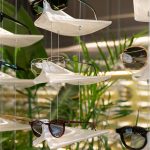
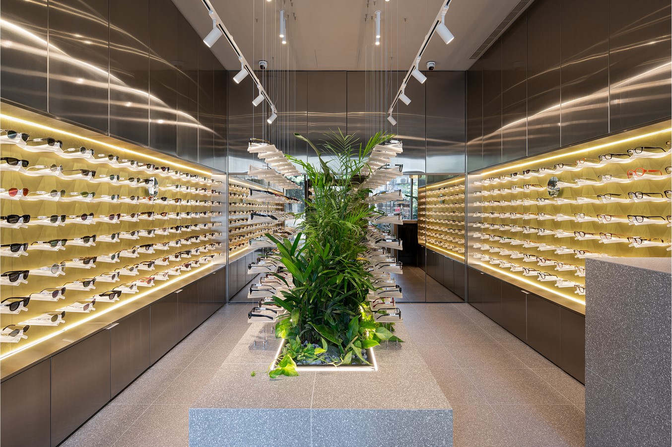
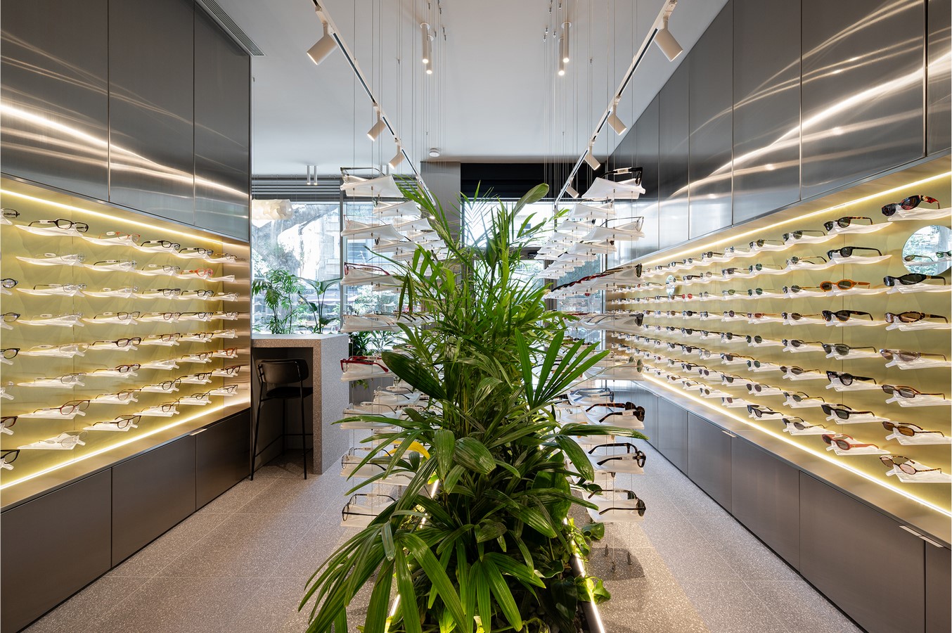
Every pair of sunglasses is treated as an individual object. Rather than being grouped together on shelves, each frame is placed on a custom 3D-printed holder developed specifically for the project. The holders were designed and fabricated by the architects through numerous iterations in order to accommodate the wide variety of frame geometries. Each element supports only a single pair of glasses, either attached to the wall or suspended from fine cables.
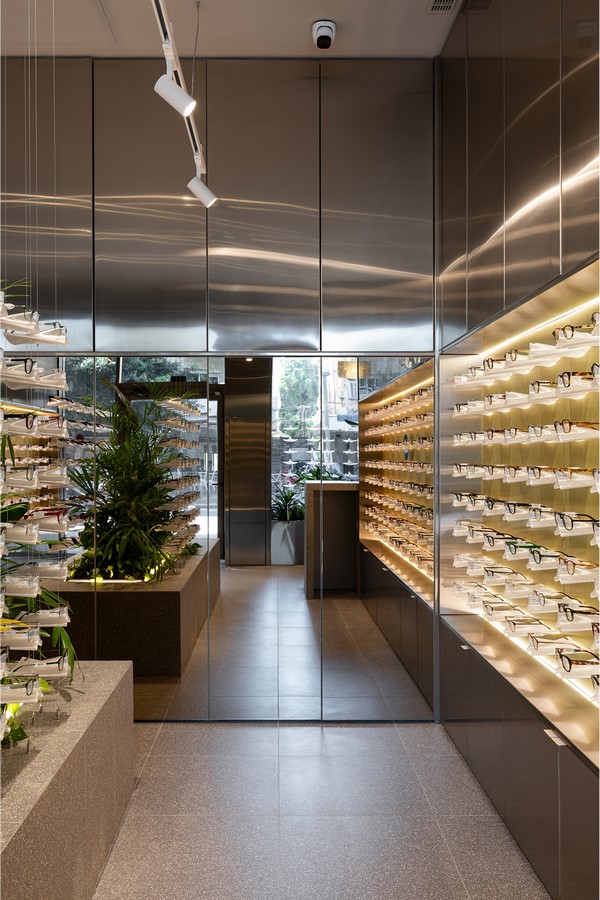
This approach removes the sense of visual crowding typical in retail interiors. Instead of confronting visitors with hundreds of products at once, the space allows each frame to appear separately, within its own small field of attention. The spatial rhythm of the shop slows the act of browsing, encouraging observation rather than rapid consumption.
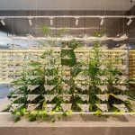
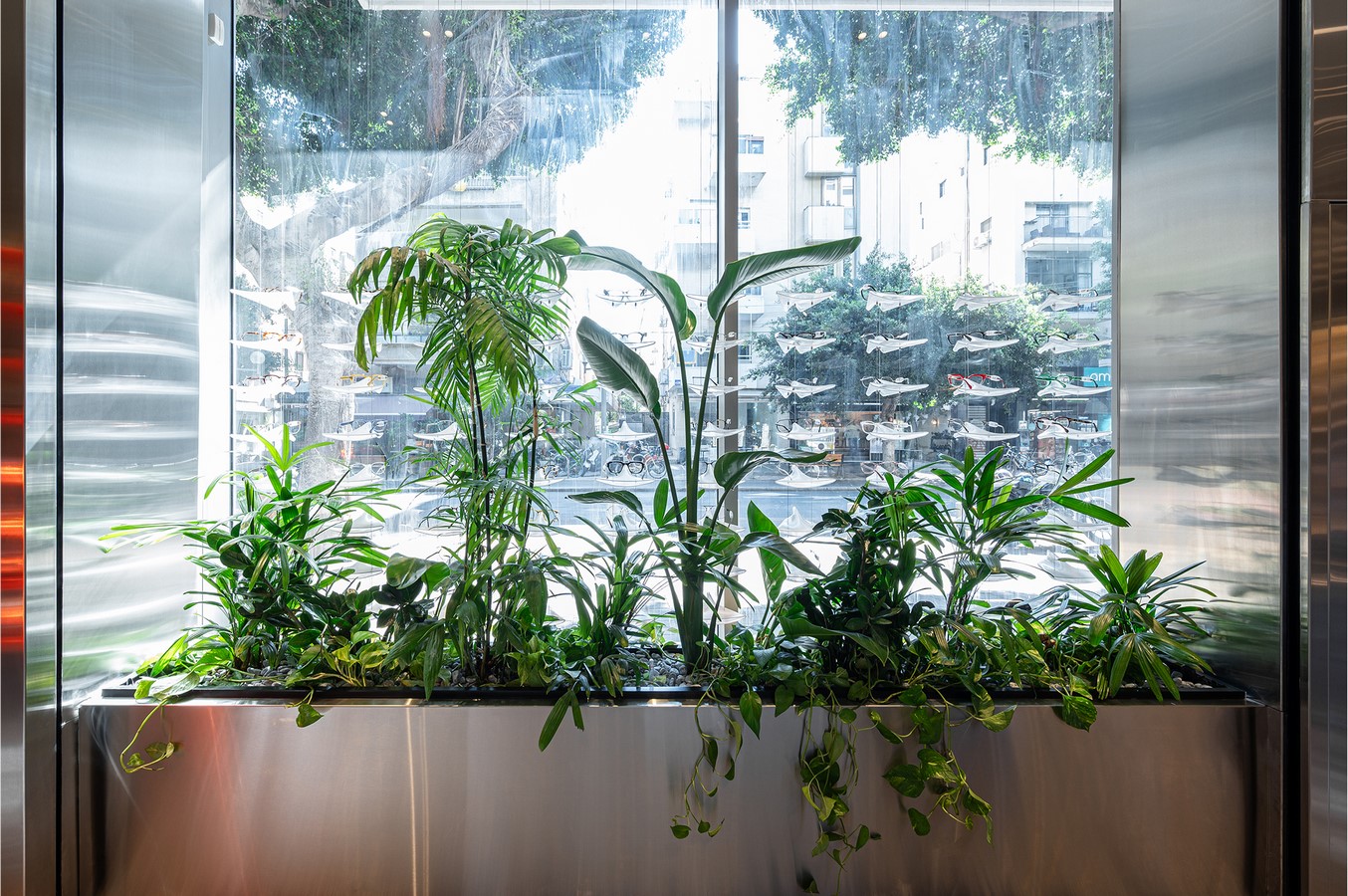
At the center of the space stands a terrazzo planter that functions as the main spatial organizer. Rather than acting as a divider, it filters the interior. By interrupting long sight lines, the planter reduces how many objects can be seen simultaneously and guides visitors to move gradually around it.
From this central element, sunglasses extend outward on cable-suspended structures that appear almost weightless. The glasses hover in space, detached from conventional shelving systems. Together, the suspended holders and the planted core form a unified display system: one technical and fabricated, the other living and organic.
Plants are therefore not decorative additions but active components of the spatial strategy. They introduce vertical softness within the precise geometry of the display system and break the repetitive rhythm of the product walls. Their presence creates moments of visual pause and helps maintain a sense of openness within the compact floor area.
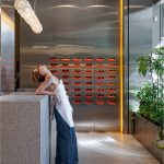
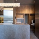
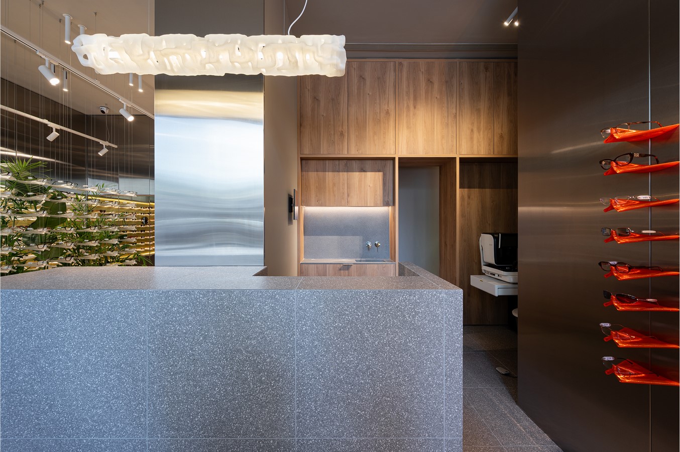
The store itself is organized into two connected rooms separated by a continuous counter. The first space is defined by terrazzo surfaces and stainless steel walls, producing a calm and reflective atmosphere. The second area introduces wooden cladding and orange display holders, creating a slightly denser and warmer environment. The contrast between these two zones establishes a subtle spatial rhythm between openness and compression.
Materials were selected for the way they interact with light rather than for decorative effect. Terrazzo surfaces diffuse light softly, while brushed stainless steel reflects it in fluid patterns that shift throughout the day. A mirrored wall visually expands the space and adds another layer of depth and ambiguity.
The holders themselves are printed in translucent PETG, allowing them to support the glasses while remaining visually light. Their semi-transparent quality prevents them from competing with the objects they display, reinforcing the idea that the architecture frames the product rather than dominating it.
The storefront continues this spatial logic toward the street. A stainless steel planter anchors the display window while several frames hover above it on suspended cables. Even when the shop is closed, the semi-transparent shutter allows the illuminated interior and the plants to remain partially visible from outside, maintaining a quiet presence within the urban environment.
SAM&JO therefore operates less as a conventional retail interior and more as a carefully calibrated spatial environment. Rather than prioritizing density or efficiency, the design focuses on clarity, rhythm, and attention.