Close your eyes and imagine this scenario. It’s a relaxing Sunday afternoon, and you are heading to the supermarket for groceries. A sea greets you as you move through the aisles. Some are colourful, some kitschy, and a few blend into the crowd. They are available in every brand and size you could imagine. A few items in particular pique your interest, and you buy them. As you drive back home, you notice an advertisement on the billboard that convinces you to buy their product instead of the competition’s. (wink, wink! We all know about those notorious brand campaign wars!) You go home, order their dish on your favourite food delivery app, and have it for lunch as you watch a movie on your preferred OTT platform.
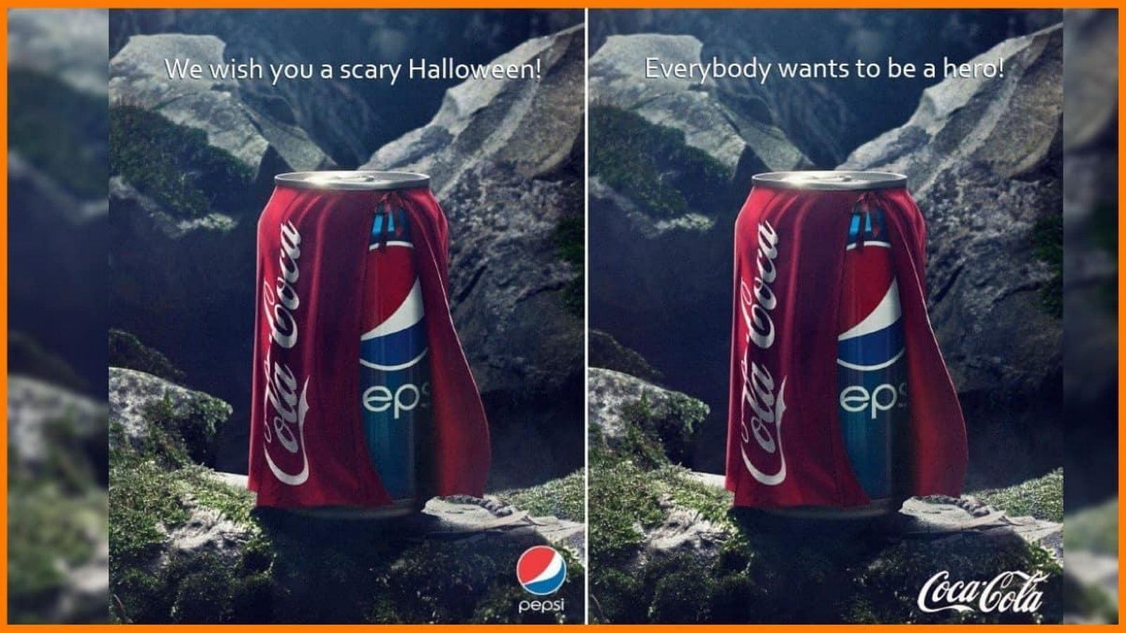
Now, look back and question yourself—what made you choose these items? What drew your attention to them? What made you trust these products over the others? Was it the colours, the visuals, the logo, or the overall packaging? Psychologically speaking, it could be all the above-mentioned factors. However, the most important one among them is the typography involved. Typography is one of the most decisive factors in influencing people’s choices. Eye-catching images surround us—billboards, newspapers, televisions, smartphones, and supermarkets. You name it! The greater their appeal, the greater the conviction.
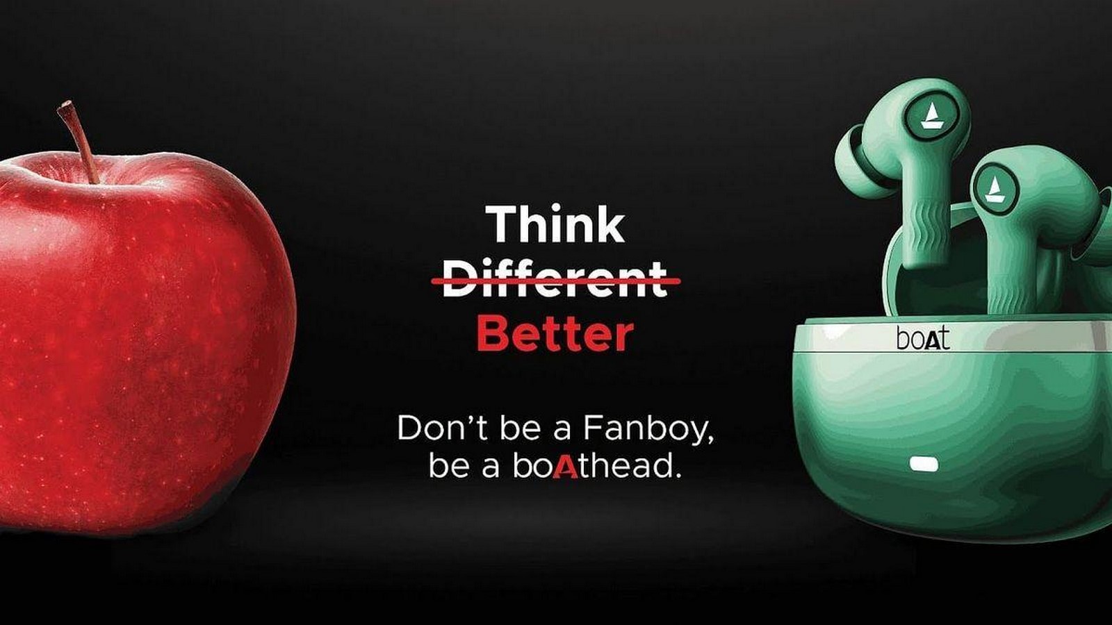
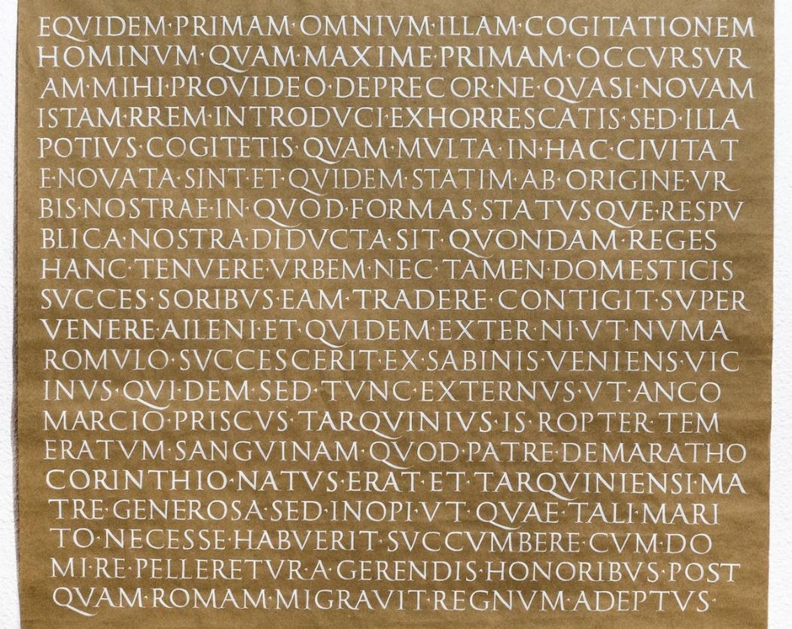
In a world run by consumerism, marketing plays a significant role in influencing consumers’ decisions. The more effectively a brand or company’s appeal, values, and importance are communicated, the greater its demand. And, what better way to achieve it than through visual impact? Since the beginning of time, man has been a visual thinker. Pictography (the use of pictures, drawings & diagrams) and typography (the strategic placement of types/letters in a legible format) are two systems that have played a fundamental role in the communication of ideas. The design of typography, especially, has evolved greatly over the last 1500 years, resulting in thousands of typefaces, fonts, and writing styles. From ancient inscription tools to modern-day digital platforms, it has borne witness to innovations aplenty, all whilst serving as an apropos medium.
So, before we delve into the whys and wherefores of typography design, let us take a quick detour to understand typography and the elements associated with it.
Typography: Decoding the artistry of lettering

The art and technique of arranging type to make written language readable and visually appealing is known as typography. The three main purposes of typography in graphic design are to ensure legibility, convey the tone or sentiment of the message, and make it aesthetically pleasing. Well-designed typography is always clean and refined, quickly capturing the viewer’s attention. While graphic design mainly revolves around visuals, typography is an indispensable part of it. Placed artfully against the imagery, it can cast a strong, memorable impression on the user.
Key elements of typography
- Typeface
Typefaces are a family of symbols, digits, and letters with identical designs. Times New Roman, sans serif, and Proxima Nova are popular typefaces.
2Font
Fonts are typefaces expressed using different sizes, heights, widths, and styles. A few examples are Times New Roman Italic, Proxima Nova Semi Bold, and Georgia Italic.
3. Leading
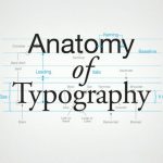
Leading is the vertical distance between two lines of the text span. The leading value denotes the vertical distance between two lines in a text. Good design dictates that the leading value must supersede the font size.
4. Tracking
Tracking is the spacing between the characters, words, or lines. It is commonly known as character spacing or letter spacing.
5. Kerning
Kerning focuses on the spacing between a specific pair of characters (e.g., spacing between two letters within a word) and could vary within the line, text, or design.
The importance of typography in design
The role of typography in design—graphic design, brand packaging design, or UI/UX design—is to deliver the message at a glance and capture the user’s attention. Strong visuals may offer an idea of the product’s intent but do not offer any further explanations. The texts then posed alongside offer a better understanding of the brand’s intent. Typography in design elevates mere words into something powerful—a voice. Tweaks to seemingly small visual elements dramatically impact the look and feel of words, lines, and texts. This persuades the audience to seek their product or design piece amidst a sea of offers. So, let us look at eight major reasons why typography is the key to a brilliant design.
- Increases Legibility & Accessibility
A fine design always ensures that the written text is clear, readable, and easy on the eyes. Choosing and pairing fonts that offer high contrast often helps. This makes it accessible for people with visual impairments to read the content.

2. Visual Communication
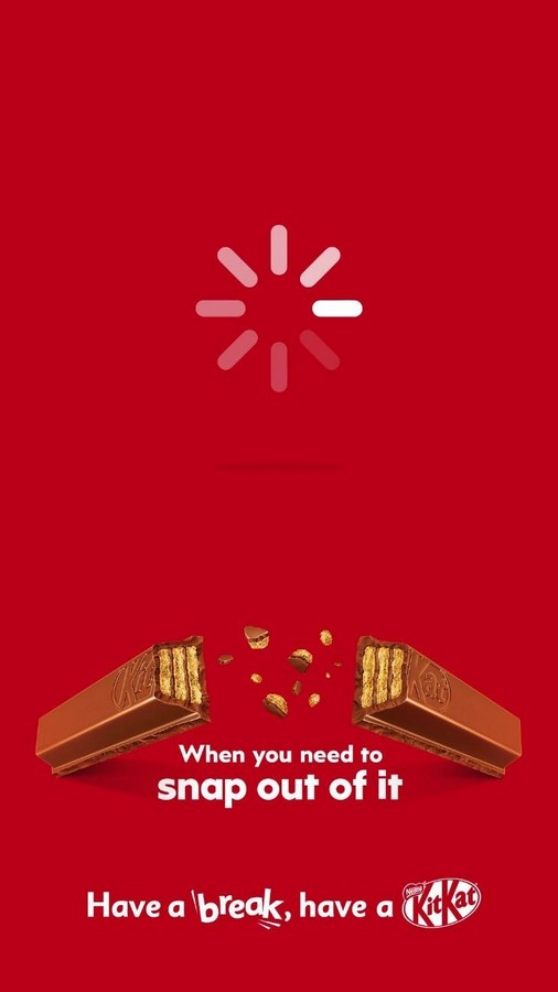
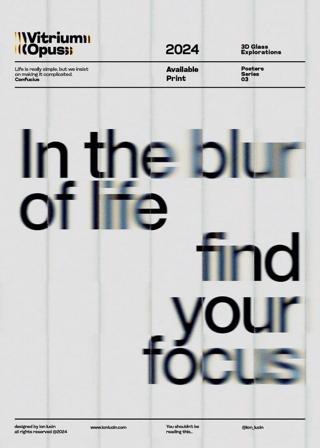
Typography in design is vital for communicating ideas, sentiments, and tone. The colours, fonts, and arrangements set the mood—warm, fun, playful, refined, formal, scary, or mysterious. As we all know, recent studies have shown a decline in our attention spans. This calls for lucid and imaginative designs that can garner attention quickly. The juxtaposition of a bold visual/logo with suitable typography creates a unique design, instantly grabbing the viewer’s eye.
3. Achieving aesthetics
Humans are visual thinkers. Studies show that it takes 13 milliseconds to grasp and retain the memory of an image. Therefore, achieving a clean aesthetic to draw the user’s attention becomes crucial. Clean, legible text with sharp contrast can provide a classy and refined appearance.
4. Brand Identity & Recognition
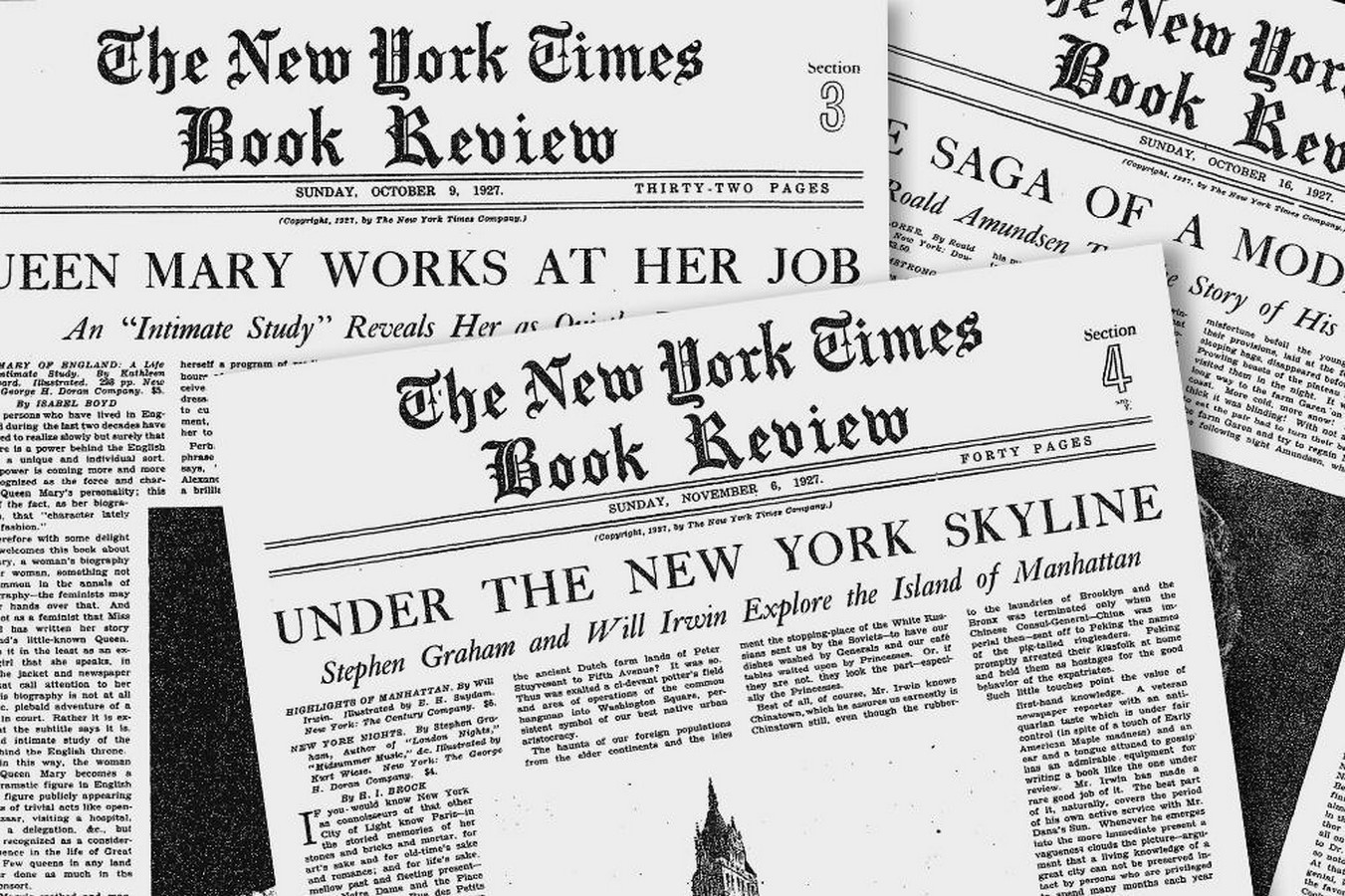
Typography is a key player in building brand identity. Using the right typefaces and colours is important to create visually appealing and memorable compositions. These influence customer preferences that bear significant impacts on the consumption of the products. With a fitting typography, brands can communicate their ideas and values at the briefest glance. They can present themselves as memorable, trustworthy, and of superior quality to their customers.
5. Influencing behaviours & decision-making
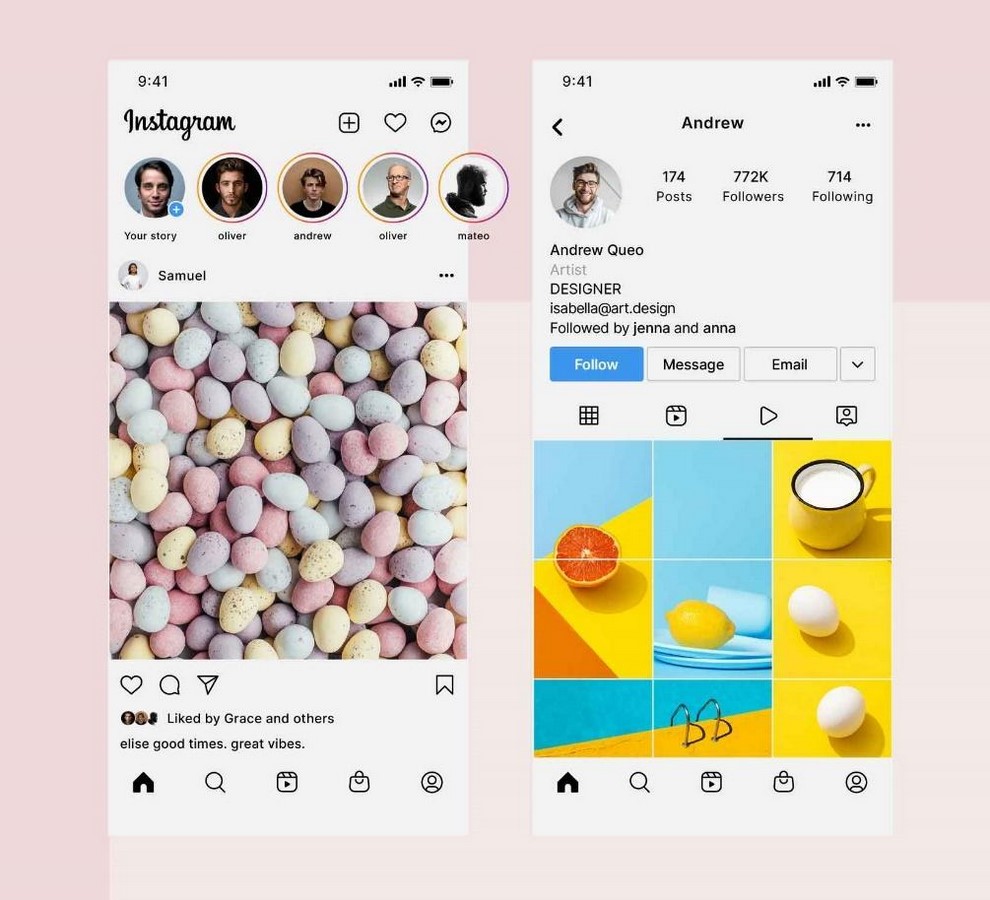
Good typography has the power to influence our cognitive behaviours. For example, Instagram uses a minimal, sans serif font, simple icons, and neatly spaced characters in its UI design. This generates a clean, easy-to-use interface. A visually striking and neat design compels us to choose these products, increasing our engagement duration. Good designs also impact our decisions, convincing us to buy well-crafted, elegantly designed items as they appear more attractive and of high quality.
6. Creating Harmony & Consistency in Design
Maintaining uniformity in typography across the different sections of the design creates visual harmony and balance, giving it a professional appearance. Consistent design language across platforms helps with brand recognition by reinforcing the memory of its identity.
7. Establishing the personality
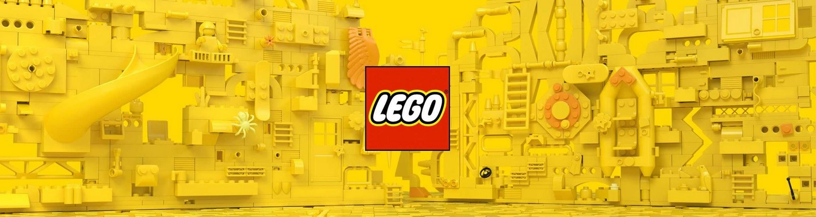
Display typefaces can add personality to the graphic design. E.g., the rounded sans serif types used in toy brands such as Lego and Funskool lend a soft, yet playful quality to the design. Therefore, we need to understand the traits of a brand or design project to use suitable typography.
8. Making an Impact
Creative use of typography can create a strong visual impact. Used tactfully, it can eliminate the need for any supporting visuals.

How can we achieve excellent typography in design?
- Contrast
Creating high contrast in the typefaces and the colours makes it easily readable for viewers. For example, using a bold sans serif font for the title and a classic serif font for the subheading and the body provides a clean reading experience. Impressive colour combinations like beige with dark brown and crème with navy blue lend a colourful, vibrant, and bold look to the design.
2. Hierarchy
Ensuring hierarchy between various content segments through sizing and typeface selection creates a clean aesthetic that easily draws and engages the user’s focus. Employing a bold, geometric sans serif font for the title against a classic serif font for the body lends a professional quality to the text.
3. Alignment
Aligning the words or lines to a base or margin helps achieve a neat, tidy, professional look that makes it easier to read. Creating variations in the character alignments results in a multitude of arrangements. These can set different moods and tones for the design.
4. Consistency
Maintaining consistency in the typefaces, fonts, and sizes lends a harmonious visual balance to the design piece. This ensures uniformity in typography across different platforms, thus contributing to brand recognition.
5. White space
White space is the space surrounding the characters and figures. It is usually the background colour. Making small changes in the alignments and spacings can greatly impact the overall look and feel of the design.
Typography is an art form that requires great artistic ability and creativity. Developing a keen eye demands a lot of practice. But when done right, it results in an awesome design that instills joy and excitement in its clients and users. Based on the points mentioned earlier, typography can be considered an integral part of graphic design. It is the final piece that completes a picture-perfect puzzle.
References List:
- Corrigan, S. (2023). Why Is Typography Important in Graphic Design? [online] www.flux-academy.com. Available at: https://www.flux-academy.com/blog/why-is-typography-important-in-graphic-design [Accessed 29 Jan. 2025].
- designlab.com. (2021). What Is Typography And How Is It Important To UX & UI? | Designlab. [online] Available at: https://designlab.com/blog/what-is-typography-how-is-it-important-to-ux-ui-design [Accessed 29 Jan. 2025].
- Vaidya, R. (2022). What is Typography? Guide On Why Its Important for Graphic Designing. [online] Elluminatiinc.com. Available at: https://www.elluminatiinc.com/what-is-typography/ [Accessed 29 Jan. 2025].
- Webflow Team (2023). The Importance of Typography and How It Influences the Impact of a Design | Webflow Blog. [online] Webflow. Available at: https://webflow.com/blog/importance-of-typography [Accessed 29 Jan. 2025].
- TEDX Talks. (2013). Typography – now you see it: Shelley Gruendler at TEDxSFU. [YouTube video]. Available at: https://youtu.be/SBgBO28ev3M. [Accessed: 29 January 2025]