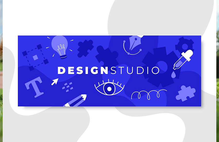
A rectangular image sits at the top of a webpage. A desktop user glances at it for roughly 1.3 seconds, maybe 1.5 on mobile, before scrolling past. That narrow window determines brand recall, click-throughs, and revenue all at once. The global average CTR for display ads still hovers near 0.05%–0.46%, depending on the format and network. Static creatives bear the worst of that number, while animated banner ads (HTML5 units, GIF sequences, rich media) consistently outperform them because motion catches peripheral vision. Getting the design for banner promotions right requires more than a Canva template; it demands deliberate choices about layout, copy hierarchy, color, and placement working in concert.
What Makes a Banner Ad Design High-Performing?
According to 2025 benchmarks, the top-performing display campaigns exceed 0.7% CTR through better targeting, creative testing, and landing page alignment. That’s roughly double the global average, and the gap comes down to a handful of structural decisions baked into the banner ad design itself.
A single focal point comes first. Banners that try to communicate three offers at once lose all three. One product shot, one headline, one CTA. That formula persists because the human eye processes very little at banner scale. Brand consistency matters just as much: ads that match the parent website’s typography and color palette score higher on recall tests. And then there’s the CTA button. A banner ad without a clear call-to-action is a billboard on an empty highway. Phrases like “Shop Now,” “Get 40% Off,” or “Reserve Your Spot” perform well because they set an expectation for what happens after the click.
Choosing the Right Banner Ad Dimensions
Not every ad slot carries equal weight. The IAB standard sizes (300×250, 728×90, 160×600) account for the majority of impressions across the Google Display Network. Designing only for one size limits programmatic reach; designing for all three at minimum ensures your creative competes for premium publisher placements.
| Banner Size | Name | Where It Appears |
| 300×250 | Medium Rectangle | In-content, sidebar |
| 728×90 | Leaderboard | Header, between content blocks |
| 160×600 | Wide Skyscraper | Sidebar, sticky placements |
| 320×50 | Mobile Leaderboard | Mobile web, in-app |
Responsive Display Ads (RDAs) on Google simplify this by letting the platform assemble your assets to fit available slots dynamically. You lose granular control over the final composition, but you gain exposure across dozens of placement types without producing each variation by hand.
Banner Ad Design Best Practices: Color, Typography, and Visual Hierarchy
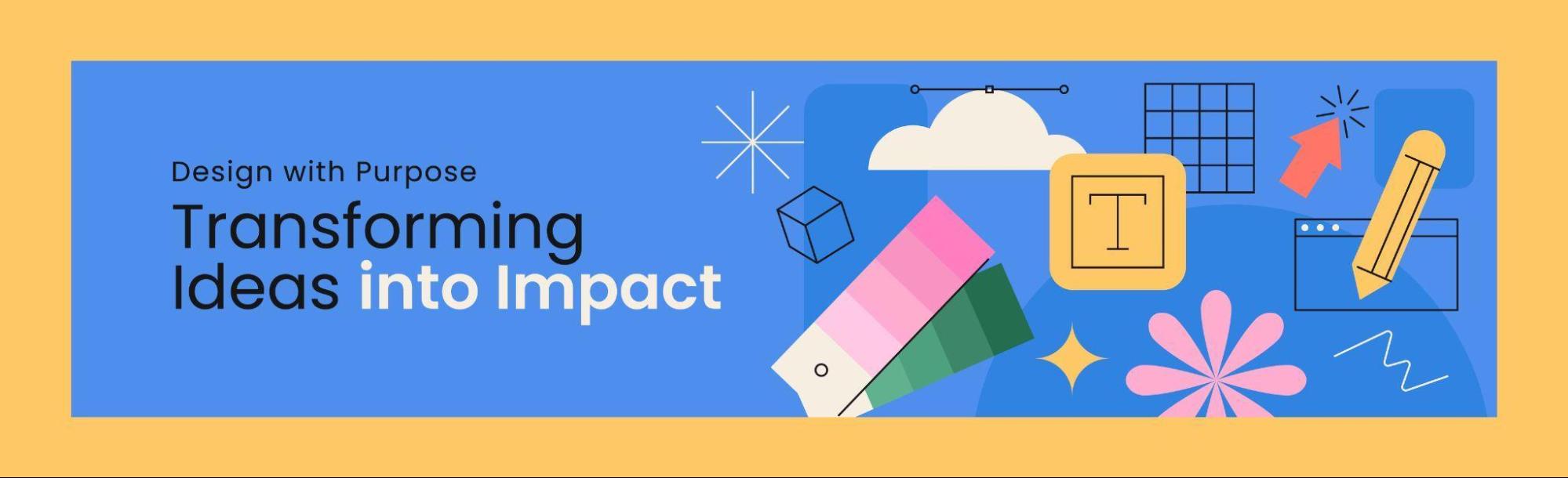 Color psychology applied to banner ad design isn’t pseudoscience. It’s pattern recognition backed by decades of advertising research. Red triggers urgency and shows up in clearance and limited-time offers. Blue builds trust, which is why financial services and SaaS brands lean on it. Black signals premium positioning. The wrong palette sends a conflicting message about your brand before anyone reads a single word of copy.
Typography follows its own rules at banner scale. Stick to one or two typefaces, maximum. The headline needs to be readable at a glance, and sans-serif fonts with strong weight work best against busy webpage backgrounds. If you need a paragraph to explain the offer, the offer is too complicated for a display ad.
Visual hierarchy ties these elements together. The viewer’s eye should travel a deliberate path: brand logo → headline → supporting image → CTA button. Disrupting that sequence with competing visual weights (an oversized product image fighting with bold-italic text, for example) fragments attention and drops engagement.
Static vs. Animated Banner Ads: When to Use Each Format
Static banners remain the workhorse of display advertising. They’re cheap, fast to produce, universally compatible. For retargeting campaigns where the user already knows your brand, a clean static image with a direct offer often performs well enough.
Animated banners earn their place when the story requires a sequence. A fashion retailer showing three seasonal looks across timed frames. A SaaS product walking through a feature in three steps. Keep in mind that the Google Ads Network limits GIF animations to 5 frames per second and 150KB file size, making GIF a poor choice for smooth transitions. HTML5 is the standard format for fluid animated banner ad creatives. The animation itself should stay under 15 seconds, and the final frame must present both the core message and CTA, since many users will only see that last static image.
Testing both formats against each other remains the only reliable way to know which works for your audience. Run A/B splits with identical copy and CTAs, changing only the format, and let performance data guide budget allocation.
How to Apply Best Practices for Banner Design Without Making It Generic
Following best practices for banner ad design shouldn’t mean producing something indistinguishable from every competitor’s creative. The guidelines (clear CTA, brand consistency, high-quality visuals, minimal text) are a foundation, not a ceiling. The real differentiation happens in three places:
Personalization
Dynamic banners that adapt content based on user behavior deliver a documented 10.4% uplift in CTR over generic versions. Personalized ads also generate three times the ROI compared to non-targeted creatives. If your ad platform supports dynamic creative optimization (DCO), use it.
Landing page continuity
The design for banner ads must extend seamlessly to the destination page. Match colors, fonts, imagery, and messaging between the ad and the landing page. When someone clicks a sleek dark-themed banner and lands on a white, text-heavy page, confidence erodes on the spot.
Frequency capping
Showing the same banner too many times triggers ad fatigue and banner blindness. Set impression caps per user per day to keep your creative feeling fresh rather than stalkerish.
How to Measure Your Banner Ad Performance
 A banner ad with a high CTR that sends traffic to a poorly optimized landing page accomplishes nothing. Track the full funnel: impressions → clicks → on-page behavior → conversions. The average CPA for display ads sits around $65.80 according to 2025 Google Ads benchmarks, so every wasted click eats directly into margins.
Rotate your creatives every two to four weeks for high-frequency campaigns and test variations of headlines, CTAs, color schemes, and imagery independently. Attribution models that account for view-through conversions (users who saw the ad but converted later through another channel) give a more honest picture of display’s contribution than last-click aloneMake the 1.3 Seconds Count
Banners live and die by brevity. The brands that consistently outperform display benchmarks do so because they pair disciplined banner ad design with relentless testing, not because they found a secret template. Start with the data, respect the constraints, and build from there.