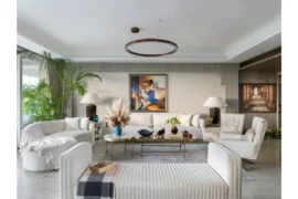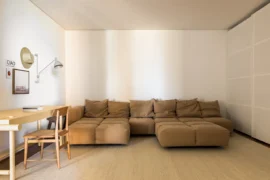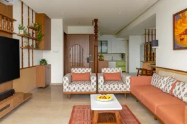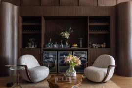
In this Moscow apartment, cinema became the starting point for the design rather than a backdrop to everyday life. The client, head of PR at an arts newspaper, framed her brief to a single line: “I want to live as if inside The Color of Pomegranates by the cult Armenian filmmaker Sergei Parajanov.”
Project Name: The Color of Pomegranates
Studio Name: Anfedo
Photo: Zhenya Muravyeva
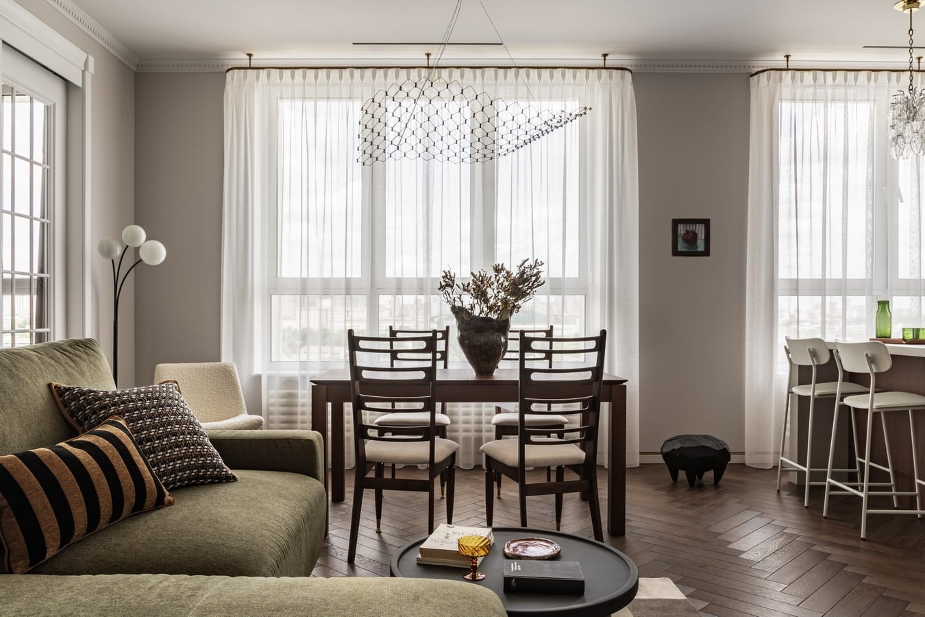
Designer Anastasia Fedorovskaya translated this reference into a cohesive interior language. Nuanced reds and greens, tactile finishes, and vintage pieces are carefully composed around the rhythms of family life — creating not just a striking image, but a lived-in atmosphere.
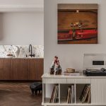
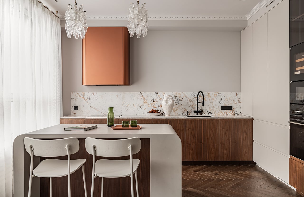
The project by ANFEDO is an eclectic apartment overlooking Moscow City, designed for a couple passionate about collecting books and art. A functional layout, carefully considered storage and bespoke elements — including a kitchen island fitted with bowls for their corgi — are balanced with family heirlooms, a contemporary art collection, and subtle cinematic references from the world of Sergei Parajanov.
The Architecture of a Designer’s Frame
The project didn’t begin with social media references, but with cinema. “Every project for me is a life story translated into architecture — about its characters, their dreams and their intentions,” says Fedorovskaya.
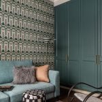
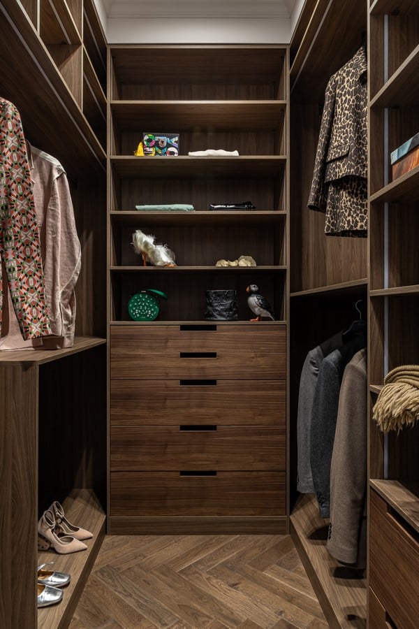
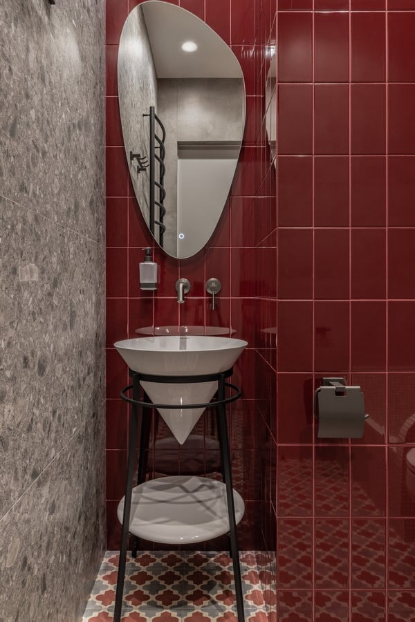
The designer worked through the film as a sequence of still frames, extracting its shapes, palette, and recurring symbols: pomegranate reds, deep wine and copper tones, malachite and khaki set against a light wooden base. Instead of gloss, the surfaces are tactile and raw — stone-textured plaster, suede paint, microcement, and vintage chairs with sculptural folds. As the clients put it: “The rougher and more aged it feels, the better.”
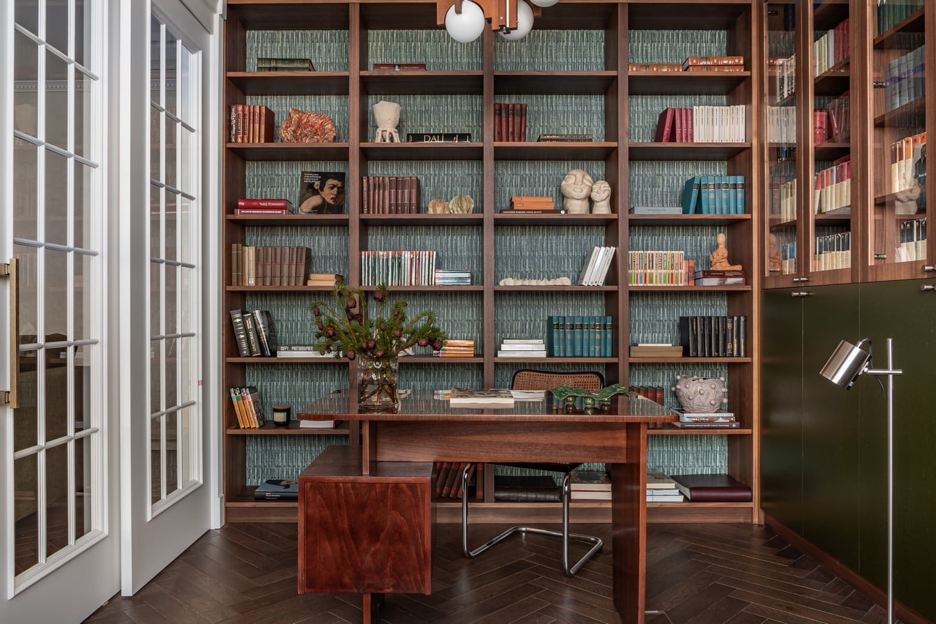
The layout came together on the first attempt: an open-plan kitchen and living area with a study, a private master suite, a utility room, a guest room (intended as a future nursery), and even a bathroom for the corgi, Bulochka (“little bun”). A brass skirting detail runs throughout like an invisible thread, subtly tying together textures, furniture, and colour into a unified composition.
Vintage as the Main Character
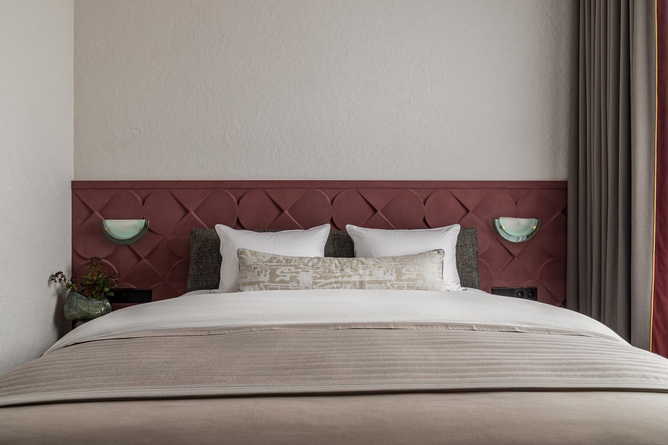
The interior was assembled piece by piece, like a kaleidoscope gradually coming into focus. Vintage items were sourced from specialist platforms and Italian showrooms: wall lights were approved even before the contract was signed, chairs were retrieved from “favourites”, and a grandfather’s chandelier carefully restored for the bedroom.
“There was a connection stronger than reason,” Fedorovskaya recalls of the moment the clients chose her studio.
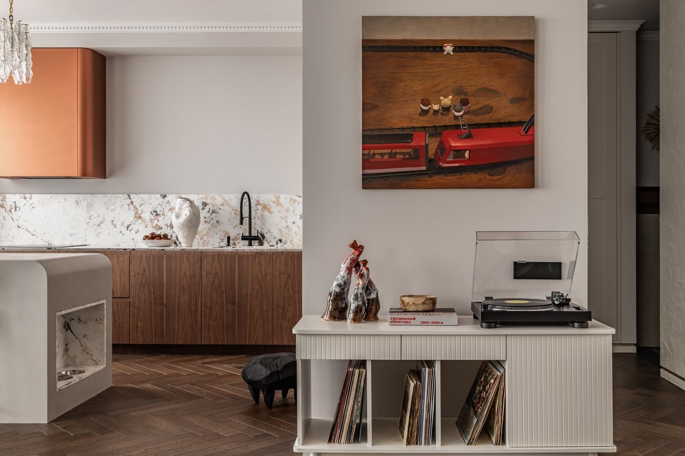
Art here is not decoration, but a co-author. Works from the clients’ collection are placed with intention throughout the apartment. Life of Mr. Duck by Maxim Trulov introduces a note of irony in the bedroom — a reminder not to take mornings too seriously. A pomegranate piece by Maria Barkovskaya, gifted by Fedorovskaya, precisely echoes the film’s palette, while a vase by Ambartsum Kabanyan complements the surrounding ceramics.
The study feels warm and gently aged, designed for books and quiet focus; the kitchen and living area are light and minimal; and the bedroom most directly channels the visual language of Parajanov.
Emotion as Outcome
The clients, both figures from the art world, saw in the project a vision of their future life: gathering friends, raising children, listening to vinyl, and drifting into nostalgia in front of a film projector.
“You created a home for us where every other place now feels a little less beautiful, because this one is entirely about us,” they shared.
Anastasia Fedorovskaya adds: “It is a self-sufficient space that doesn’t need to prove anything. It is loved, and it gives everything back in return.”
“Life is meant to be lived beautifully. Trust creates results,” she says, summarising her design philosophy. This project stands as a symbol of creative fulfilment, rooted in full immersion and open collaboration with clients. Trends fade, style endures — and so will this interior, like a pomegranate held in the hands of Sergei Parajanov.