


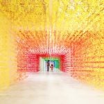
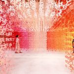
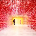
Installation title : Universe of Words
July 7th is the 100th year anniversary of the beloved Japanese drink Calpis. Coinciding with the Japanese star festival, Tanabata, Emmanuelle unveiled two installations, “Universe of Words” and “100 message bottles”, presented at the “Calpis 100th year anniversary, Let`s Meet at Tanabata” exhibition.
Name: emmanuelle moureaux
Title: Architect, Artist, Designer
Art: emmanuelle moureaux
Studio: emmanuelle moureaux architecture + design
Photograph: Daisuke Shima
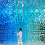
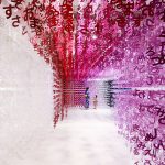
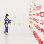
Installation title: Universe of Words
100 colors series: 100 colors no.28
Materials: Paper, thread
Exhibition title: Calpis 100th year anniversary, Let`s Meet at Tanabata” exhibition
Date and venue: July 4 (Thu) – 7 (Sun), 2019
3331 Arts Chiyoda (Tokyo)
Main Gallery
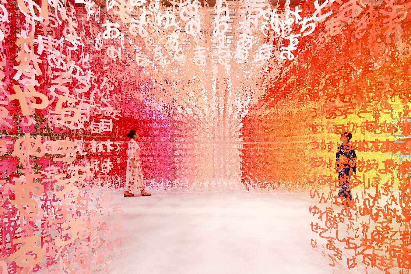
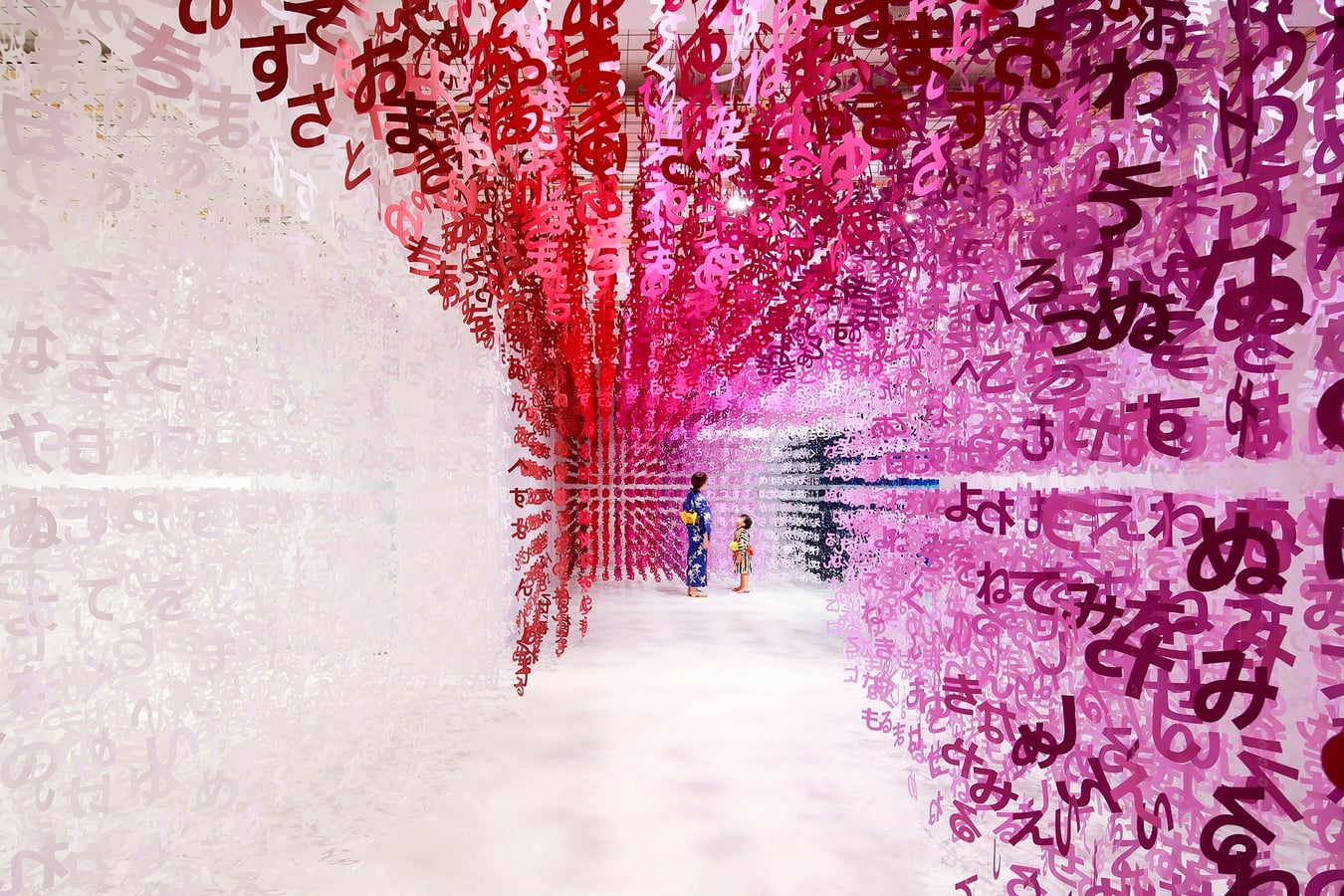
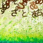
On Tanabata day, Japanese people write their hopes and dreams on colored pieces of paper and hang them on a bamboo branch in hopes that their wishes will come true. Emmanuelle reimagines this tradition by extracting the sense of Tanabata onto the floating words. She chose the simplest written alphabet children first learn “hiragana”, composed of 46 different characters. In Tanabata, hiragana are used to express the hopes and dreams. The universe created by these floating hiraganas evokes an emotion through its stillness and its endlessness. By condensing the essence of the word itself, it derives to the emotion. The swaying hiragana form and symbolize the wishful colored pieces of paper swaying from the bamboo branch.
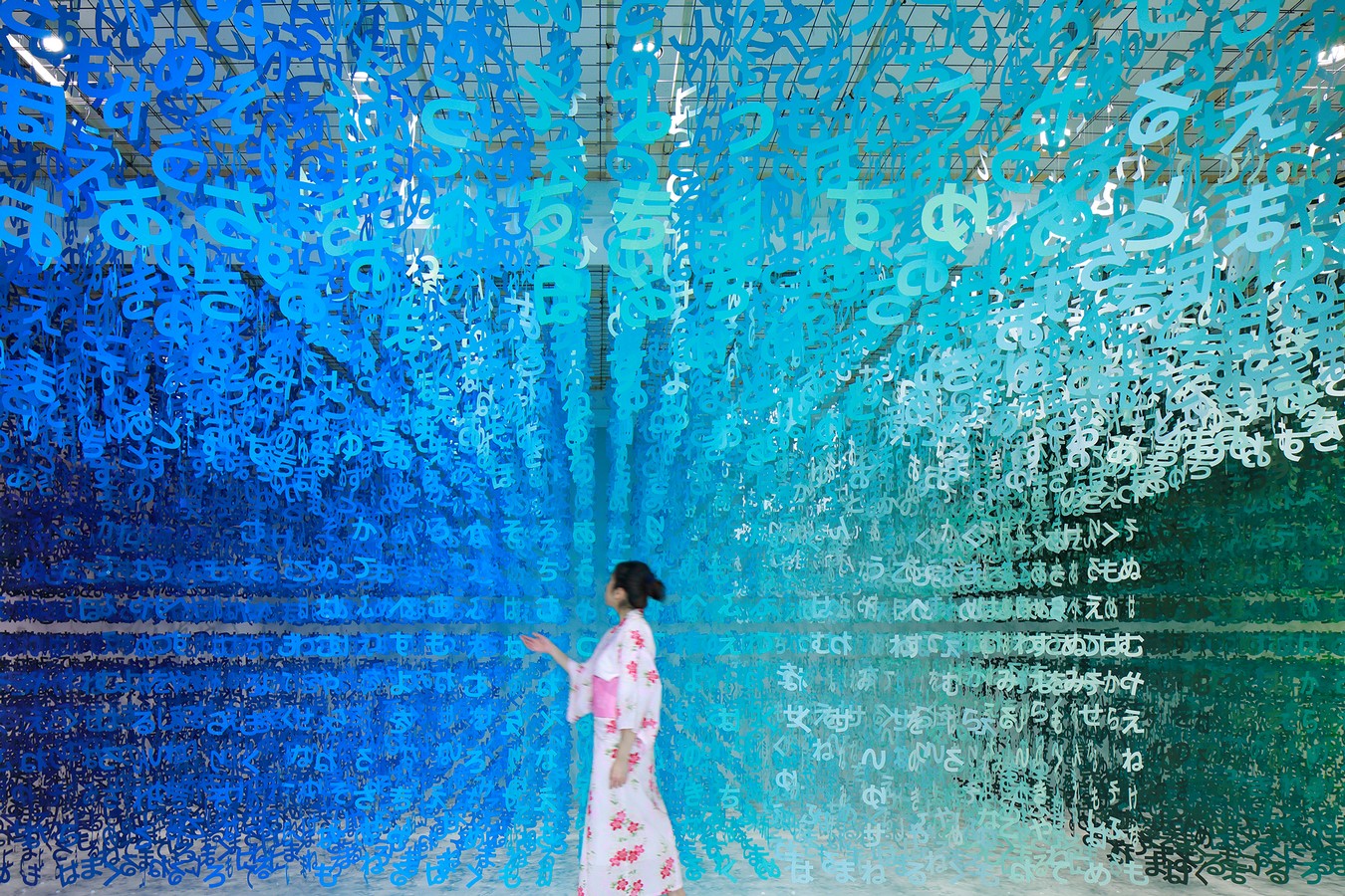
The installation was composed of approximately 140,000 hiraganas, regularly aligned in three dimensional grids. Visitors could wonder inside the colorful space filled with hiraganas to share the sense of stillness. Sections of the installation were removed, creating paths that cut through the installation. Walking through the countless numbers of hiraganas, words gradually come to mind…As part of Emmanuelle’s “100 colors” installation series, the layers of hiraganas were colored in 100 shades of colors, creating a colorful Universe of Words. Within those characters, CALPIS bottles figures were lost and could be found along with the CALPIS logo, adding playfulness to the installation. One path led the visitors to the next installation room, “100 message bottles”.
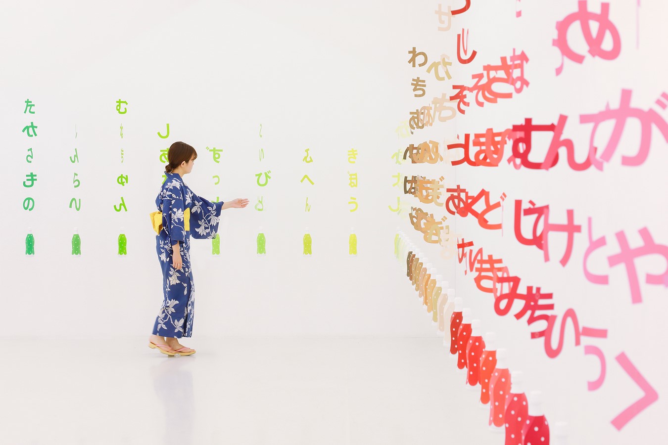
“100 message bottles” installation was designed for visitors and their loved ones to find the one “message bottle” which best described their relationship. 100 “CALPIS” bottles specially designed in 100 shades of colors were associated to 100 words such as “friendship”, “longing”, “warmth”, each “message bottle” representing a color and a meaning of a special relationship. Once viewers found their “word”, they could take a photo in front of their message bottle to remember the moment. It is truly a special experience to remember.
Born in France. Living in Tokyo since 1996. Established emmanuelle moureaux architecture + design. Inspired by the layers and colors of Tokyo that built a complex depth and density on the street, and the traditional spatial elements like sliding screens, she has created the concept of “shikiri”, which literally means “dividing (creating) space with colors”. Using colors as her signature, her works extend to a number of projects, including architectural design for Sugamo Shinkin Bank, space design for ABC Cooking Studio, art installations for UNIQLO and ISSEY MIYAKE, “100 colors” art installation series, and “Forest of Numbers” at The National Art Center, Tokyo. Associate Professor at Tohoku University of Art and Design.
About 100 colors
“100 colors” is an installation series began in 2013, which forms space using 100 shades of colors. Emmanuelle wishes to give emotions through colors as she felt from seeing overflowing “colors” in Tokyo when she first visited in 1995. She also wishes to give opportunities for people to see, touch and feel colors with their senses to become more conscious of colors that exist around them.
In “100 colors”, Colors are explored in various forms depending on the environment, to maximize the beauty of colors. 100 colors entering the body with a glance triggers a physical response to engage with the sensation of colors. The installation series will continue to travel around the world.
“When I first arrived in Tokyo,
I was fully fascinated by the colors overflowing on the street.
In that very moment, my mind decided to move to Japan.
Overwhelming number of store signs, flying electrical cables,
and flashes of blue sky framed by various volumes of buildings,
created three dimensional “layers” in the city.
The flood of various colors pervaded the street
built up a complex depth and intensity in the space.
These indelible experiences of colors and layers in Tokyo
were the inspiration and essence of my design concept of “shikiri”,
which means dividing (creating) space with colors.
Valuing the emotion inspired from Tokyo,
I want to show the beauty of colors to the fullest extent.
I also wish to share the feeling of being surrounded by overflowing colors
by exhibiting 100 colors, here in the middle of Tokyo.
Please come and find your favorite color. ”
emmanuelle moureaux (September, 2013)


 Philippine Pavilion Opens at Venice Architecture Biennale 2025 by Studio KIM/ILLI")