


The client’s intent for this over buzzing co working space was to add value to the already existing linear workplace in terms of more zest and vibe as well as the introduction of new spaces fostering comfort and recreation to attract more clientele. There was an utmost need to cater to not only just immediate functional requirements of workability, privacy, aesthetics, and human comfort at the day-to-day office level for all the co inhabitants but to go an extra mile to create an atmosphere of leisure and playfulness and spaces to foster a spirit of team bonding amongst people and companies from myriad walks of life. There was something that needed to be a USP for this brand to stand out amongst its competitors in the market and to make an impressionable foray into this hustling sea of co working brands in Noida and furthermore in Delhi NCR in the future.
Project Name: Workwings Office
Studio Name: Studio Meraki
Client: Mr. Rahul Narang
Interior Design & Refurbishment: Studio Meraki
Design Team: Shweta Kaw, Naushaba, Mujahid Saifi, Sneha
Area: 2000 sqft.
Photography: Visuary, Suryan/Dang
Concept Note:
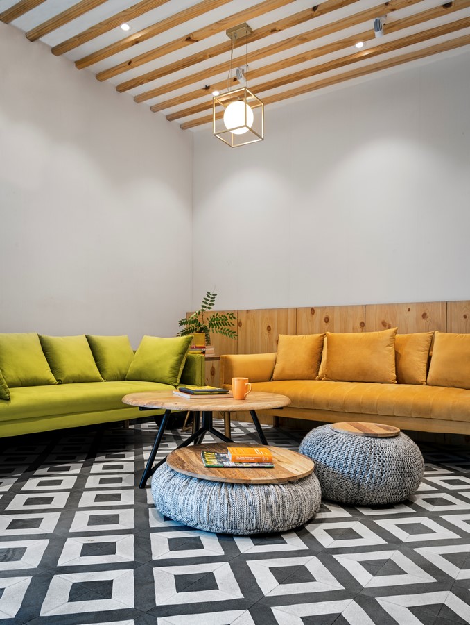
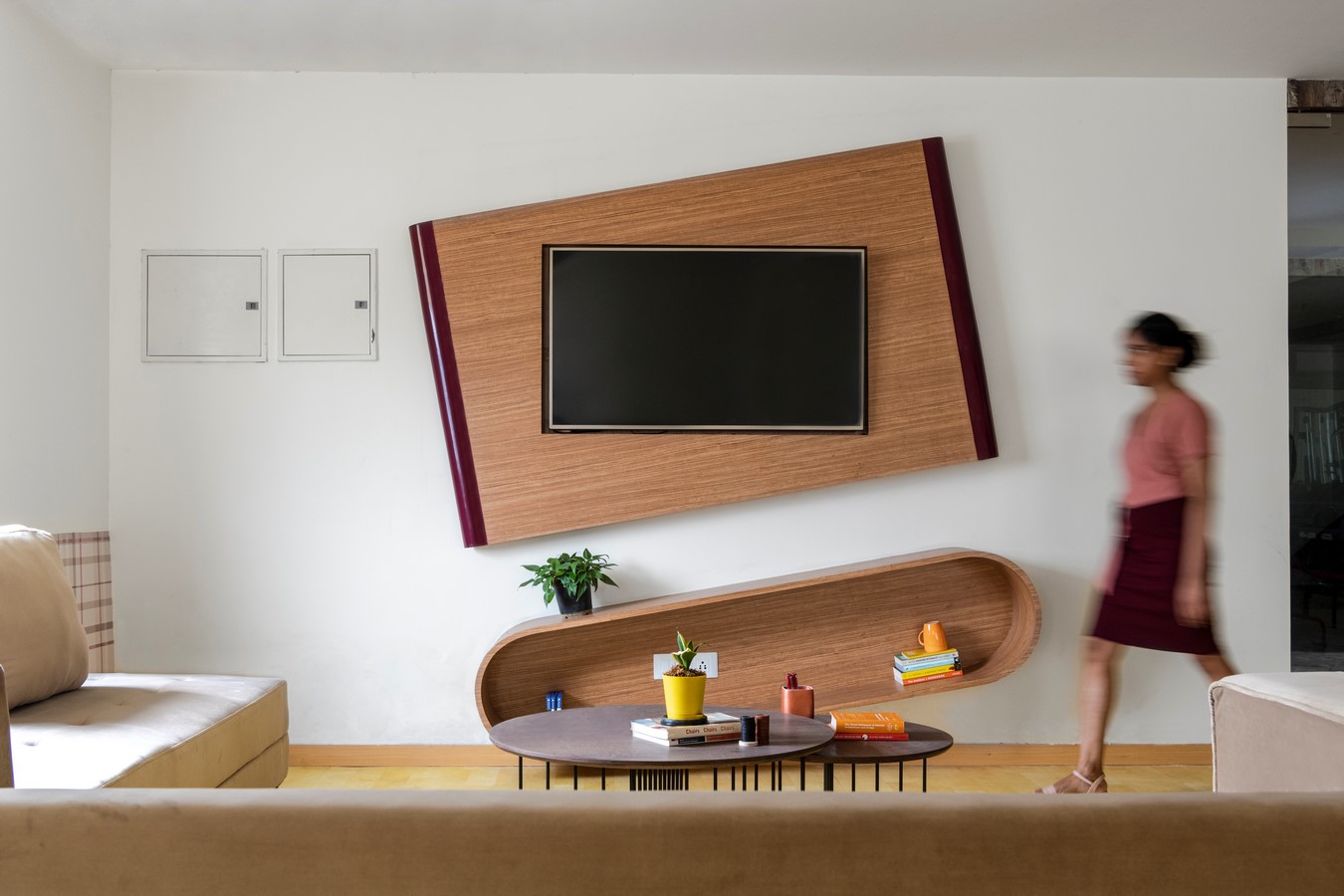
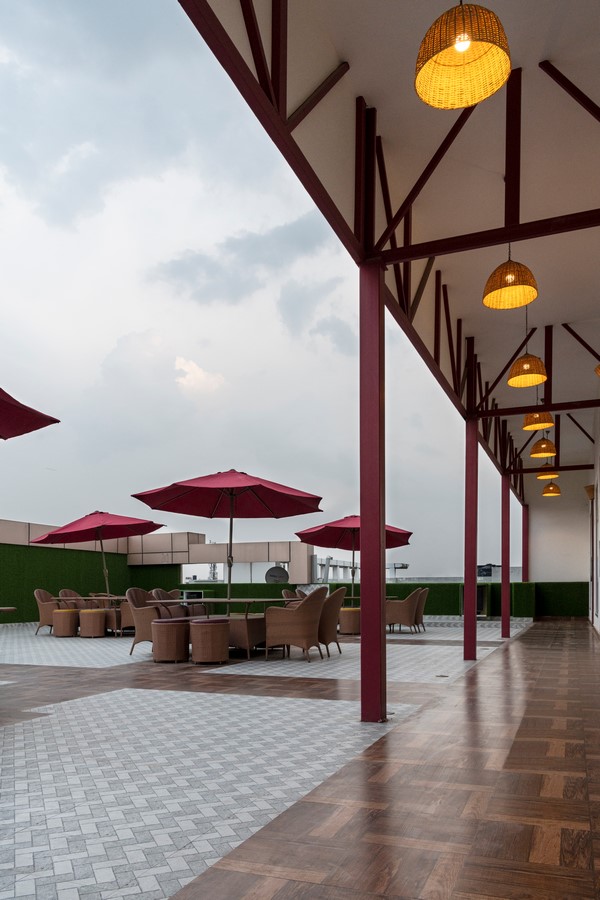
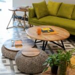
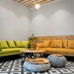
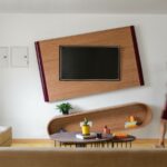
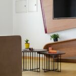
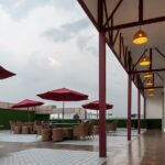
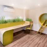
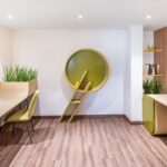
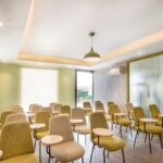
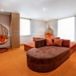
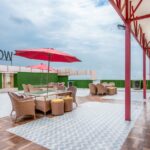
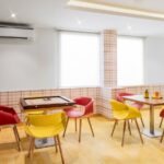
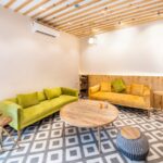
The design was tailored to transform the previously vacant areas on the Top floor. The functions added to this dedicated floor were a 25-seater Lecture Hall, Terrace café, Snooze area, Library/Reading Area, TV and Games Lounge and Gym. There were no structural changes/interventions done whatsoever.
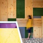
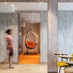
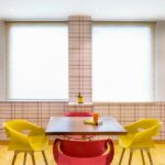
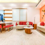
The guiding motive of creating a relaxation zone by introducing an array of different experiential segments to feel the exhilaration and novelty and thereby killing the monotony/stillness attributed to a workstation played its part in finding a motley of design solutions boiling down to a single word approach i.e., “Colour Intervention”. It was crucial to seek remodelling in terms of colour and its appropriate usage to be able to create a harmonious and balanced palette that would add the necessary vigor and dynamism to the new spaces.
Design Process:
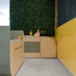
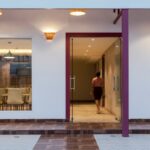
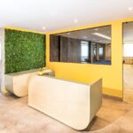
The main design intervention was through colour. The scheme was woven around maroon, green and yellow. Maroon being synonymous with the logo of the brand whereas green and yellow adding cheerfulness, energy and illumination in the aura along with visual calm. The finishes and furniture designs are softer, curvilinear, flowy and easy on the psyche with subtle wooden textures interwoven with a selection of energizing colours. There is an attempt to create exclusivity in these distinct spaces so that the experience in each is unique and pertains to that activity/mood.
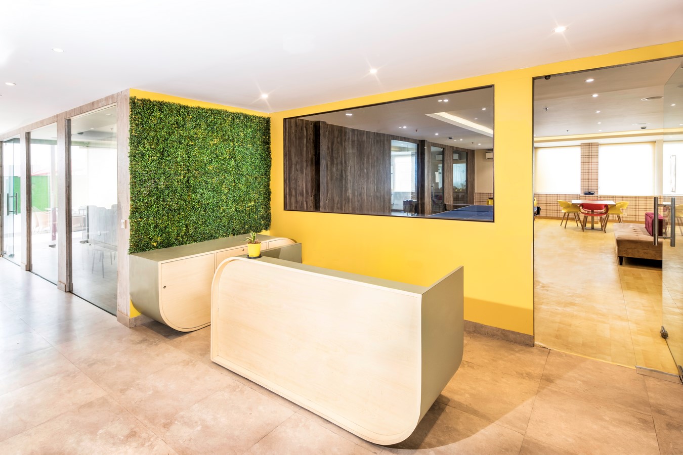
The dealbreaker is to the project the entire floor as a vantage point in the building that attracts new clients like a magnet and engage the already existing crowd to a heightened experience of joy and fulfillment. The spaces most certainly become a cross point for new conversations, social engagements, business dealings as well as soul searching in tranquil corners. On one hand there are louder play areas with games and entertainment facilities but they are nestled along with quiet rest areas and a small library. The overall scheme blends it all with a captivating interest in all these spots pushing people out of their workstations’ shell and breaking the stereotype.


 Design & Architecture Studio")


