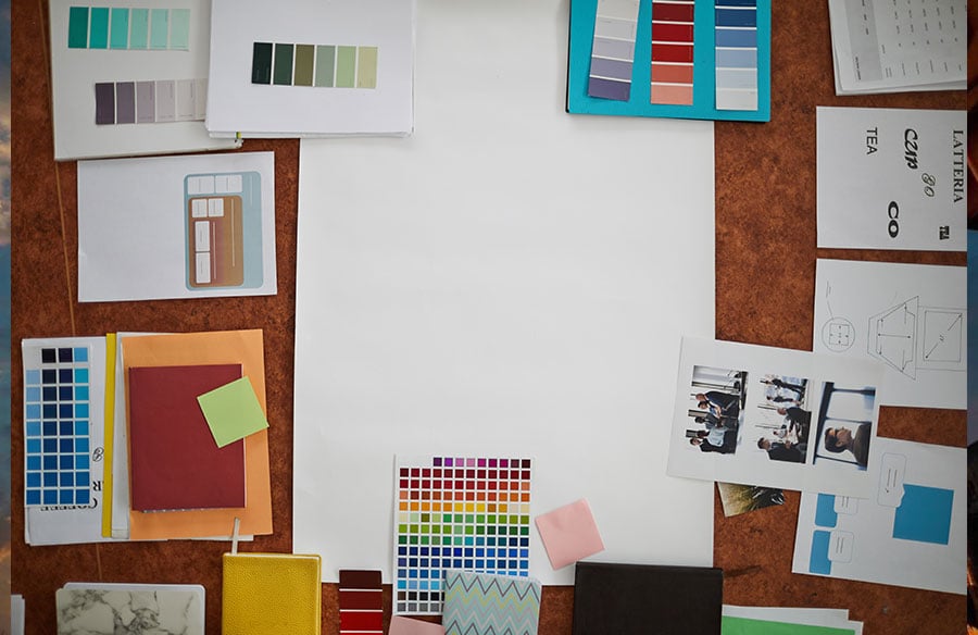
Designers have never had greater access to visual inspiration. Images of buildings, interiors, objects and graphic systems arrive in an almost continuous stream, ready to be saved, sorted and assembled into mood boards. Yet abundance has not solved the most difficult part of working with references: understanding precisely why an image is compelling, and translating that insight into an original design decision.
A mood board can establish a convincing atmosphere. It can suggest that a room should feel quiet, monolithic, warm, theatrical or domestic. What it rarely explains is how that impression has been constructed. Is the atmosphere carried by the material palette, the height of the camera, the proportion of solid to void, the softness of the light, or the absence of visual clutter? Unless those qualities are articulated, the same board may communicate a different idea to every person who sees it.
This is where generative AI can be useful—not as an automatic design solution, but as a medium for analysis and controlled iteration. Its most productive role is to help designers turn tacit visual impressions into explicit variables: elements that can be discussed, adjusted and tested. The objective is not to reproduce a reference image. It is to extract a working design language from it.
A Reference Image Is a Compressed Design Argument
Every reference image contains several layers of decision-making at once. An interior photograph, for example, may combine geometry, circulation, colour temperature, material ageing, furniture, styling, lens choice, time of day and human activity. Because these elements arrive as a single, persuasive image, it is easy to borrow the visible surface while overlooking the spatial principle that gives the image its force.
Before writing a prompt, then, the designer has to interpret what is being seen.
Imagine a photograph of a narrow restaurant lined with dark timber, with a sequence of pendant lights leading towards a bright opening at the far end. “A moody restaurant interior” names the overall effect, but offers little design guidance. A more precise reading would identify a compressed linear plan; a strong contrast between a dark foreground and a luminous destination; repeated pools of warm light that establish rhythm; tactile, low-reflectivity surfaces; and an eye-level viewpoint aligned with the principal route through the room.
The second reading is useful because it separates the image into decisions. Each decision can now be retained, modified or rejected. What first appeared to be an indivisible “look” becomes a set of relationships that can travel into a different project without carrying the original image with it.
Curate References for a Reason
A single image can be seductive, but it is rarely sufficient. A small, deliberately constructed reference set is more revealing because it helps distinguish essential qualities from incidental ones.
An effective set might contain three kinds of material. Anchor references establish the project’s central atmosphere or spatial ambition. Contrast references define what the project should resist: excessive gloss, visual noise, symmetry, monumentality or another undesirable tendency. Detail references isolate a particular question, such as a façade rhythm, a junction, a lighting condition, a type treatment or the way planting mediates an edge.
The collection should remain small enough to discuss. Five images that each have a clear role are more valuable than fifty images gathered under a vague theme. Designers looking for a broader visual vocabulary can study a curated library of AI prompts and visual references to see how composition, subject, lighting and finish are described across different kinds of image-making. The useful act is not copying an existing prompt; it is noticing which words make a visual decision legible.
A simple test improves any reference board: complete the sentence, “This image is here because…” for every item. If the answer is imprecise—or merely repeats an adjective such as “beautiful” or “minimal”—the image is probably decoration rather than evidence.
Read the Image in Layers
Turning a reference into a usable brief requires separating what has been designed from how it has been represented. A practical reading can move through six connected layers.
Begin with subject and function. What is actually being shown, and what must it do? A chair photographed in a gallery-like room remains a product with demands of posture, structure and manufacture. A dramatic façade image still represents a building with an entrance, a programme and a relationship to the street.
Next, examine form and organisation. Look for massing, proportion, hierarchy, rhythm, depth and the balance between solid and void. In graphic design, the corresponding questions concern grid, scale, alignment, density and negative space. The aim is to describe relationships rather than objects alone.
Material and colour should be recorded with equal precision. “Stone” is a category; “pale honed stone with subtle tonal variation and softened edges” begins to describe behaviour. Dominant, secondary and accent colours should be distinguished, as should reflection, texture, weathering and the way a material meets another surface.
Light deserves its own analysis. Its direction, hardness, colour and apparent source often do more to establish atmosphere than the objects in the frame. “Warm” or “dramatic” light is not a complete instruction. A designer should be able to say where the light enters, what it touches, where it falls away and how much contrast the image depends upon.
Viewpoint is another design choice disguised as documentation. Camera height, angle, focal emphasis, foreground and perspective compression all shape the viewer’s understanding of space. The same principle applies to a poster or interface, where hierarchy is revealed by the order in which the eye encounters information.
Finally, separate the proposal from its representational finish. Film grain, shallow depth of field, collage edges, imperfect linework and immaculate photorealism can alter the emotional register of an image without belonging to the designed object or space. Confusing representation with design is one of the easiest ways to pursue the wrong idea.
An image-to-prompt tool can help produce a first-pass description of these visible layers. That output should be treated as an editable reading, never as an authoritative one. Irrelevant details need to be removed, assumptions corrected and generic language replaced with terms that belong to the project and the discipline.
From Description to Experiment
Once the image has been decomposed, its qualities can be organised as constants, variables and exclusions.
Constants are the conditions that must remain stable: programme, basic geometry, accessibility requirements, an established brand palette or a critical material. Variables are the elements under investigation, such as daylight direction, façade depth, display density, furniture arrangement or graphic hierarchy. Exclusions establish what the design must avoid, preventing the process from drifting towards familiar but unsuitable conventions.
This framework matters more than elaborate prompt writing. If every property changes from one image to the next, the results may appear diverse but reveal very little. A meaningful study changes one or two variables while holding the rest of the proposition steady.
Consider a small cultural pavilion. Its footprint, entrance position, timber structure and surrounding trees might remain constant. One round of studies could test roof profiles; another could compare daylight strategies; a third could examine degrees of enclosure. The resulting images become comparable propositions rather than a collection of unrelated scenes.
A prompt can then operate as a concise design brief. A useful sequence is:
Project and purpose → spatial or formal organisation → materials → light → viewpoint → representational finish → constraints
For example:
A compact neighbourhood reading room conceived as a quiet timber pavilion; a simple rectangular plan with a deep shaded threshold and clearly expressed structural bays; dark-stained local timber, pale lime plaster and a matte stone floor; soft overcast light entering through a high clerestory; an eye-level view from the garden path, with people included only to indicate scale; restrained architectural photography with natural colour and no dramatic wide-angle distortion; retain the existing trees and avoid monumental or futuristic forms.
The effectiveness of this prompt does not come from its length. It comes from the hierarchy of decisions. It defines what the project is, how it is organised, what may change and where the boundaries lie.
Work in Rounds, Not in Volume
Generating dozens of images at once creates the appearance of productivity while making comparison almost impossible. A better process is cumulative.
The first round should establish direction. Produce a limited number of genuinely distinct options and look for a territory worth developing rather than a polished image. The second round should isolate a variable: roof pitch, material warmth, light direction, graphic scale or another project-specific decision. The third can begin to resolve the selected proposition through junctions, edges, planting, occupation, signage or surface finish.
A fourth round should stress-test the idea. Remove the conditions that make the image easy to admire. Show the space in flat daylight, under a crowded programme, from an awkward angle, with a smaller floor area or a reduced material palette. A concept that succeeds only through cinematic lighting has not yet demonstrated that it can survive as design.
Each round should be annotated. “Option B feels better” is not a useful conclusion. The designer must record which relationship improved and why. Those notes gradually form a project-specific visual grammar—one that can inform drawings, models, material samples and conversations with clients.
Judge the Design, Not the Image
Generated imagery is persuasive, and persuasion can conceal weak thinking. Evaluation criteria should therefore be established before the first image is produced.
Does the proposal support the programme and the intended experience? Is its spatial or visual hierarchy legible? Are the materials plausible and coherent? Does the atmosphere reinforce the concept, or merely distract from unresolved questions? Can the useful idea be translated into drawings, specifications or production decisions? Most importantly, is the proposal sufficiently distinct from the references that initiated it?
Reference-led work should extract principles, not signatures. If an output depends on the recognisable manner of a living designer or on the appearance of a particular protected work, the process should step back. What is actually valuable in the reference: proportion, rhythm, material behaviour, contrast, layering or narrative sequence? Describing those qualities in neutral terms creates room for interpretation. Invoking a name merely asks for imitation.
Return the Image to the Discipline
AI-generated visuals can support ideation, atmosphere studies, internal reviews and early client conversations. They cannot quietly substitute for resolved technical work. A convincing image may still contain impossible spans, inconsistent junctions, inaccessible circulation, unsuitable materials or an environmental condition that has never been tested.
Every generated proposition must return to the ordinary instruments of design: plans, sections, physical or digital models, material research, performance analysis, costs, codes and consultation. The image is a question posed to the project, not proof that the question has been answered.
The same care applies to confidentiality and attribution. Unreleased client material, personal information and proprietary drawings should not be uploaded to a service without a clear understanding of its terms and the project’s agreements. Public references should be credited where appropriate, and generated images should be labelled clearly enough for collaborators and clients to understand their status.
The Essential Skill Is Selection
AI increases the number of visual possibilities available to a designer. It does not determine which of them deserves to become architecture, an object, a space or a system. That responsibility remains with the practitioner.
The designer’s contribution lies in framing the problem, selecting meaningful references, defining what must remain constant, recognising productive variation and rejecting images that are attractive but irrelevant. Used in this way, the movement from image to prompt is not a mechanical conversion. It is an act of design criticism: an attempt to explain what is being seen, decide what matters and turn atmosphere into a language that others can question and develop.
The aim is not to make a machine imitate a mood board. It is to make the design intent more precise than the mood board could ever be.