#9 Poster Bodoni
This Bodoni display version from the 1920s is something extra special.
Okay, so Vignelli already ticked Bodoni off the list – and a beautifully classy Didone-style serif it is too, thanks to the craft skills of Giambattista Bodoni in the late 18th century. But this display version from the 1920s is something extra special for setting large, high-impact type where the extreme contrast between the stem thickness really comes into its own. A top font that’s perfect for setting large, high-impact type where the extreme contrast between the stem thickness really comes into its own.
#8 Modern No 20
Modern No 20 is perfect for adding class to your designs.
Designed by Stephenson Blake, this modern serif is excellent typographical shorthand for quality and refinement. Designed by Edward Benguiat forBitstream, it’s perfect for adding class to titles the world over, but there’s no better testimonial than the fact it’s been employed for world-renowned design agency Pentagram’s logotype.

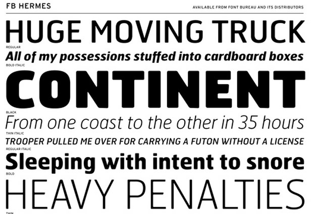
#7 Hermes
An obvious choice for our list of top fonts, Hermes is available in a large range of weights and styles.
A favourite among designers and an obvious choice for our list of top fonts, Hermes is available in a large range of weights and styles. In 1995, Font Bureau’s Matthew Butterick updated an original German design from 1908 – maintaining the blunt corners that once signified wear and tear from the heavy industrial presses, but are now a distinctive characteristic of the modern Hermes typeface as we know it.