Whether you are an architectural student or a related professional, this article aims to act as a guide, helping you win your professors or clients by enhancing your project design sheets.
After a few days in any design school, one realizes the significance of correct representation to convey one’s creative ideology. As an architectural student, one uses every muscle to complete architectural design projects. Sometimes the final product of hours of brainstorming, research, discussions and reviews would not necessarily get the highest grade in juries/reviews or clientele in the case of a professional. This mainly happens due to a lack of presentation skills. As mundane sheets disinterest viewers just at first glance, making it harder for them to analyze the sheets. But an ideal or ‘Pinterest-worthy’ design sheet helps viewers visualize and interpret the design better. And are also capable of explaining the design project even in the absence of the designer.
Following are the points that one must consider to make aesthetically impressive design sheets
1. Content list | Design Sheets
One must make a list of all contents that need to come on the final presentation sheets according to the project’s brief. For example, some briefs demand construction details, project budget estimates, environmental impact assessments etc.
2. Choosing the aesthetics and presentation style
Following are some ways of how one could choose their presentation’s style and aesthetics
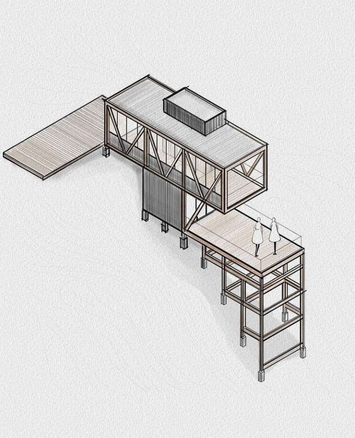
- Drawing inspiration from the sheets made by multiple firms on similar structure typology.

3. Following the project’s style | Design Sheets
For example, a minimalist presentation style for a project where the structure is designed around principles of minimalism.

4. Considering the audience of a presentation
For example, one might choose muted colours (tints and tones of any colour) for a professional presentation.
5. Showcasing one’s best skill | Design Sheets
For example, a person good at sketching or realistic renders or working drawings etc. should adopt an aesthetic which highlights their skills in the best way possible.
6. Deciding the colour palette
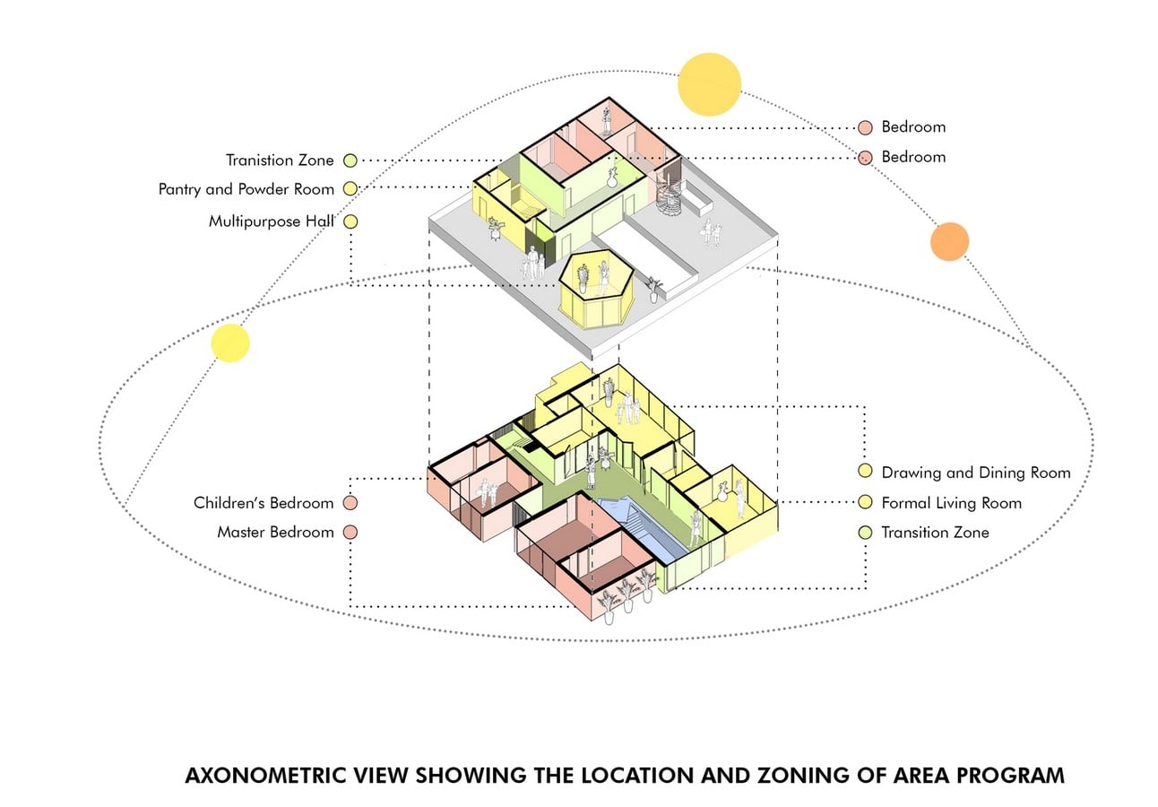
For graphics (which include rendered drawings, conceptual sketches and diagrams)
One can decide the colour scheme/palette of their presentation in three ways. The first way is by having statement colour(s) in all renders, which would surely make a bold statement. The second way is to choose as per colour psychology. For example, one could choose tints and tones of purple with golden colour for a project with royal or luxurious appeal. The third way is to choose any one colour scheme of the colour wheel, which would give a harmonious and elegant look to the overall presentation.
Protip: Never let colour overpower any drawings or diagrams in the design sheets.
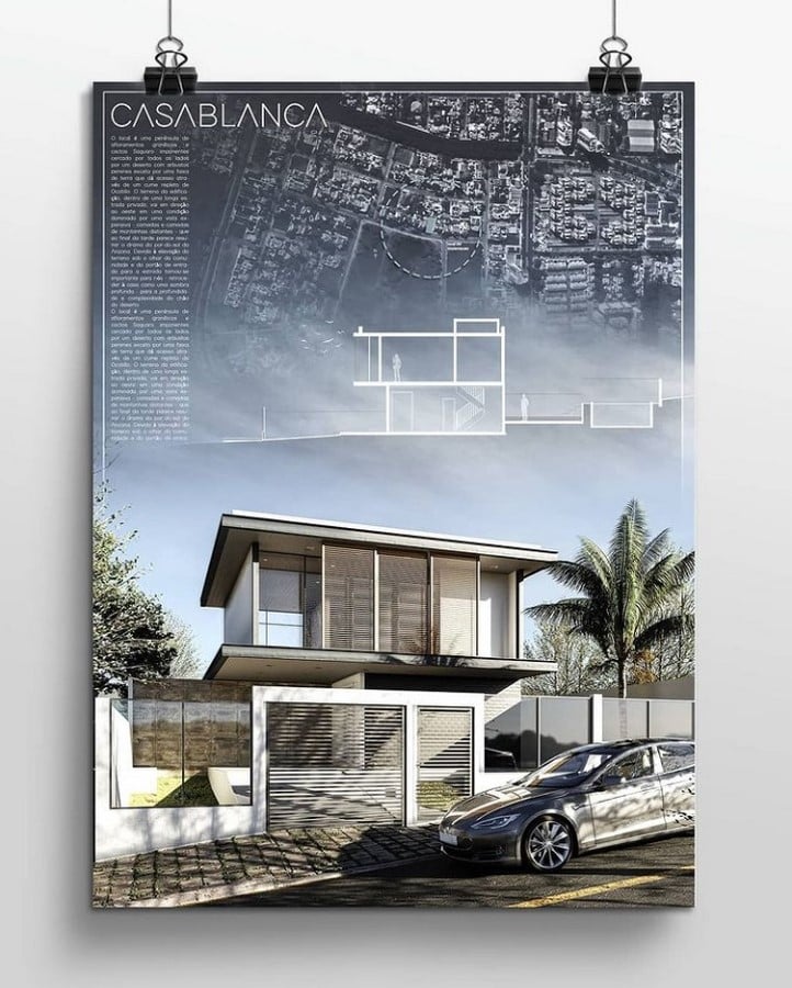
For Background
It is always best to have a tint of colour as the background which complements the graphics and does not overpowers them. This way text and graphics always stand out and make the sheet look clean. Having a darker shade for the background is avoided as it often leads to halation and printing errors. But sometimes the darker colour could be used where the key graphic of the sheet has it. Protip: One can try experimenting with a muted textured pattern for the background to provide a visual textile nature.
7. Finalizing fonts | Design Sheets
For design sheets, it’s always best to keep the text on sheets minimal. One should try to replace text with conceptual sketches or diagrams wherever possible. As for the field of architecture, one could say that a drawing is worth a thousand words. One must finalize the font style and size, keeping in mind that text should not overpower the overall sheet. The font size for the various text like heading, subheading, caption etc, should be kept different.
Protip: Having a subtly different font style for each text would improve the visual hierarchy of the sheet.

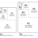
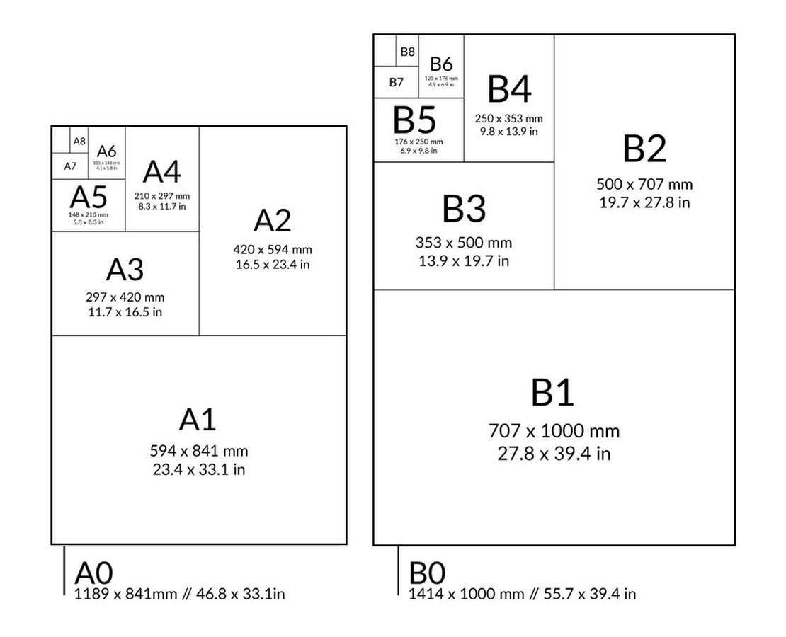
8. Sheet Size
At architectural schools, it is common for professors to restrict students to particular sheet size. Whereas professionals might get restricted by the presentation board’s size and orientation. If one has an option to choose a sheet of any size, they must finalize the sheet size after considering a couple of factors like the presentation board’s size and orientation, how would one carry sheets to the venue etc. If possible, one should always choose the size of the sheet with which they are comfortable working.
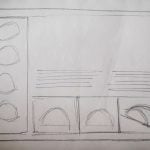
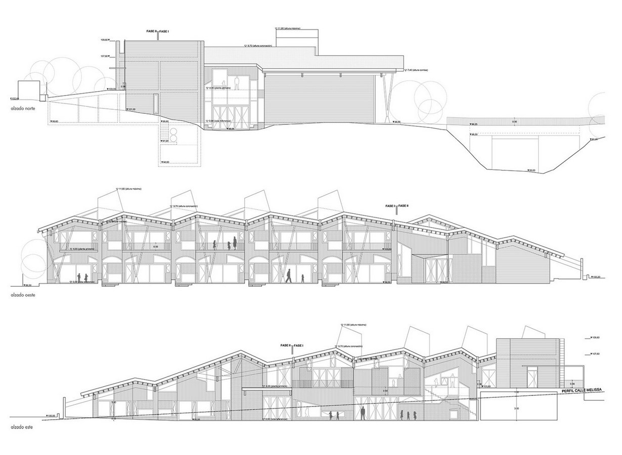
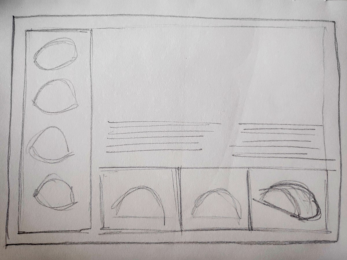
9. Layout | Design Sheets
One should finalize the sheet’s layout before exploring different possibilities keeping in mind the size, orientation, style and aesthetics. One should always keep content’s hierarchy in mind while zoning. One could draw, sketch or take the help of software like Photoshop, Autocad, Adobe Illustrator etc to explore multiple layout possibilities. Protip: Layout should make viewers easily navigate from top to bottom or left to right of the overall presentation.

Additional Pro tips
- One shall never forget to add a legible project’s title and presenter’s name.
- Minimal font styles for presentation provide elegance to sheets.
- One shall always keep all the drawings across different sheets in the same orientation with the North direction marked.
- Leaving a border of complementary colour with background enhances the overall visual impact of the presentation with minimal effort.
- Enough negative space shall be evident in the presentation.
- One shall always take a print a day or two before the presentation, to check the text’s size and colour of the overall sheet.
Good luck!
References:
- Arch2O.com. (2017). 10 Tips for Creating Stunning Architecture Project Presentation. [online] Available at: https://www.arch2o.com/tips-architecture-project-presentation/ .
- First In Architecture. (2017). A great design can be mediocre if it is not presented well. Here are some tips for a great architecture presentation board. [online] Available at: https://www.firstinarchitecture.co.uk/architecture-presentation-board-tips/.
- Surviving Architecture (2019). The Ultimate Guide to Architecture Presentation Boards *Life Changing*. YouTube. Available at: https://www.youtube.com/watch?v=Rx6lF79zCdo.