An armchair can fit neatly inside a floor plan and still make the finished room feel crowded. A sofa may leave the recommended route around it yet look too heavy beside a low window. Even when every dimension is correct, the arrangement can feel oddly out of balance.
That is because a floor plan answers only part of the question. It shows where furniture sits and how much floor area it occupies. It does not fully show how high a piece rises, how solid it appears, how much attention it attracts, or what happens when several substantial objects are seen together. Those qualities create visual weight, and they are often what people react to when they say a room feels cramped, empty or simply “off”.
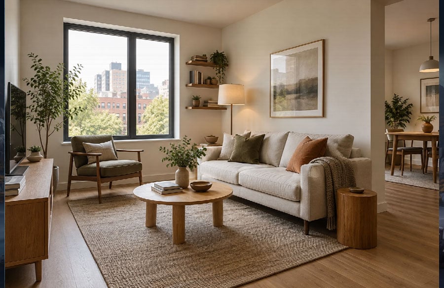
Concept visualisation showing balanced furniture scale and circulation in a compact living room. Image generated with AI.
A footprint is not the same as presence
On a plan, two sofas with the same length and depth look almost identical. In the room, one might have a low back, slim arms and raised legs. The other might sit directly on the floor with broad arms and deep cushions. Their footprints match, but the second sofa occupies far more of the view.
The same problem appears with storage. A shallow cabinet can be unobtrusive when it remains below eye level. Extend it to the ceiling, darken the finish and remove any open sections, and it becomes a wall of visual mass. None of that change is obvious in the rectangle shown on a floor plan.
Designers therefore need to judge footprint and presence separately. The plan still matters for fit and circulation, but elevations, perspectives and room views reveal the character of the objects occupying that plan.
Establish what cannot move
Furniture scale makes sense only in relation to the shell around it. Before comparing pieces, mark the elements that will remain fixed: door swings, windows, structural columns, radiators, built-in joinery and the main walking routes through the room.
Then identify the room’s strongest existing lines. A low window sill may favour furniture with a lower profile. A tall opening can support more vertical weight nearby. In an open living and dining space, the edge of a rug, the back of a sofa or the position of a pendant may need to define a zone without interrupting the route between rooms.
This first step prevents a common mistake: choosing furniture in isolation and asking the architecture to absorb it later. The room should set the limits before individual pieces are allowed to compete for attention.
Compare the whole group, not one piece at a time
Furniture is often approved in a sequence. The sofa comes first, followed by a coffee table, chairs, lighting and storage. Each choice may look reasonable by itself. The combined arrangement can still become too dense because every item has been selected as though it were the main object.
A better comparison treats the seating group as one composition. Keep the room and camera position consistent, then test a few controlled alternatives. A deep sofa might work with a light-framed chair and a small table. A solid armchair may need a sofa raised on legs. If the coffee table has a thick stone top, the surrounding pieces may need more air beneath them.
The aim is not to make every object visually light. Rooms need contrast. The useful question is where the weight should sit and which pieces can recede.
Check height and sightlines
People do not experience a room from directly above. They see furniture at eye level while entering, sitting and moving between spaces. Height can therefore change an arrangement more dramatically than footprint.
Test the view from the doorway first. Can the eye travel into the room, or does it meet the back of a tall sofa? From the main seat, does a floor lamp frame the view or cut across it? In a connected living and dining room, does the storage block the visual link between the two areas?
These checks are especially useful in compact homes, where one oversized backrest or cabinet can shorten an otherwise open view. Lowering a single piece may restore a sense of depth without changing the layout at all.
Read the empty space
The gaps between furniture are part of the design. A circulation route should not look like the narrow strip left over after every object has been placed. Nor should an empty corner automatically be filled simply because the plan shows spare floor area.
Look at the shape of the open space as carefully as the furniture. Is there a clear route from the entrance to the window? Does the seating group have enough room around it to read as a group? Are there small, awkward pockets that will collect side tables or decorative objects with no clear purpose?
Negative space gives large pieces room to make sense. It can also expose a scale problem quickly. If an arrangement works only when every gap is reduced to a minimum, the furniture is probably asking too much of the room.
Test controlled visual alternatives
Once the measurements are sound, visual comparisons can make the remaining decision easier. Keep the architecture, viewpoint and main layout fixed. Change one variable at a time: sofa profile, chair bulk, table diameter, storage height or rug size. A room visualisation should be treated as a comparison surface rather than a finished promise.
A browser-based tool such as AI room design can help produce room-level alternatives before a furniture direction is presented. The useful part is seeing several elements together. A fabric swatch cannot show whether a dark sofa will dominate the wall behind it, and a product cut-out cannot show how its legs relate to the table, rug and surrounding floor.
Use the same camera position for each version and label what changed. If the viewpoint, lighting and styling also shift, the comparison becomes a contest between images instead of a test of scale.
Make the decision before ordering
The final review should return to practical questions. Does the chosen furniture fit the measured room? Can people move through it comfortably? Do doors, drawers and chairs have room to operate? Then look again at the views and decide whether the visual weight supports the intended character of the space.
Floor plans remain indispensable, but they are not the final picture. A good furniture arrangement works in dimensions and in view. Testing both before anything is ordered gives designers and clients a clearer basis for approval, and it is far easier to reduce the visual weight of a sofa on screen than after it arrives in the room.