Walk into almost any newly renovated office these days and you’ll notice the same things get all the attention: statement lighting, a big collaborative table, maybe some greenery near the windows. Nobody’s arguing those choices are wrong. But spend enough time actually working in one of these spaces, and you start to notice what nobody designed for — like the sad little faucet in the break room that everyone quietly complains about.
It’s a strange blind spot, honestly. That faucet gets touched more times a day than almost anything else in the building. Filling water bottles, rinsing mugs, washing out the espresso machine’s portafilter for the fifth time before lunch — it’s constant, low-grade use, and it happens in full view of clients, candidates, and everyone’s coworkers. Get it wrong and it just becomes one more thing people grumble about. Get it right, and most people won’t consciously notice, they’ll just feel like the space was actually put together by someone who cared.
That’s really the whole argument for treating fixtures as a design decision instead of a line item on a facilities checklist. The finishes and shapes that used to live only in high-end residential kitchens — matte black, sculptural gooseneck spouts, pull-down sprayers — have made their way into commercial spaces for a good reason. They’re built to take a beating from constant use without looking like it.
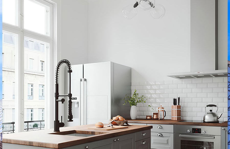
We’ve been looking at VIGO’s Zurich faucet as a decent case study for this. It’s a tall, high-arc pull-down model with a matte black finish, and underneath the design flourishes it’s actually built the way a heavily-used fixture should be — solid brass body, ceramic cartridge, the kind of internals that matter when fifteen different people are using something every day instead of one household. It also splits its sprayer and pot-filler functions instead of cramming everything into one nozzle, which sounds minor until you’ve watched three people in a break room take turns with a single combined sprayer. If you’re speccing something similar for a project, VIGO’s pull-down faucet lineup is worth a look for comparable options across finishes.
None of this really works in isolation, though. It only lands in offices where someone already thought hard about how the space gets used day to day. Sonai Infrastructure’s workspace project is a good example of that — the shared areas get the same design attention as the private offices, instead of being treated as leftover space.
Maybe that’s the actual point here. Good corporate design isn’t only about the spaces people photograph. It’s whether the break room faucet still works properly six months in, whether the finish still looks decent after a hundred hands have touched it, whether the small stuff holds up as well as the big stuff. Offices that get this right tend to feel considered in a way that’s hard to fake — and increasingly, it’s these unglamorous details that decide whether people actually want to come back into the building.