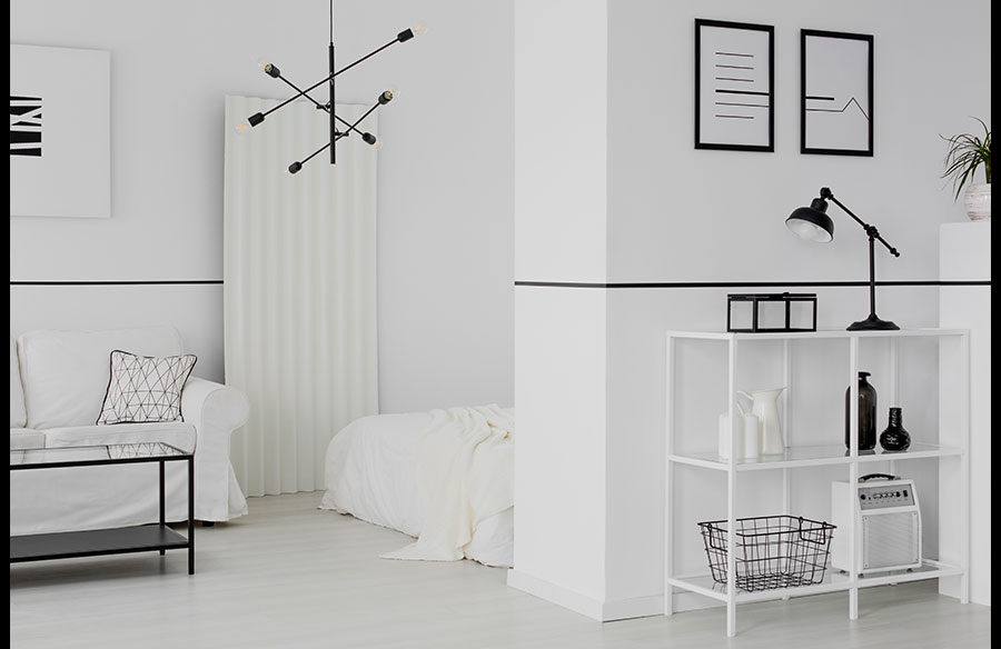
Monochrome interiors work because they reduce visual noise while sharpening the role of form, texture and proportion. Instead of relying on many colours to create impact, a black, white and grey palette uses contrast, material choice and placement to make a space feel intentional. For modern homes, apartments, offices and commercial interiors, this approach can feel calm, refined and highly adaptable when it is handled with enough depth.
Use Black and White Art to Build Contrast
Wall art is one of the most direct ways to introduce structure into a monochrome interior. In a white or light grey room, black-framed pieces, charcoal artwork or high-contrast prints can create a clear focal point without overwhelming the palette. In darker interiors, lighter artwork can break up heavy surfaces and stop the room from feeling enclosed.
The key is to choose pieces that support the room’s proportions and intended use. Large-scale abstract prints can help anchor open-plan living areas, while smaller grouped artworks suit hallways, bedrooms, offices or hospitality spaces. For designers, decorators and homeowners selecting pieces for residential or commercial interiors, browsing black and white wall art through curated wall art and interiors providers like designerboysart.com can help clarify how scale, contrast and composition affect the overall mood of a monochrome room.
Layer Textures to Avoid Flatness
A monochrome room can look plain if every surface has the same finish. Texture gives the palette depth. A white linen sofa, a black timber console, a wool rug, a stone coffee table and matte ceramic accessories may all sit within the same colour family, but each one reflects light differently.
This is where materiality becomes important. Smooth, rough, soft, matte and reflective finishes create subtle variation, helping the room feel designed rather than empty. In modern interiors, this balance is often more effective than adding more decorative items. The palette stays clean, but the space still feels warm, tactile and liveable.
Balance Black, White and Grey Carefully
Monochrome does not mean using equal amounts of black and white. A room dominated by black can feel dramatic and intimate, while a room led by white feels open and minimal. Grey works as the bridge between both ends of the palette, softening the sharp contrast and making the space easier to live with.
A practical approach is to choose one dominant tone, one supporting tone and one accent tone. For example, a living room may use warm white walls as the base, grey upholstery as the middle layer and black lighting or artwork as the accent. This creates visual order while still allowing contrast to guide the eye.
Use Shape to Add Visual Interest
When colour is restrained, shape becomes more noticeable. Curved furniture, arched mirrors, sculptural lamps and geometric wall art can all make a monochrome interior feel more dynamic. Straight lines tend to create a crisp architectural feel, while softer curves bring ease and movement.
This matters in both residential and commercial spaces. A monochrome office, display suite or reception area can feel too severe if every element is angular. Introducing rounded seating, oval tables or organic artwork can make the space feel more approachable without disrupting the overall design direction.
Control Light for a Softer Finish
Lighting can change how a monochrome interior feels throughout the day. Natural light makes whites appear brighter and blacks sharper, while warm artificial lighting softens contrast in the evening. Poor lighting, however, can make grey surfaces look dull or make black finishes appear heavy.
Layered lighting is usually the safest approach. Ceiling lights provide general illumination, while accent lighting can highlight artwork or architectural details, and lamps add warmth at eye level. This helps a monochrome room maintain atmosphere rather than looking stark or unfinished.
Keep Accessories Deliberate
Accessories should support the design rather than compete with it. In a monochrome interior, fewer pieces often have more impact because each item is more visible. A black vase, a pale stone bowl, a textured cushion or a framed print can become part of the room’s composition.
The aim is not to remove personality, but to edit with care. Repetition of tone, shape or material can make accessories feel connected. When each object has a clear role, the interior feels calm, modern and considered rather than sparse.
Bringing Monochrome Rooms Together
Monochrome styling works best when it is treated as a full design system, not just a colour choice. Strong wall art, layered textures, balanced tones, controlled lighting and carefully chosen accessories all help the palette feel complete. When these elements are handled with restraint, modern interiors can look polished, comfortable and visually strong without needing bold colour to make an impression.