AAS Gonzalez Haase founded by Pierre Jorge Gonzalez and Judith Haase in 1999 is a Berlin-based studio. Their work spreads across in the fields of architecture, scenography and lighting and has worked in many highly regarded projects with contemporary artists, curators and collectors. They kept the interaction between light and architecture at the limelight of their designs and gained an excellent reputation for their spatial concepts. Their work revolves around artwork installations, luxury retail interiors, residential extensions, and conversions for industrial and art-related spaces.
Here are some of their notable projects:
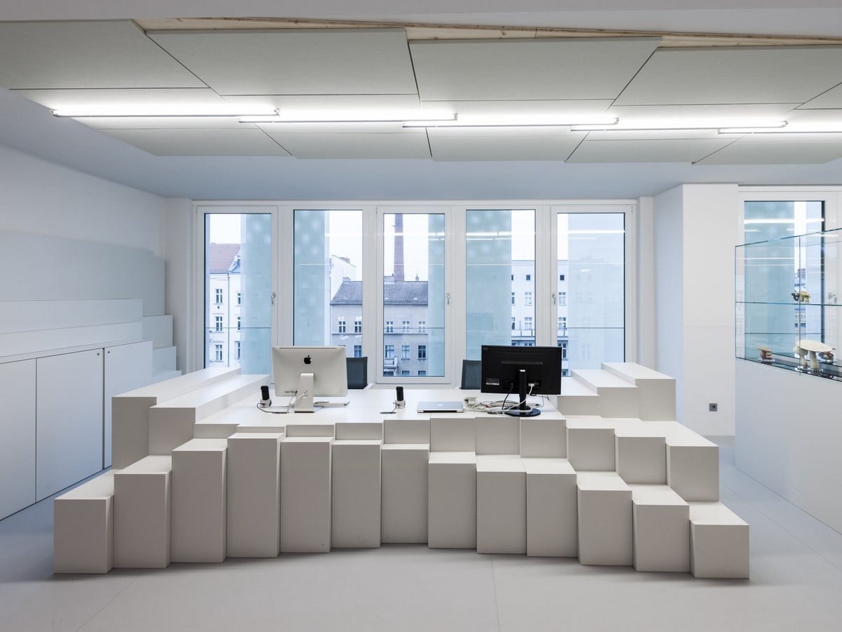
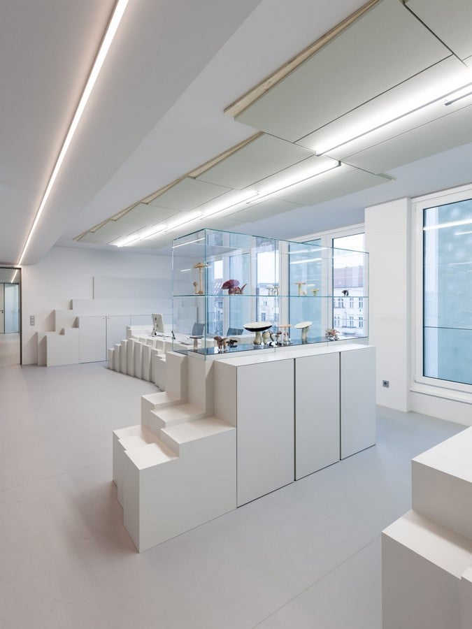
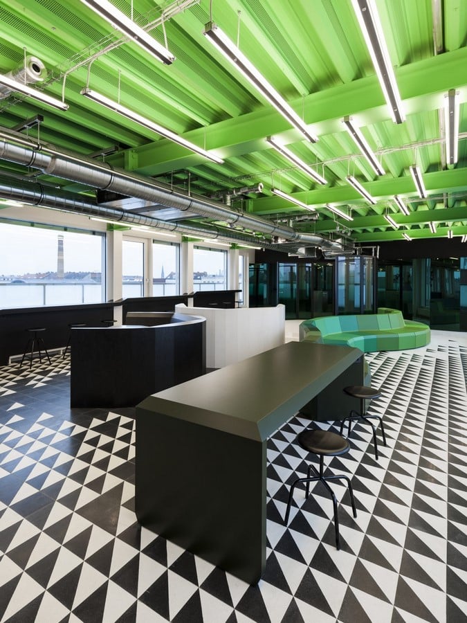
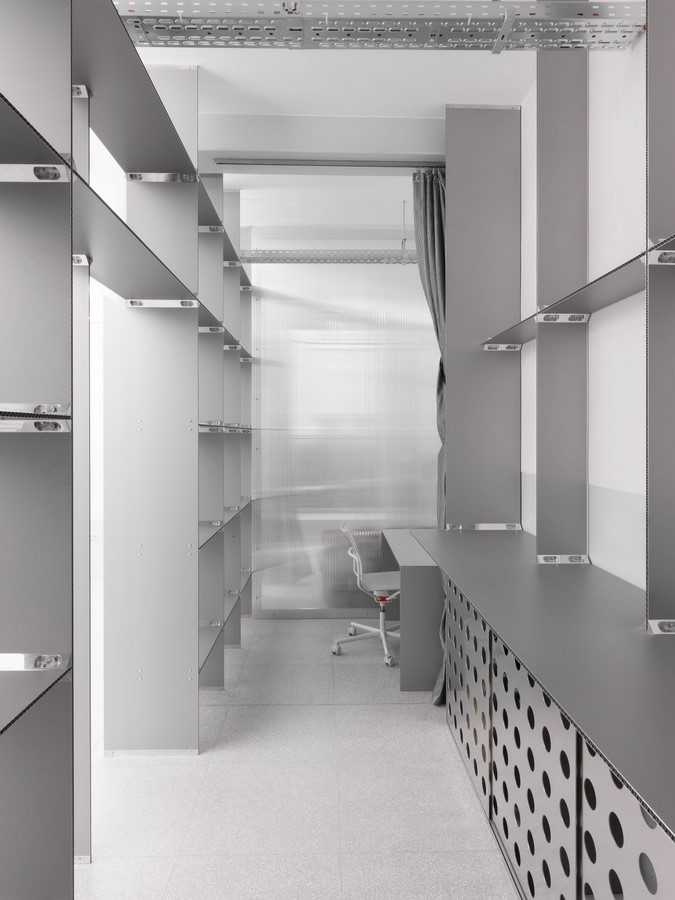
1. Fischerappelt Office
They designed the project without forgetting the context or history of the place.
Gonzalez Haase AAS added something hidden to their design, inspired by figures from Alice in Wonderland. The executive floor points out the caterpillar Absolem; the attic floor relates to the March Hare; the third floor to the Cheshire Cat and the final fourth floor refers to Tweedledee and Tweedledum. But this script does nothing to determine the atmosphere of the rooms; they achieved this in how they handled light, material, and architecture to lend each space its individual and yet holistically cohesive character.
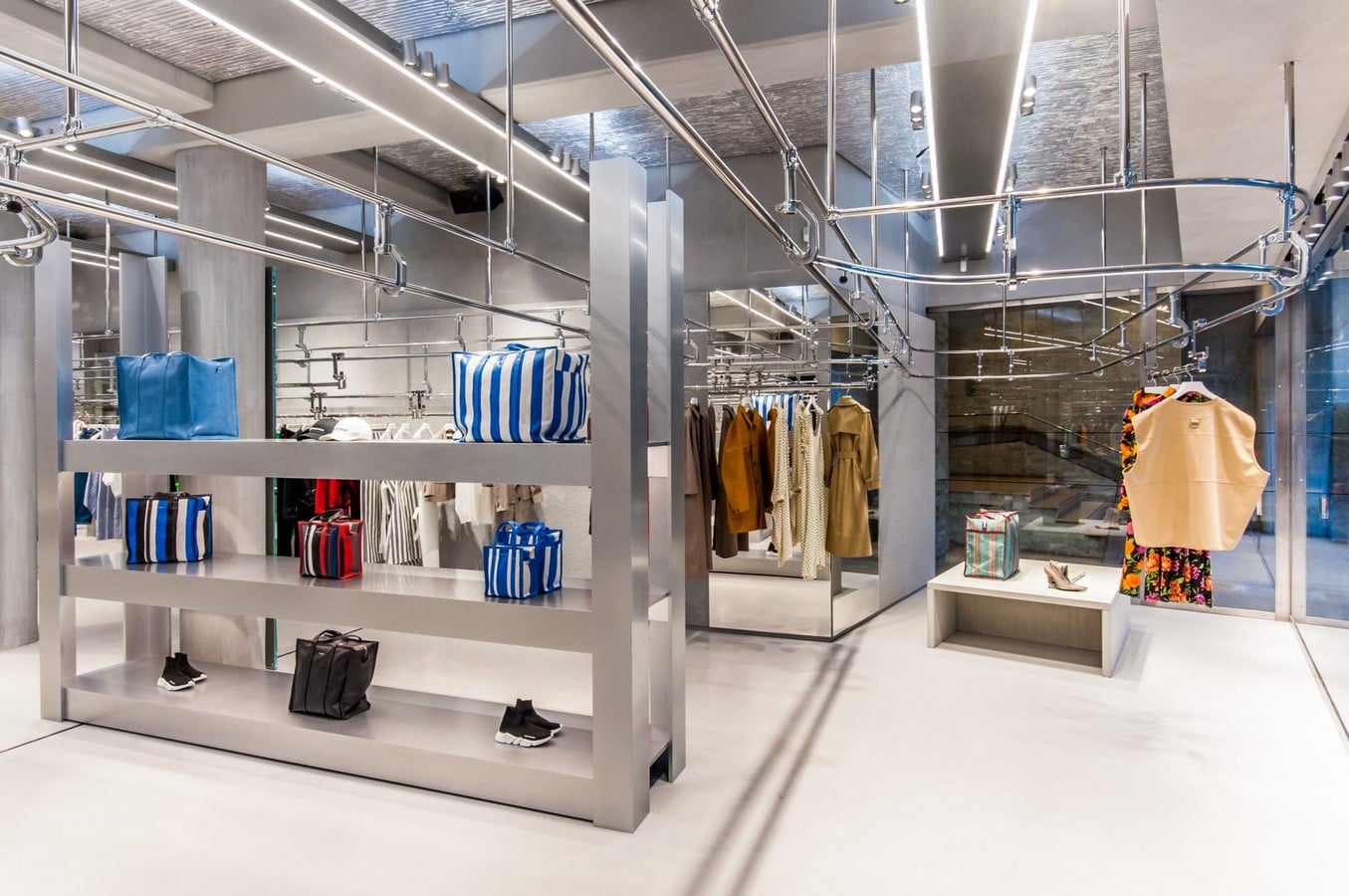
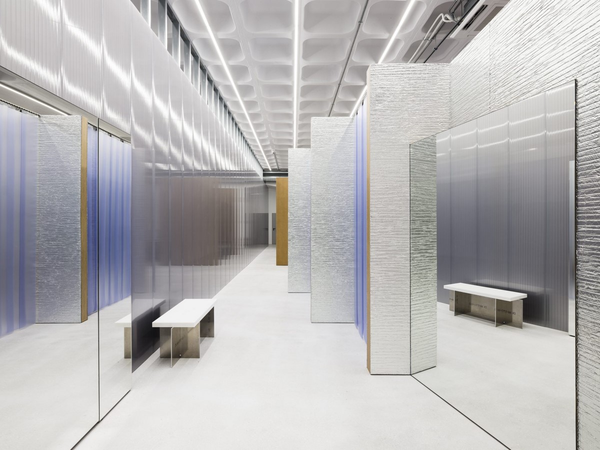
2. Balenciaga
The groundbreaking designer Demna Gvasalia, known for his work with Vetements invited AAS in 2016 to design Balenciaga’s spatial aesthetical boutique. Gonzalez Haase AAS redesigned the flagship boutique in Paris under his creative direction. The result is subtle, industrial, practical and fresh.
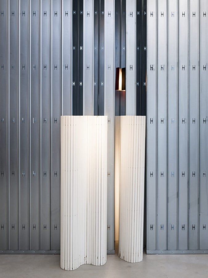
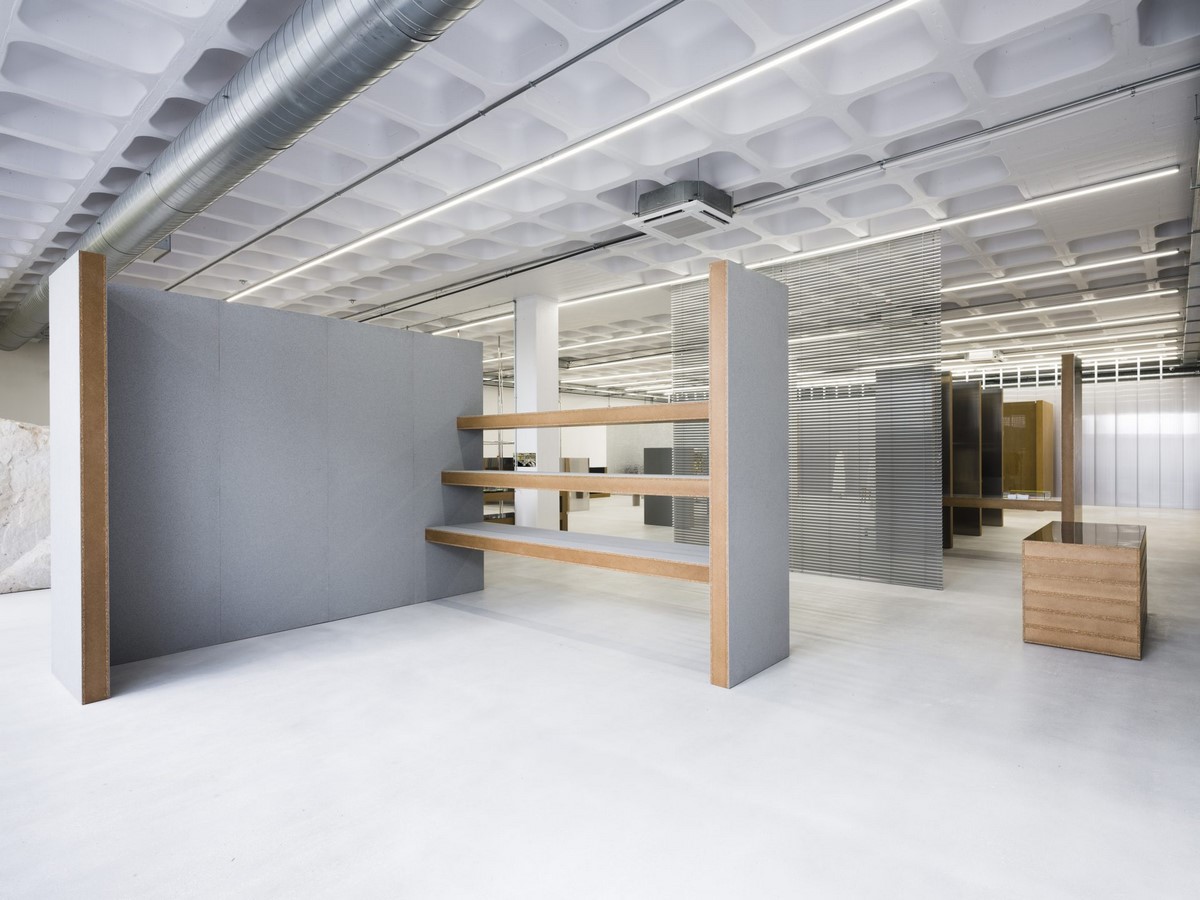
3. AAS Exhibition Assembling
AAS defied the notion of ‘assemblage’ concerning the history of modern furniture design, for the spring 2015 exhibition. They explored the relation between space and object from the perspective of an architect.
The objects chosen varied from conventional and minimal furniture to re-engineered objects. They designed the building, the gallery and the exhibition. They created the gallery by keeping the natural light in mind.
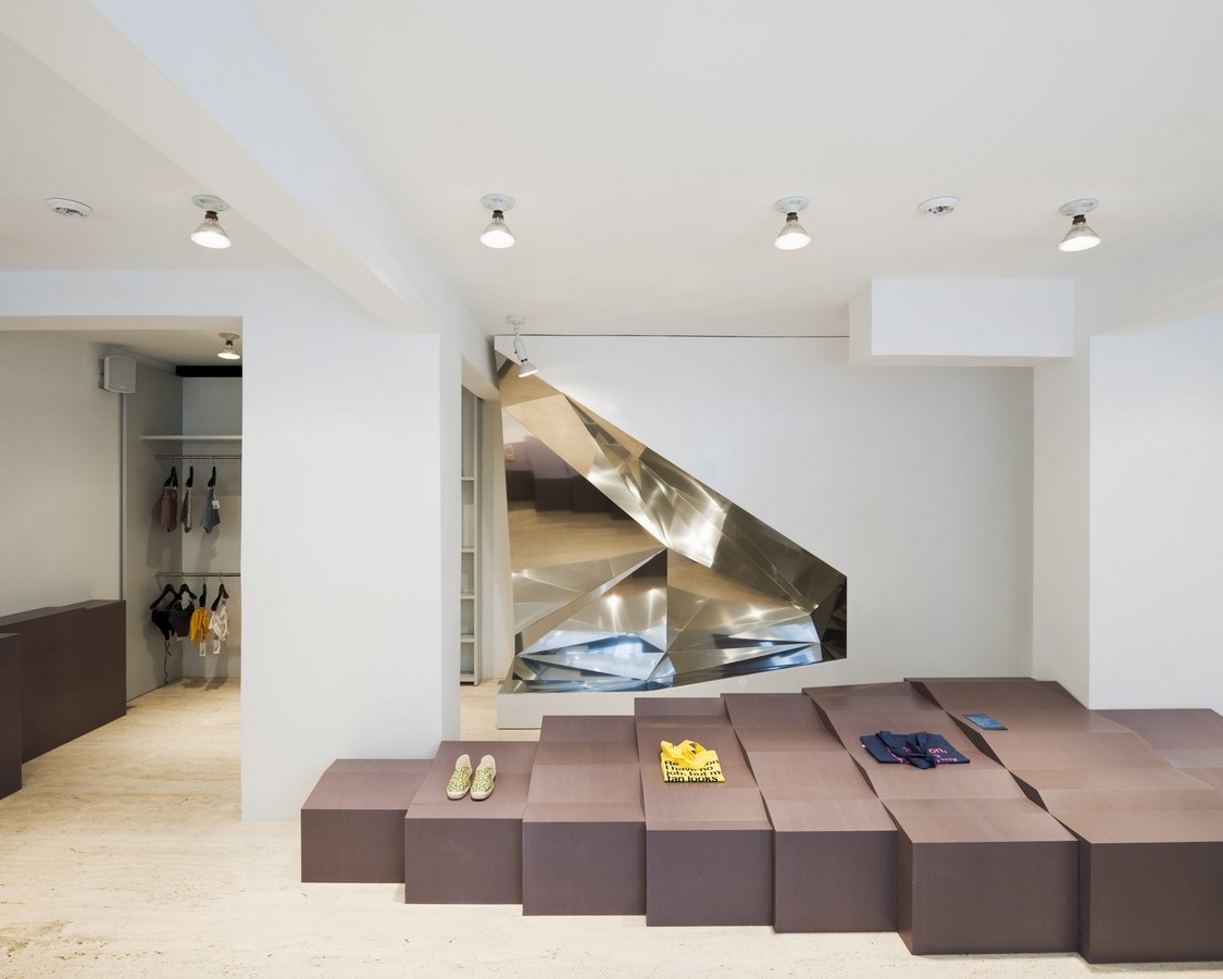
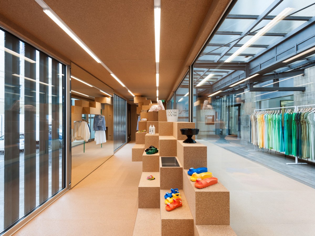
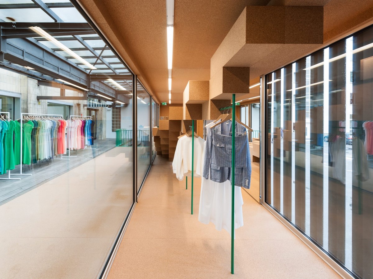
4. Antonios Markos Store
In this fashion store, they used the windows as a perspective into the exposed clothing instead of the usual show-cases throughout the interior. They designed and defined the building space to harmonise with the structural elements
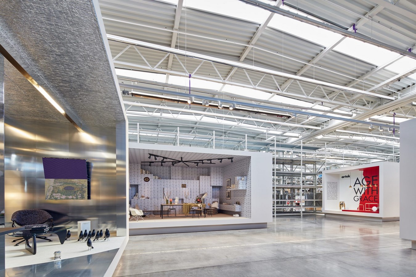
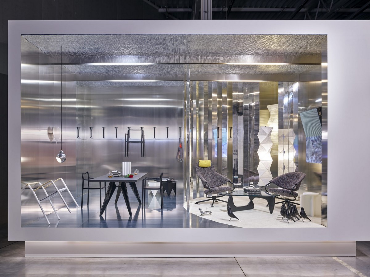
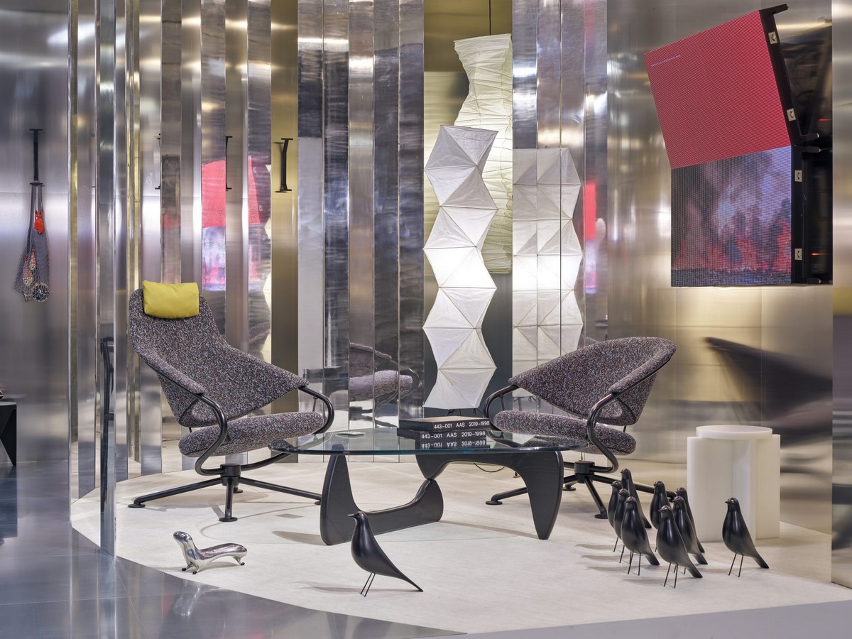
5. Vitra Booth
The Vitra booth showed an imaginary living space scenario in a mobile, yet urban place. It is based on the recording of a domestic moment which is a previous experience or one which will eventually come. Each element is synonymous with the place and function. The inherent flexibility in the booth contrasts with the indigenous familiarity of the scenario.
6. The Watermill Center Byrd Hoffman Foundation
Robert Wilson had visualized the Long Island site as a cultural centre, rehearsal spaces and living quarters. The building which previously was a research laboratory used by Western Union preserved its function as a factory but for artistic production. The Flexible interior spaces can also serve as dormitories, studios, or galleries. Perpendicular axes join the interior and exterior spaces and open views to the landscape further. Robert Wilson Commissioned the project and the design developed in collaboration with Richard Gluckman.
7. Tem-plate
For a fresh approach, they transformed an old 800-square-meter warehouse into a minimalist, open spatial continuum. The art galleries, workshops, concert halls and markets restored the once isolated storage halls and factory buildings of the industrial suburb by turning it into a gathering sight for young pioneers of the new creative scene.
The store concept behind TEM-PLATE included automatically re-curating the store’s exhibition space every month. They base the design around simple forms and original surfaces that play with the raw framework of the old warehouse halls while reinventing them using a monumental architecture and material language. The project displays an interplay between polished and realistic, between the classic and the unusual.
8. Birkenstock Box @ Andreas Murkudis
The retail store was designed with a concept that engages some world’s leading speciality stores while using something as simple as freight containers. They design the chrome version for Berlin lifestyle store Andreas Murkudis.
The BIRKENSTOCK BOX was a mobile container designed in a way that it was transported in various locations around the globe which included places in big cities like Seoul, Los Angeles, and New York. The box design adapted to each locale. It was Gleaming silver on the outside and covered in birch from the inside.
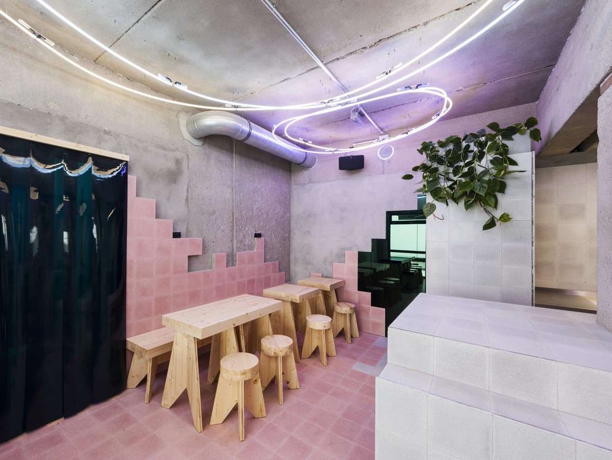
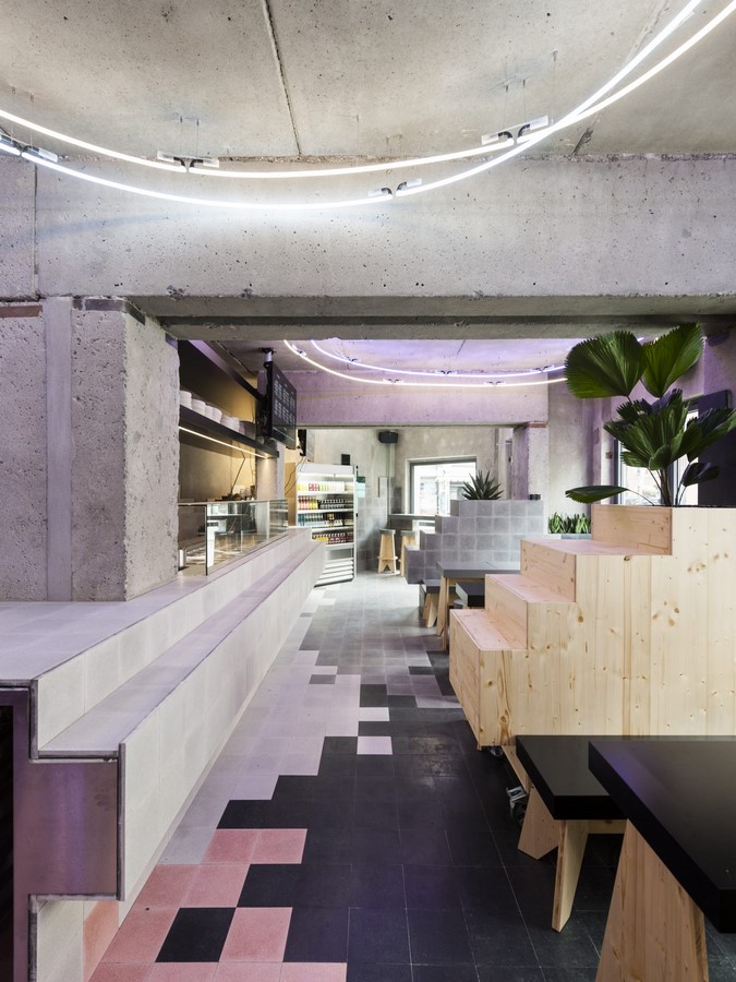
9. Beets and Roots Restaurant
Beets & Roots is a casual fast-food restaurant chain based in Berlin. The restaurant’s design is a combination of modern, healthy and honest fast-food with vitamins that has an atmosphere reminiscent of an American Diner to supply the guests. The design usee tiles across the bar, floors and walls to create an environment with integrated connections . They used coloured zones to divide the space into the four main areas of the restaurant. This design replicated in multiple locations in the city set the foundation of the brand.
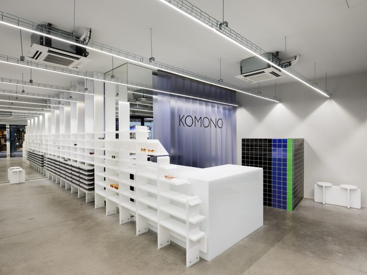
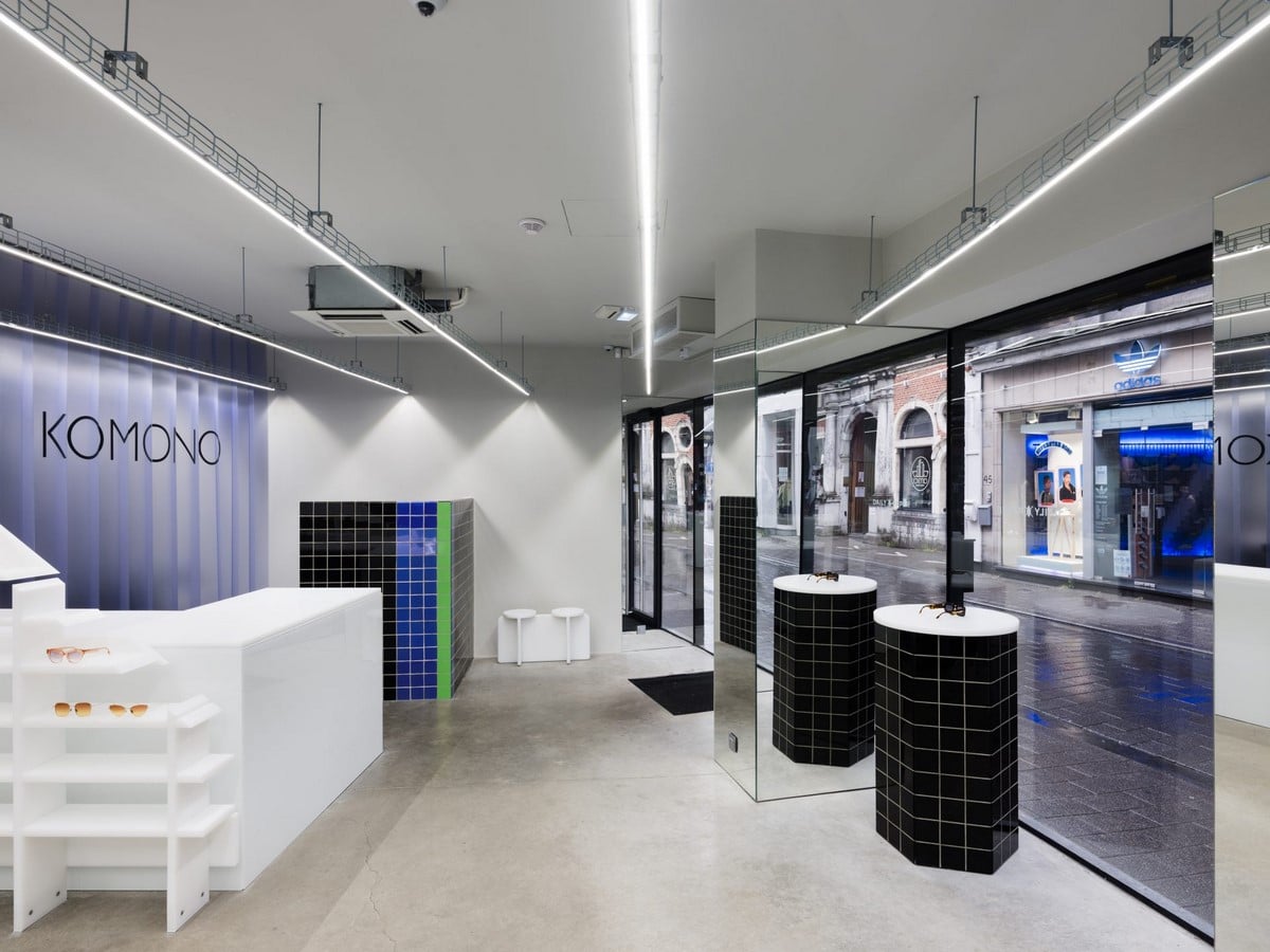
10. Komono
For KOMONO in Antwerp, a clear gallery was created in which the eyewear, watches and the related product have been placed at the centre stage. This project highlights the firm’s spatial language. They design the store with a reduced palette of materials that transmit the light on certain manners. The materials used range from translucent to opalescent and have been fabricated in simple and repetitive shapes to avoid unnecessary details on the space. The mirrors become part of the large glass windows from which the light flows into space and diffract all over the displays.