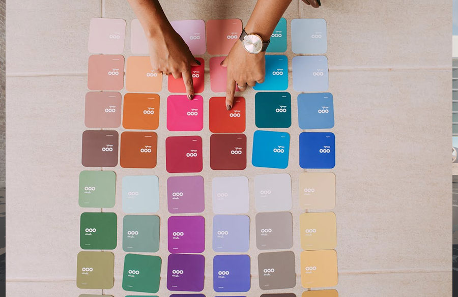
A newly painted room looks clean, yet the bigger change is how light moves across surfaces. Walls can brighten a corner, soften a hallway, or make timber and stone feel warmer. Those shifts come from colour, sheen, and prep, not from furniture or decor items alone.
In Perth, painters watch how strong sun and shifting cloud cover change the same wall through a day. Teams like Ascend Painting Stirling often translate design notes into finishes that suit real use. Good results come from testing in place, choosing the right sheen, and timing coats for the room’s airflow.
Colour Decisions Start With Real Light
A paint swatch looks steady under shop lighting, but homes mix daylight, lamps, and shadows. That mix can push a beige toward pink at night, then toward grey in morning shade. Before picking a shade, track where sun lands at breakfast, mid day, and late afternoon.
Room orientation changes colour more than many people expect, even inside open plan layouts still. North facing rooms can read cooler, while west facing rooms can feel warmer near sunset. A small test patch on two walls gives clearer feedback than a single sample near a window.
Designers often break colour into three roles, wall field, trim lines, and the ceiling plane. When roles are clear, deeper tones can feel calm because edges stay readable from across rooms. When wall and trim are too close, door frames fade and the room can look less crisp.
To keep choices grounded, check lightness first, then colour family, then intensity of tone always. Lightness sets contrast, colour family sets mood, and intensity controls how bold the result reads. This order helps avoid over correcting later with new lamps or extra feature walls that cost.
A simple note on finishes saves time during selection, because paint names vary between brands. Write down the colour code, sheen level, and the room’s main light source on the same sheet. That record helps when adding an extension, repainting a door, or fixing a scuffed section.
Sheen Guides Attention And Wear
Sheen is a practical design tool, because it controls reflection and highlights surface texture subtly. Higher sheen bounces more light, so patch work and roller marks show faster in raking sun. Lower sheen hides joins better, yet it can mark when bags rub a corridor wall.
Many interiors work best when sheen matches touch points, not just room names like lounge. A hallway near school bags needs washability, while a dining wall may need softer glare control. In most homes, a mix of low sheen walls and higher sheen trim balances both needs.
When choosing sheen, think in zones that match how people move through the space daily. Use tougher finishes near handles, switches, and corners, then quieter finishes where eyes rest longer. This keeps cleaning simple without making the whole room look shiny under ceiling lights everywhere.
These quick pairings suit many modern interiors, and they translate well across brands and ranges.
- Ceiling, flat finish lowers glare and makes downlights feel more even across the room.
- Main walls, low sheen wipes clean yet keeps reflection soft in mixed daylight in most rooms.
- Trim and doors, semi gloss resists knocks and cleans easily without a chalky look.
- Wet areas, satin handles steam and splashes, while still looking calm beside tile grout.
If a space has textured plaster, a lower sheen often looks better and shows fewer ridges.
Sheen also affects colour depth, because light reflection can wash out a pale tone on big walls. A soft white can look brighter in satin, while the same colour can feel creamier in low sheen. Testing both colour and sheen together avoids surprises after the full room is coated once.
Indoor Air, Drying Time, And Product Labels
Paint is a building material, so it can affect indoor air during work and early curing. Some coatings release volatile organic compounds, which can spike indoors during painting and soon after. The EPA explains these indoor sources and clear exposure notes in its guidance on VOCs.
Low VOC labels can reduce odour, yet comfort also depends on airflow and drying time. Open windows when weather allows, and use fans to push stale air out, not around. Plan two light coats with a longer break, instead of rushing thick coats in one session.
Prep work matters too, because sanding dust can travel into soft furniture and air vents. Cover returns and supplies, vacuum with a sealed filter, and wipe ledges before the final coat. In family homes, keep children away until smell fades and surfaces feel hard to touch.
Furniture placement can also help, because tight piles create dead air that slows curing near skirting boards. Leave a small gap behind wardrobes, and move beds away from fresh walls for the first night. These small shifts help paint cure evenly and reduce marks from early contact with walls.
Commercial sites add another layer, because staff schedules and ventilation systems must align with the job. Many offices paint after hours, then run fresh air cycles before reopening the next morning. Clear sign off steps help, since cure time depends on humidity, temperature, and film thickness.
Detail Work That Supports The Design Intent
A strong colour plan can fall apart when edges bleed, patches flash, or trims look uneven. That is why experienced painters focus on surface prep, clean cut lines, and steady coat builds The goal is not speed, it is a finish that reads clean from doorways and close up.
Modern interiors often pair painted planes with timber, stone, plaster, and brushed metal hardware details. Paint needs enough body to sit beside those materials, without looking thin under grazing light. That can mean a deeper primer tint, or a softer sheen to reduce glare near feature walls.
Lighting choice can also change how paint reads, because some lamps distort colour rendering subtly. Warm LEDs can mute greens, while cooler lamps can make warm greys look flat and sterile. NIST notes how lighting quality affects colour preference and perception in its lighting article too.
In Perth’s sun, minor flaws show quickly, so prep and protection steps matter for long term results. Use the right filler, sand smooth, and seal porous patches so the top coat dries evenly. Masking and careful cleanup protect floors, and they keep crisp edges around skirting and hardware.
A written scope helps too, because repaint cycles affect budgets for homes, strata, and small offices. A five year workmanship warranty can set clear expectations for prep, application, and follow up checks. It also helps owners address early issues, like bubbling near moisture or peeling at moving joints.
Paint choices shape modern interiors when they match real light, real use, and real materials. Test colours on site, pick sheen by touch points, and plan airflow so curing stays on track. Then keep notes for future repairs, so the space stays consistent as rooms change over time.