There’s a lot more to tile than just picking a color or material off a showroom wall. In modern interior design, tile does heavy lifting—not just as a surface, but as a visual connector that carries energy and rhythm throughout a home. When chosen carefully, tile can define flow, shape perception, and bring a quiet kind of balance to everything from open-concept kitchens to spa-inspired bathrooms.
Choosing tile is about more than durability or budget. The right tile complements light, plays with color, and creates transitions that feel intentional rather than abrupt. It’s where artistry meets practicality—if you know what to look for.
Professionals in Palm Coast Tile Installation often emphasize that tile layout and selection should be considered early in the design process, not just slapped on at the end. A well-installed tile plan doesn’t just finish a room—it guides the eye, reflects the space’s purpose, and helps everything feel cohesive without looking staged.
Let’s dig into the key elements—texture, tone, and layout—that make tiled interiors feel seamless and stylish.
The Texture Factor: Why Surface Feel Matters
Tile texture isn’t just tactile—it’s visual. Glossy tiles bounce light around, making rooms appear brighter and more open. Matte finishes, on the other hand, tend to absorb light and give a softer, more grounded feel. Neither is better than the other; it just depends on the vibe you’re going for.
For bathrooms or spa areas, matte or honed finishes offer a subtle, calm atmosphere. In contrast, a glossy backsplash in a kitchen or bar area can energize the space with brightness and shine. And when used strategically, textured tiles—think rippled or 3D—can create focal points without relying on loud colors.
Pro tip: Don’t go all-in on texture just because it looks interesting in a sample. Highly tactile surfaces can collect dust or be harder to clean. Think about where it’s going and how you’ll interact with it day-to-day.
Tile Tone and Color Depth: It’s Not Just About “Light or Dark”
When people talk about tone in tile, they often mean “is it white or charcoal?” But tone also refers to how rich or muted a color is, and how that affects other materials nearby. Warm tones—like sand, terracotta, or soft peach—tend to bring out warmth in wood and brass. Cooler tones—like slate, blue-gray, or icy whites—pair better with steel, glass, or concrete.
Color depth also plays a role. A tile that looks flat under showroom lights might gain surprising richness under natural daylight. That’s why it’s smart to test tile samples at home, in various light settings, before committing.
For open-concept spaces, stick to a limited color palette across different areas to create a visual thread. You can vary pattern and shape, but when tones clash, the whole flow feels off—even if everything is technically “neutral.”
Size and Scale: How Big Tiles Change the Feel of a Room
Large-format tiles aren’t just a trend—they change the perception of space. Fewer grout lines mean less visual clutter, which helps rooms feel more expansive. They’re especially useful in open-plan homes, where one material can carry across multiple functions without interruption.
But don’t ignore smaller tiles—they shine in detail work. Mosaic tiles, for example, are perfect for shower floors, niche shelving, or statement backsplashes. The key is using them where intricacy is welcome, not overwhelming.
Think of it like this: large tiles guide the eye; small tiles draw it in. If you’re designing a room with a focal point (like a fireplace or bathtub), use tile scale to help lead people toward it.
Layout and Pattern: Flow Isn’t Always About Color
The direction and pattern of your tile layout might affect a space just as much as color. For instance, a herringbone layout pulls attention sideways or vertically, depending on the angle. A staggered brick layout can ground a space, giving it a classic and familiar structure.
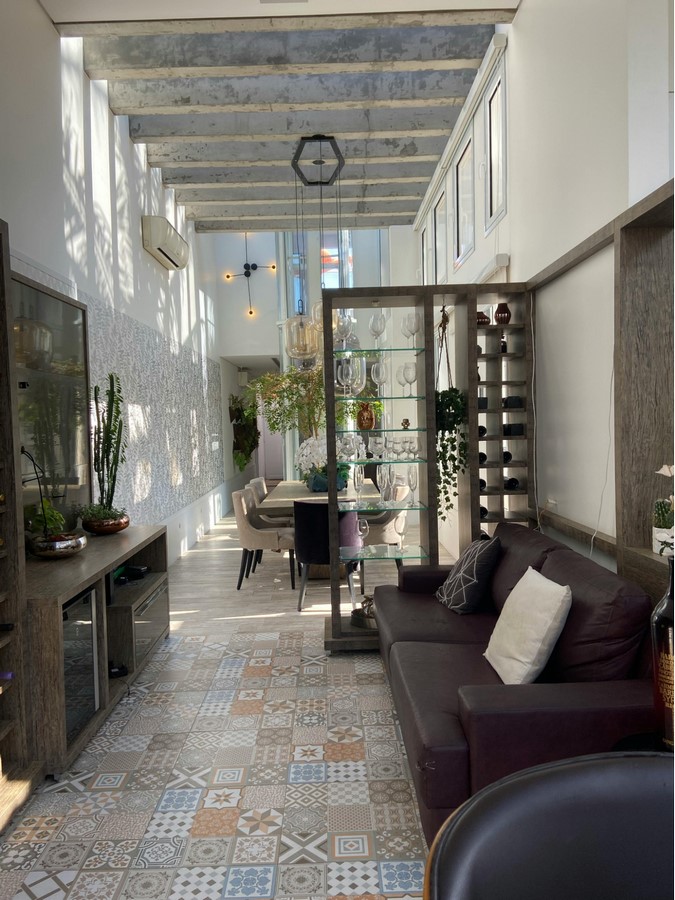
Running tiles lengthwise down a hallway makes it feel longer; laying them widthwise can make a narrow space feel wider. Even simple adjustments—like shifting a grid layout off-center—can bring visual interest and movement.
Patterns shouldn’t feel like afterthoughts. Decide early how you want the room to feel—formal, relaxed, energetic—and use layout accordingly.
Zoning with Tile: Defining Space in Open Interiors
In open-concept homes, tile can help subtly define areas without building walls. A change in tile pattern or tone can separate a kitchen zone from a living area, or a shower from a vanity. It’s less jarring than paint or partition walls and much more durable than rugs.
For example, switching from a neutral wood-look tile in a living area to a patterned encaustic tile under a dining table creates an instant “zone” without breaking the flow. If you use similar tones or textures across the zones, they’ll still feel like parts of the same story.
This technique also works well in compact apartments or multi-use studios, where space is at a premium and versatility is essential.
Feature Walls and Focal Points: When to Break the Rules
You don’t have to keep everything uniform. Sometimes, breaking the flow on purpose can create balance. A tile feature wall behind a freestanding tub or bed can serve as an anchor for the space. But here’s the trick—choose a tile that complements the rest of the room, even if it contrasts in color or finish.
Feature tile should be about texture, shape, or artistry—not shock factor. A terracotta wall in a neutral-toned space brings warmth; a dark green handmade tile adds character without overwhelming.
Always consider lighting. If your feature tile is highly reflective or textured, it may cast shadows or glare depending on the time of day. Test with samples and move around the space before making final decisions.
Tile Transitions: Blending Without Borders
One common design mistake is abrupt changes between flooring types—like wood to tile with no transition thought. Instead of using jarring trim strips or threshold dividers, consider using complementary tones or tile shapes that taper naturally into another surface.
Hexagonal tiles, for example, can transition beautifully into wood planks, especially in entryways or kitchens. The organic edge softens the change and makes it feel purposeful. Similarly, continuing the same tile from the bathroom floor into the shower pan (with proper slip resistance) helps the room feel unified and clean.
These transitions are where good installation really shines. Poor execution can cheapen even the most expensive tile.
Lighting and Reflection: Let the Tile Do Some Work
Tiles don’t exist in a vacuum—they interact constantly with light. Glossy and polished finishes reflect daylight and artificial lighting, making them ideal for darker spaces like windowless bathrooms or hallways.
However, too much shine in a sunny room can cause glare or feel cold. That’s where semi-polished or satin finishes hit the sweet spot. They reflect just enough light to lift the room, without creating hotspots or visual noise.
If you’re using pendant or spot lighting, consider how it will hit the tile. A rippled surface will catch and scatter light dramatically—perfect for ambiance in dining spaces or powder rooms.
 Final Thoughts: Designing with Intention, Not Impulse
It’s easy to get excited about a trendy tile on Pinterest or a showroom sample that sparkles just right under halogen bulbs. But good tile design is about long-term livability, not short-term flash.
Take the time to think through how tile will work with your home’s lighting, usage, and mood. Do the tones match your furnishings? Will the texture still feel good five years from now? Are your tiles setting the tone—or just filling space?
Interior harmony isn’t achieved through paint swatches alone. When chosen with care and installed with skill, tile can be the invisible thread that ties your entire design together—one square at a time.