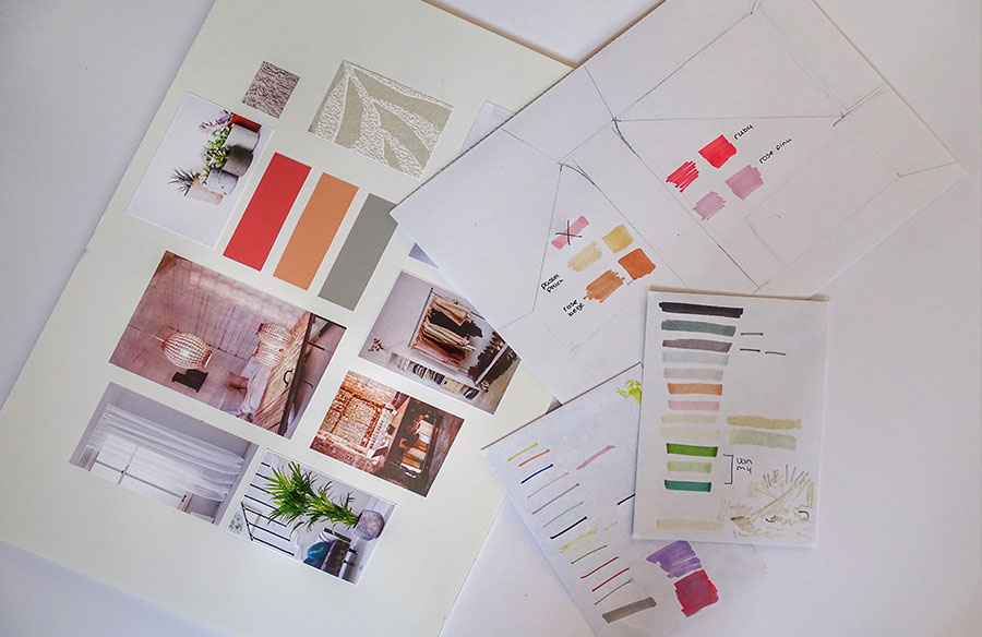
In interior design, the best concepts aren’t just beautiful—they’re coherent, emotionally resonant, and narratively strong. That coherence doesn’t happen by accident. It begins with a tool as foundational as it is creative: the moodboard.
Moodboarding is not just about aesthetics—it’s a process of visual storytelling. It captures the intangible: atmosphere, intention, and emotional tone. Done well, a moodboard becomes the north star of a design project, guiding everything from material choices to layout decisions.
Whether you’re a seasoned designer or just starting out, understanding how to use moodboards effectively will elevate your design process—and your communication.
What Is a Moodboard in Interior Design?
A moodboard is a curated visual collage that conveys the feeling, style, and tone of an interior concept. Unlike a technical drawing or a material board, a moodboard isn’t about precision. It’s about evoking emotion, establishing visual direction, and aligning creative vision—with clients, teams, or yourself.
It typically includes:
- Color palettes
- Textures and materials
- Reference imagery (architecture, fashion, nature, art)
- Typographic elements (for branded environments)
- Words or phrases that capture mood
Why Moodboards Matter in Interior Design
1. Clarify Your Concept
Moodboards force you to commit to a clear visual identity before you start sourcing or space planning. They help answer questions like:
- Is this space calming or energizing?
- Is it minimal or layered?
- Is it rooted in nature, history, or technology?
2. Improve Client Communication
Clients often struggle to articulate what they like. Moodboards create a shared language. Presenting curated visuals lets clients respond to something tangible early in the process—avoiding misalignment later.
3. Maintain Visual Consistency
Once approved, a moodboard becomes a reference point for all subsequent decisions. It helps prevent “style drift” and ensures that furniture, lighting, finishes, and styling choices all align with the original intent.
The Anatomy of a Strong Moodboard
An interior moodboard should be more than a pretty collage. It should tell a story—visually and conceptually. Here’s what to consider:
1. Color Palette
Choose 3–6 core colors, including neutrals, to set the emotional tone. Think of how color affects space:
- Warm tones = cozy, intimate
- Cool tones = calm, expansive
- High contrast = dramatic
- Monochrome = restrained, elegant
Include real-world examples of the colors in use—walls, textiles, lighting.
2. Texture and Materiality
Texture defines how a space feels as much as how it looks. Include swatches or images of:
- Natural materials (wood grain, stone veining)
- Fabrics (linen, velvet, leather)
- Metals (matte brass, brushed steel)
Think tactile—what would it feel like to move through this space?
3. Imagery and Reference
Pull images that match the atmosphere you want. These can include:
- Architecture (historical, regional, modern)
- Nature scenes (for biophilic design cues)
- Art or photography (for emotional tone or palette)
The key is intentionality—don’t include images just because they’re trendy.
4. Typography and Words (Optional)
For branding, hospitality, or commercial projects, add:
- Typefaces that reflect personality (e.g., modern sans-serif for tech; serif for heritage)
- Key phrases or adjectives that define the space: “elevated calm,” “industrial warmth,” “urban sanctuary”
Digital vs Analog Moodboards
| Digital | Analog |
| Easy to edit and share | Tactile, emotionally engaging |
| Use tools like Canva, Milanote, Adobe Express, or Morpholio | Involves cutting, pinning, arranging by hand |
| Great for remote teams or quick iterations | Ideal for client presentations or studio critique |
Pro Tip: Digital boards can be printed and presented physically for the best of both worlds.
Step-by-Step: Creating a Moodboard
1. Define the Brief
- Who is the client?
- What’s the space used for?
- What’s the emotional goal (calming, vibrant, timeless)?
2. Collect Visuals (Inspiration Phase)
- Use Pinterest, design books, magazines, and real-life photos.
- Pull liberally—curation comes later.
3. Curate (Edit Ruthlessly)
- Remove anything that doesn’t support your core idea.
- Choose images that work together to tell a story.
4. Lay It Out With Purpose
- Group images by theme: color, material, use.
- Create visual flow—balance density, whitespace, contrast.
5. Label if Needed
- Use light annotations to clarify purpose or concept keywords.
6. Present With Context
- Explain your concept clearly: “This board communicates a warm, textural palette designed for a contemporary family space inspired by Scandinavian calm and desert minimalism.”
Tools for Digital Moodboarding
- Milanote – Great for organizing ideas visually with flexibility.
- Morpholio Board – Built specifically for interior design.
- Canva – Easy drag-and-drop templates.
- Pinterest – Best for early idea gathering.
- Adobe InDesign – For polished, professional presentations.
Final Thoughts: Moodboarding as Design Strategy
Moodboarding is more than aesthetic exploration—it’s a strategic alignment tool. It transforms abstract ideas into visual clarity, bridges the communication gap between designer and client, and sets the tone for the entire design process.
A good moodboard doesn’t just show what a space will look like. It shows what it will feel like—and that’s what turns good interiors into great ones.