DIG Architects was founded in 2009. The team is a Multidisciplinary Design Implementation team. It is headquartered in Mumbai. He has designed and carried out many successful and original projects in the field of Architecture and Interior Design. Its purpose is to create spaces that reflect the spirit of the times. He uses technology and culture in his designs in a balanced and rational way.
Here are the 10 most known designs from DIG Architects:
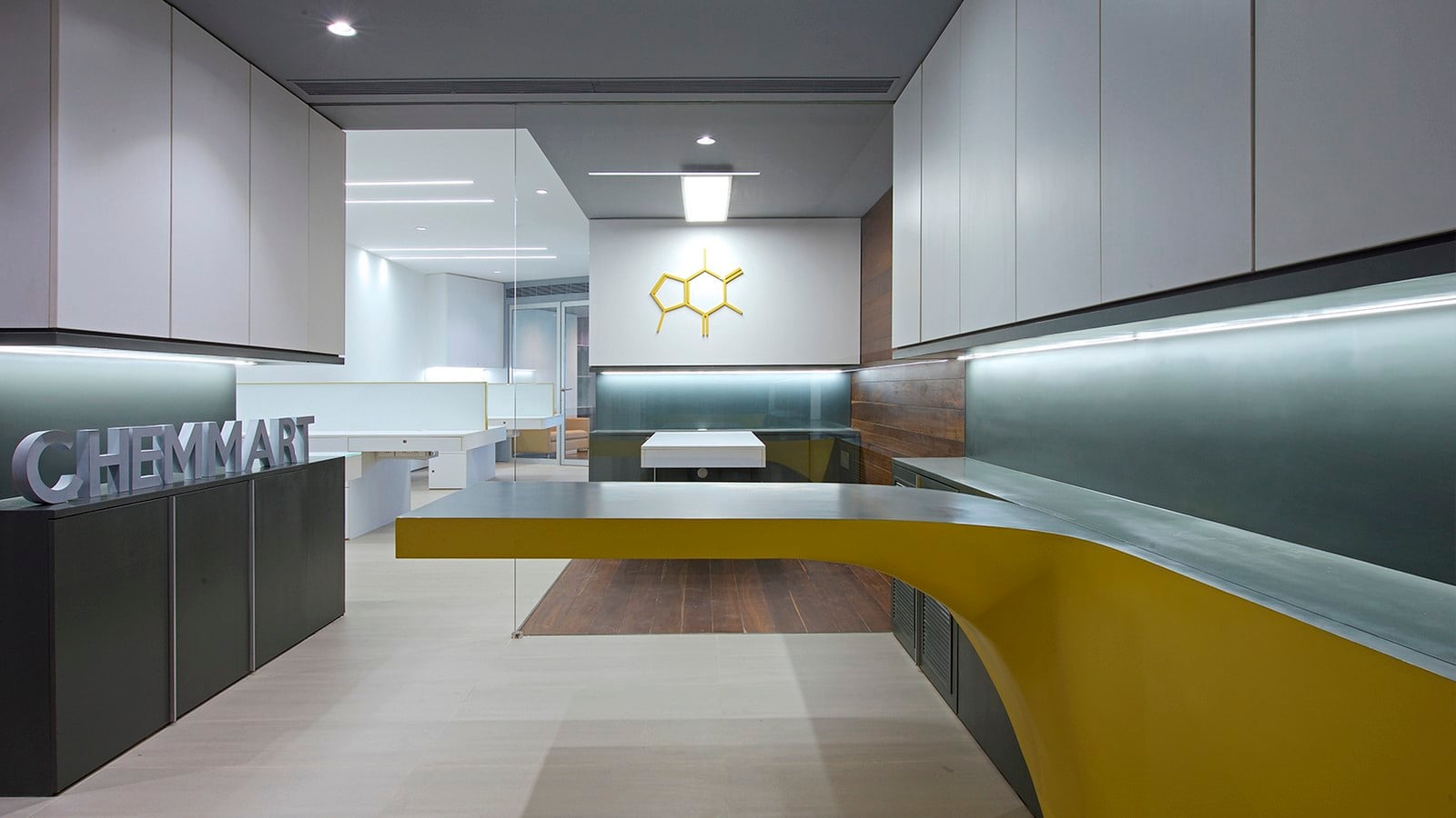
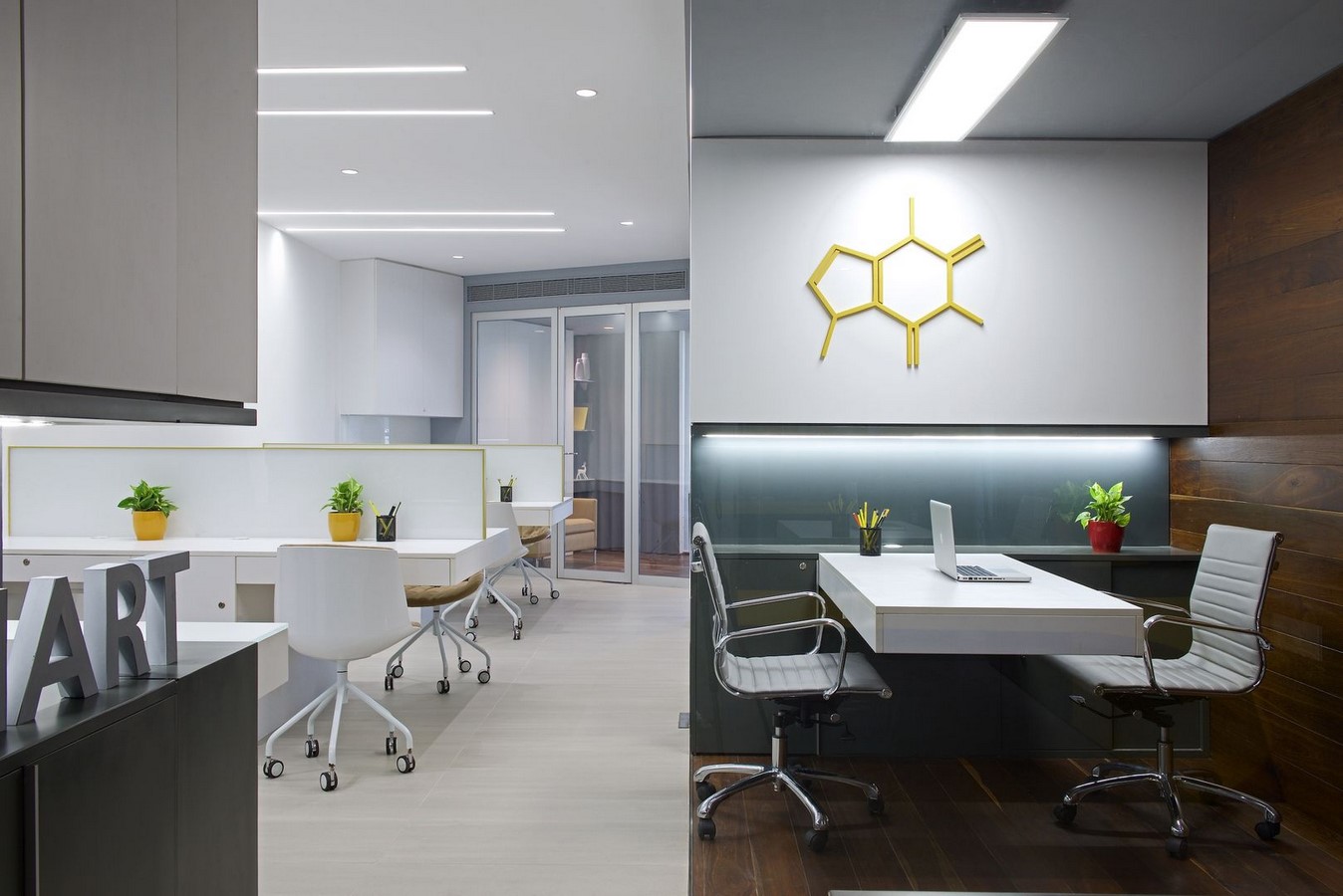
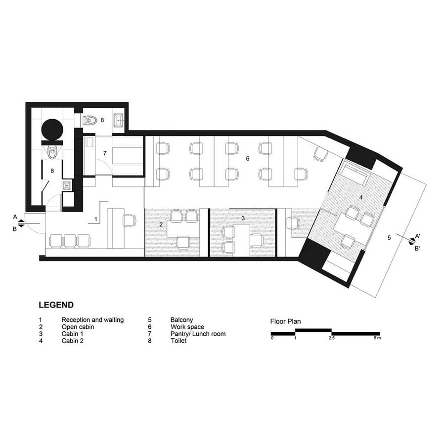
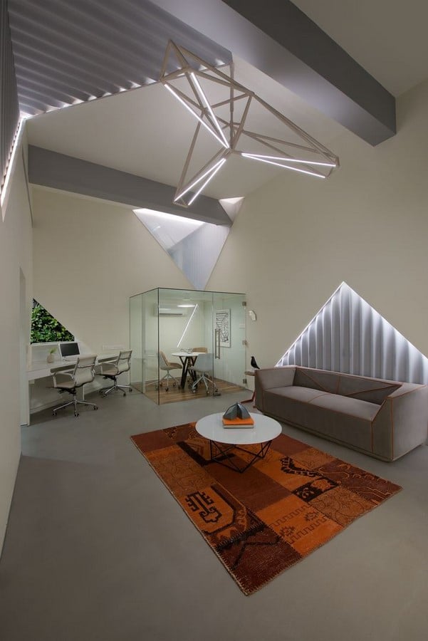
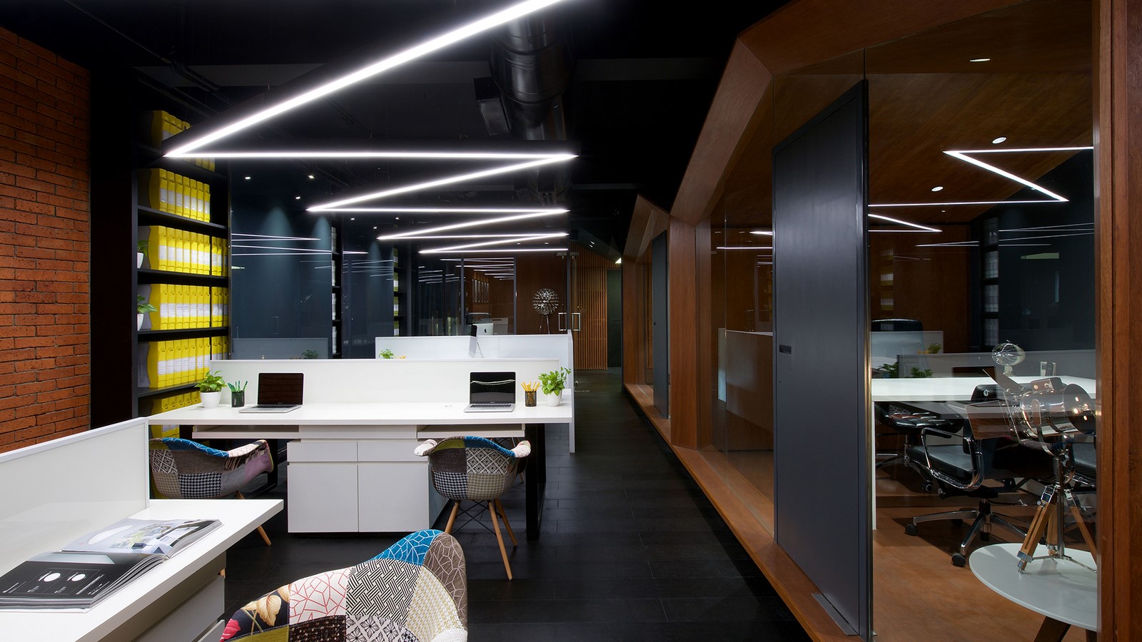
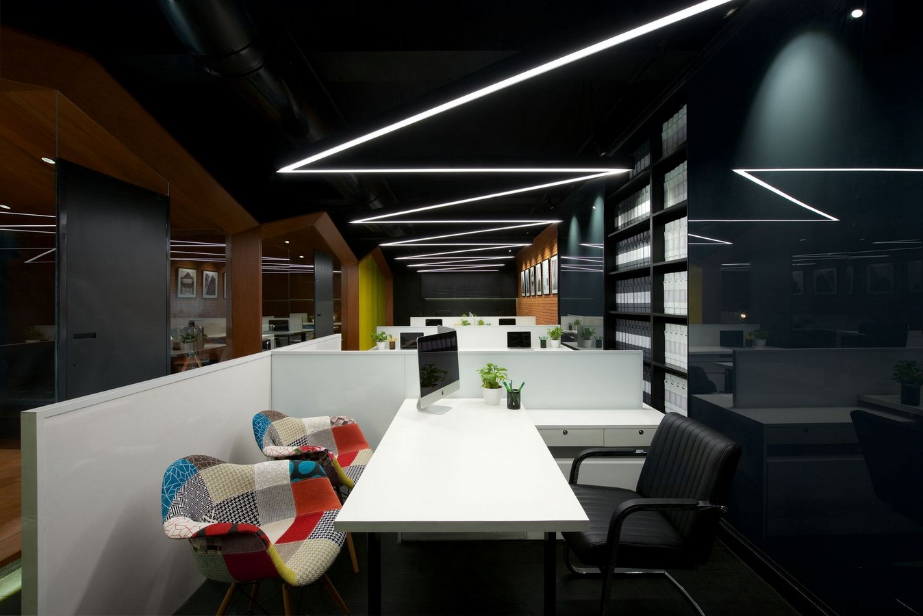
1. Twisted Table Office
The creativity that needs to be displayed in a limited space is much more than that of a large area. DIG Architecture shows that a striking design can be created even in a limited space in this project. There is a reception area that says Welcome before the management and workstations. It was designed as a double-slope surface by breaking the linearity of this area. Today’s digital technologies could be used for this design.
However, it was not used and instead was handed over to the hands of skilled craftsmen. They supported this curvilinear fiction with the use of color. The reception was seen as the protagonist of this design.
By creating a hierarchical model, reception, then workstations, and then management was planned. It was aimed to leave the floor as clean and plain as possible in the work areas. T-shaped tables were designed for this purpose. Also, the fictionalized file storage section used this simplicity.
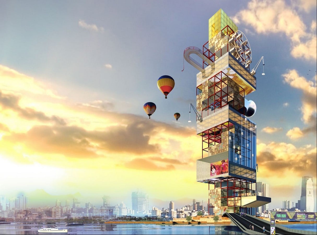
2. Filmcity Tower
This project was designed for Film City Tower: Bollywood Reimagined competition held in Mumbai in 2015. Film City is Bollywood’s movie production hub, meaning it is a state-owned studio facility in the northern suburbs of Mumbai. This competition aims to explore the possibility of a vertical Film City for Mumbai.
The ground floor of the tower was designed as a ferry terminal in the project of DIG Architects. Thus, by adding another branch to the transportation provided by land, the road of transportation from the water is opened.
This building, which serves as a call to the whole city, is also a public gathering area on the ground floor. High and low tides have been a tool for design. With this in mind, they pixelated the base. On the upper floors, a system that uses intense activity as electricity is considered. At the top levels, the structure is oriented in the NW-SE axis to soften the wind resistance.
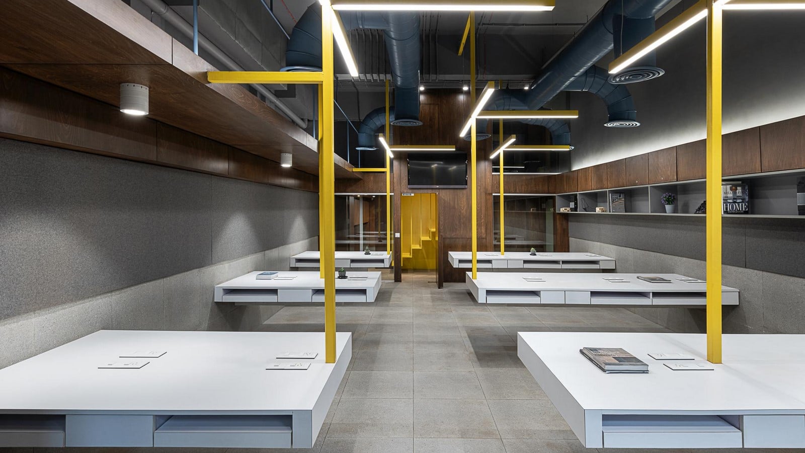
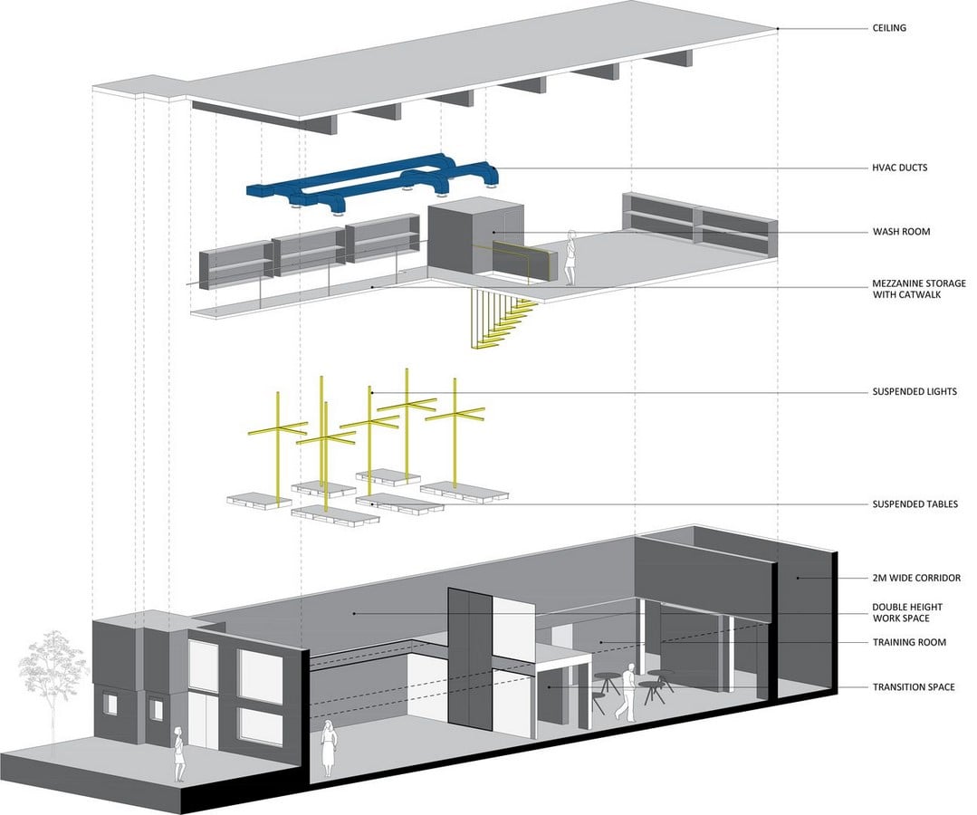
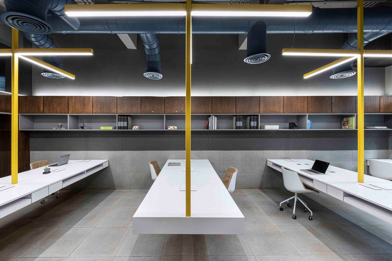
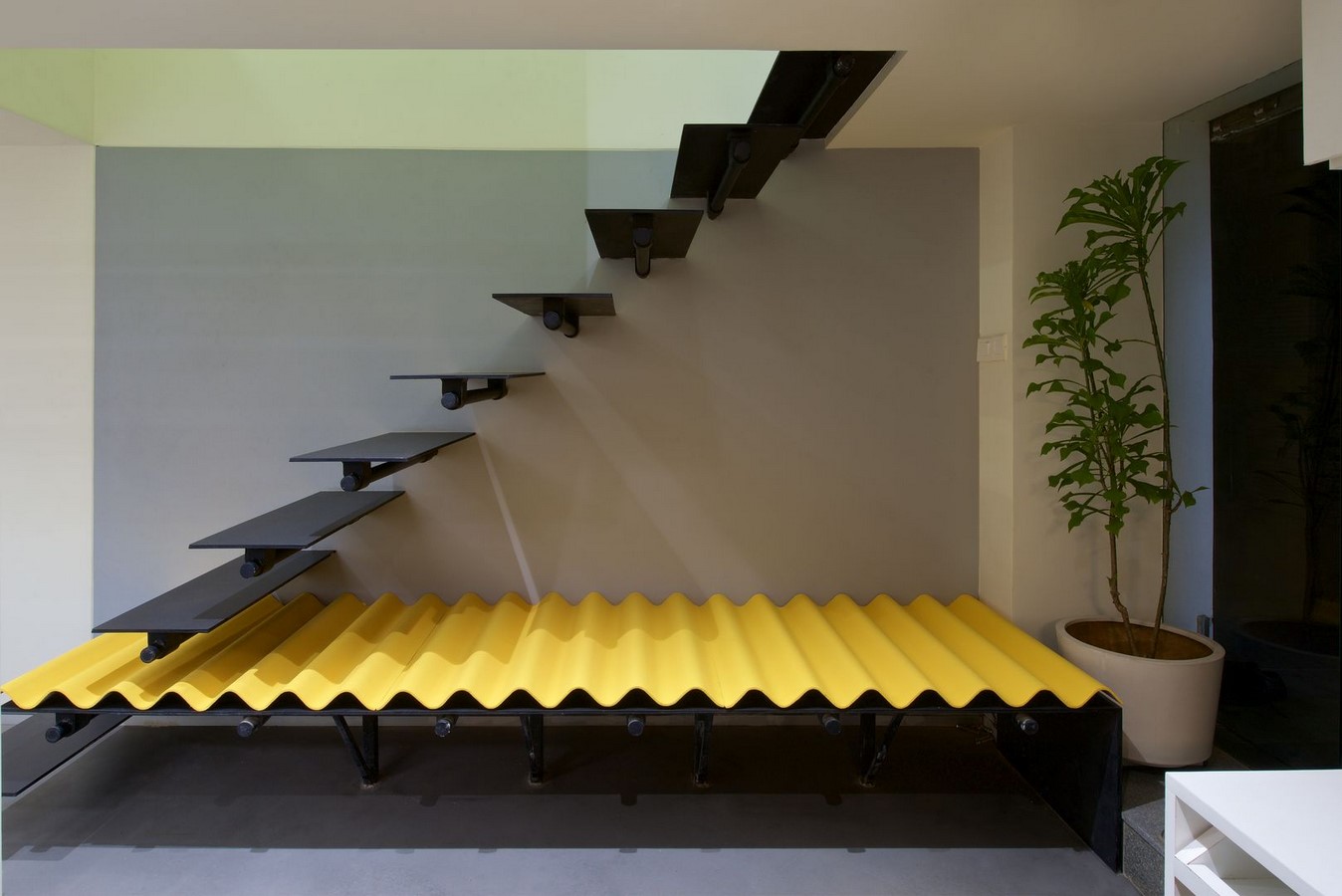
3. Suspended Office
Mumbai is known for its scorching heat and raids causing downpours. While a period was quite dry, then the rain begins, which causes floods and makes transportation and life difficult. Not only that. Some properties are inundated. The 1200 square meter project area, located in a low-lying area of Mumbai, was one of the annual victims of the rain.
The office structure that existed in this region also had to fight the floods. It was necessary to turn this office into a convenient and safe workspace for 35 staff, as well as a functional training room for visitors. DIG Architects solved this problem by cutting the connection with the floor in all areas of use and designing with the ceiling suspended method.
Workstations, even ladders, are designed to be suspended. The bright yellow color was preferred to draw attention to the hanging elements. The materials used on the walls and floors were preferred as waterproof.
4. Tetracube Office
The office designed by DIG Architects in 2015 is located in Mumbai Maharashtra minus one heavy industrial zone. It has an office area of 2 floors on the ground floor. This section is designed as Box In Box offices.
The 2-story high outer box is separated from the 1.5 m inner box with a clever design. There is a pleasant and winding road to get there. This transition is intriguing. The inner box has some different openings at the lower levels. There are a series of spaces, corridors, and stairs that follow this two-story-high space. Here, we can feel the breeze of the old industrial area in a modern and simple way.
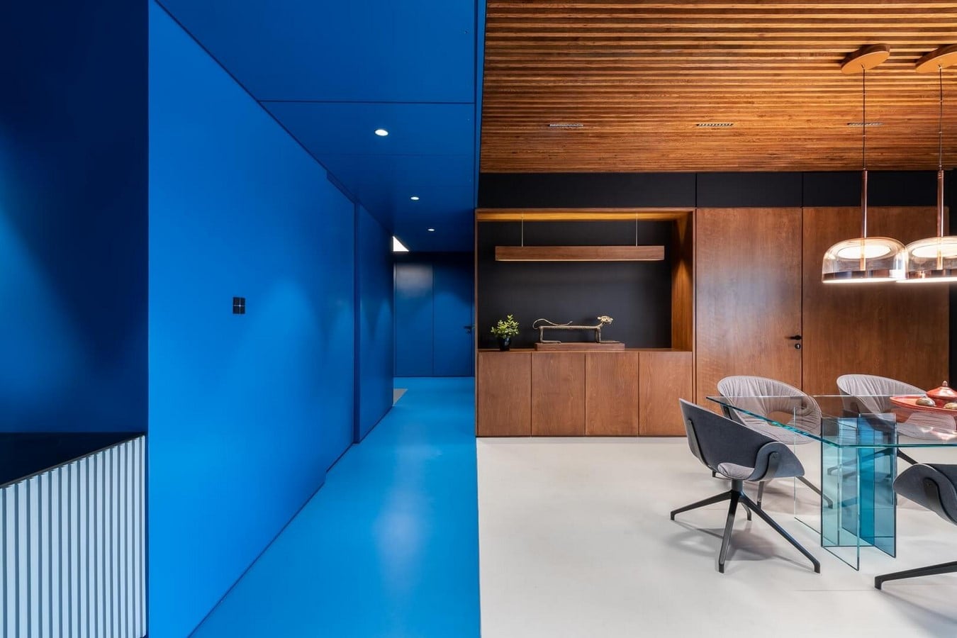
5. Blue Scoop Haus
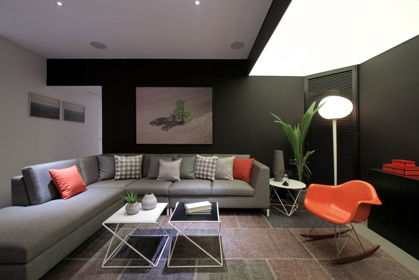
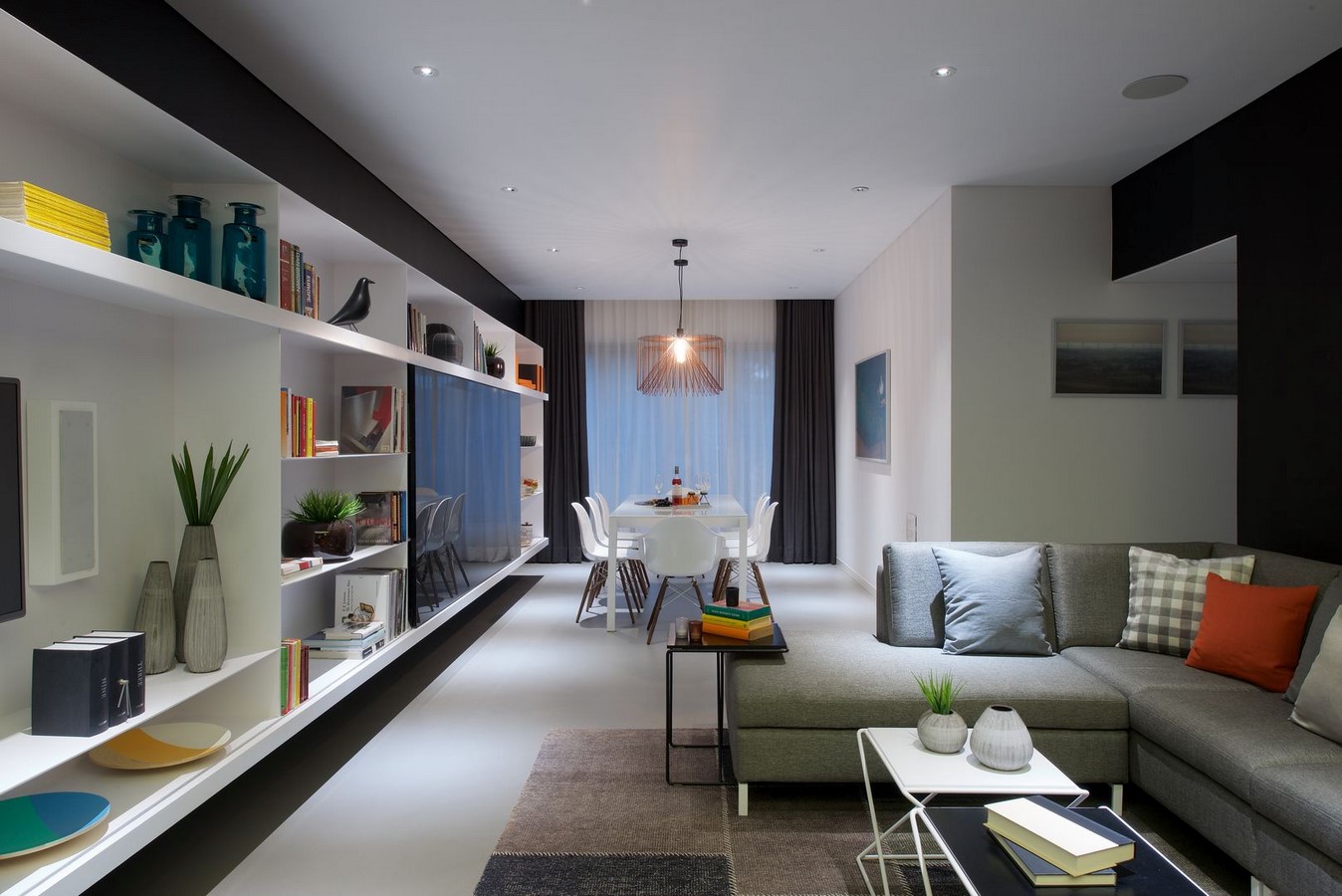
This project is a private residential project in Mumbai, built-in 2019. In design, we witness India’s color-loving culture meeting with a modern and contemporary design. It aimed to contrast with cool and muted tones rather than creating many bursts of color at the same time.
The project is named the blue bucket because a clear blue color shows the connected spaces in circulation and provides contrast. The use of black, which is especially preferred, has made it a smartly designed part of a beautiful design instead of being afraid of it.
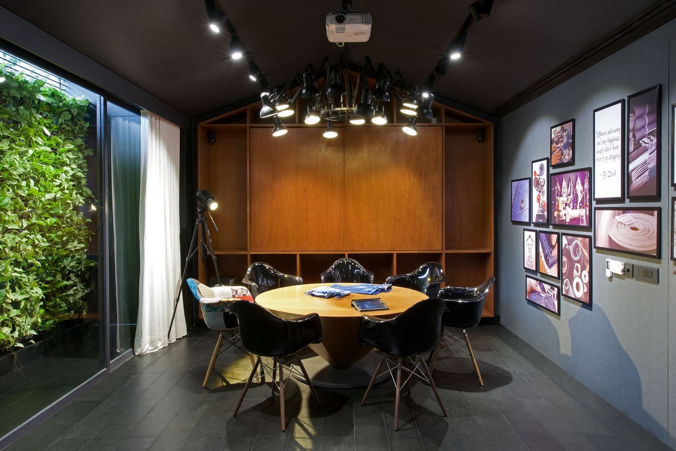
6. Nostrum Jeans Office
It was designed by DIG Architects in 2015 with the idea of designing a large office space in a modular way. Avoiding a settled plan and designing more transformable, variable, and modular spaces were the basis of this project. The common open workspace connects to smaller offices. These areas are like buildings that have sloping and hipped roofs.
Glasses preferred instead of walls as partitions support the theme of openness and transparency. The lighting element preferred in the main space is designed for the impression as if it were floating in an uncertain space.
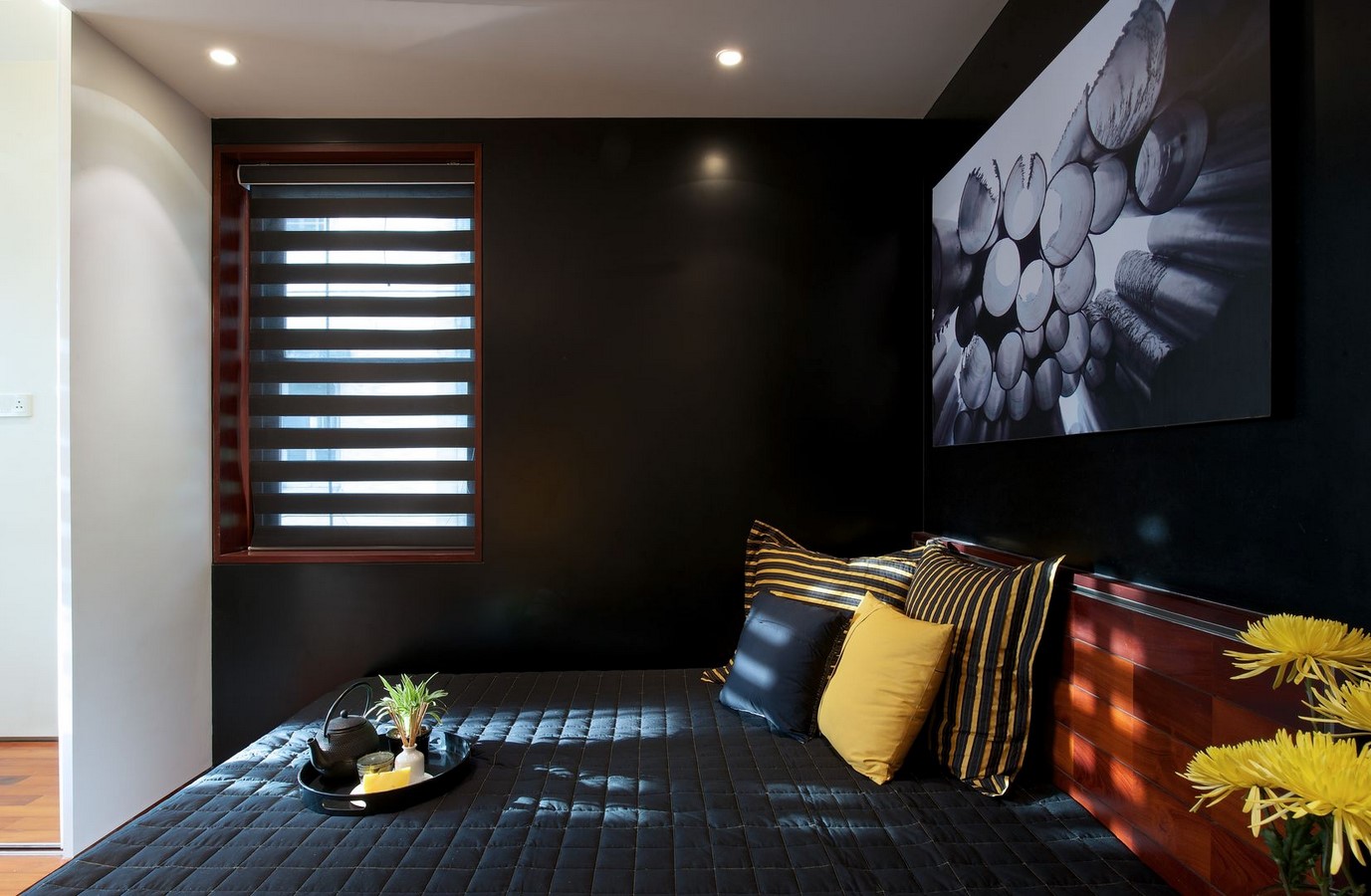
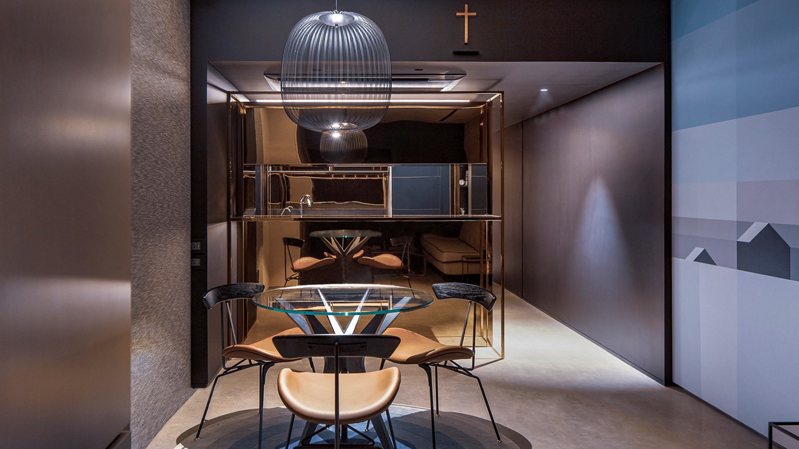
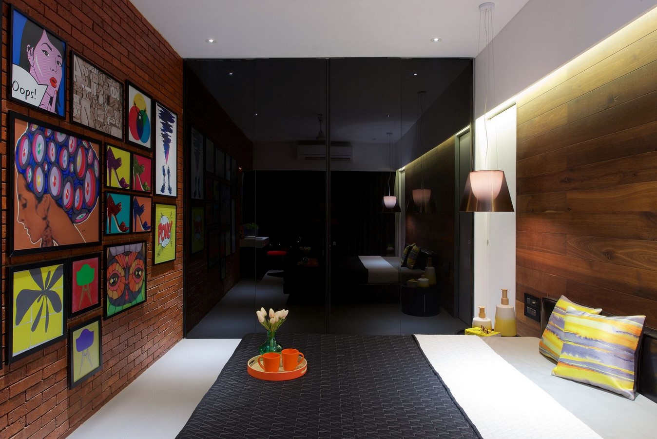
7. Copper Cube House
This residence is designed for someone who spends most of his time traveling. For him, any place can be his home. For this reason, this is his second home. It is planned like a peaceful getaway for a quiet break between travels. This space has a unique design, more like an experience center than an apartment.
Spatial Rooms lead to a central area similar to a studio apartment and this is the essence of the space. The service counter, which gives the feeling of sitting in a stylish bar outside, gives the feeling of being both at home and in a stylish place. This cube serving counter and its complementary kitchen part are covered with copper. This unique touch has given the house its name.
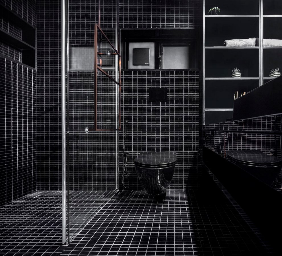
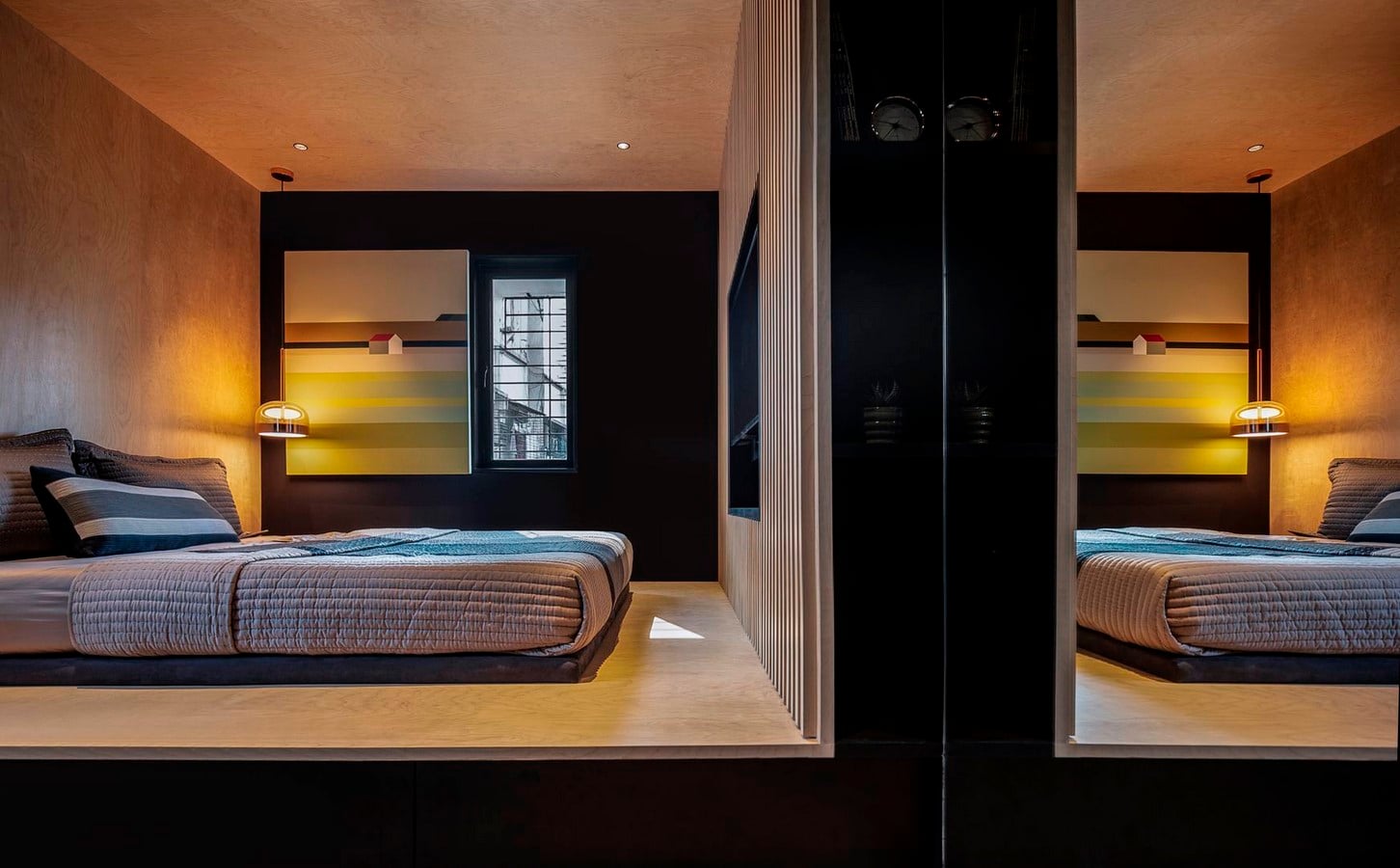
Opposite this cube is the table and sofa that accompany it with its design line. On the side, the circulation area continues and connects to the bedroom. The bedroom is a representation of rest. Unlike copper and bright tones, it has a more modest cube design with the use of matte colors and wood. The toilet, on the other hand, has the same brightness and is designed like a cube covered with black glossy mosaics.
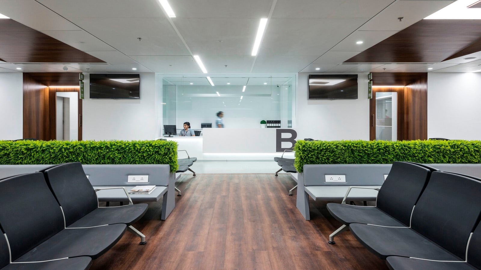
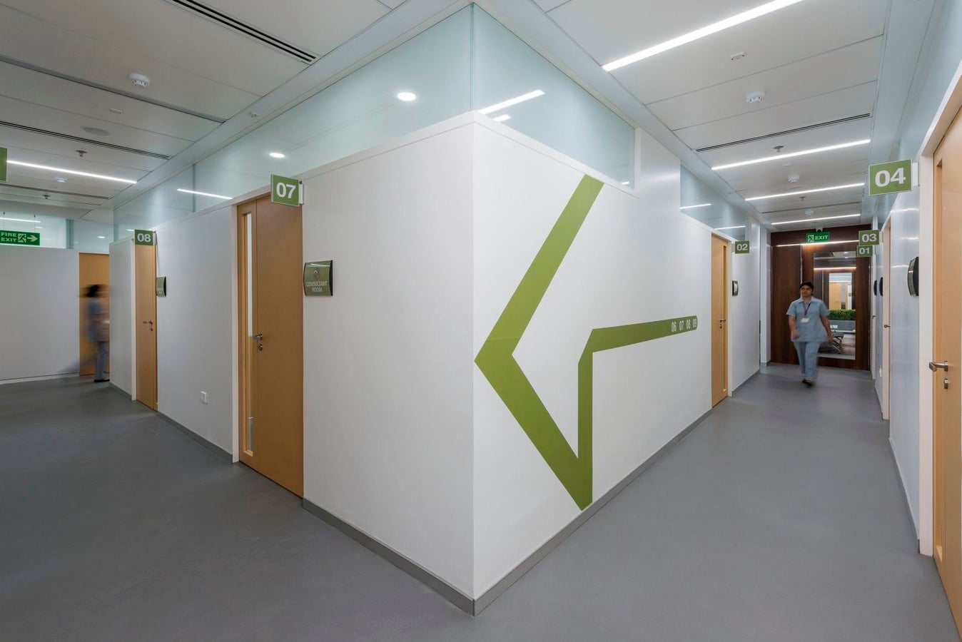
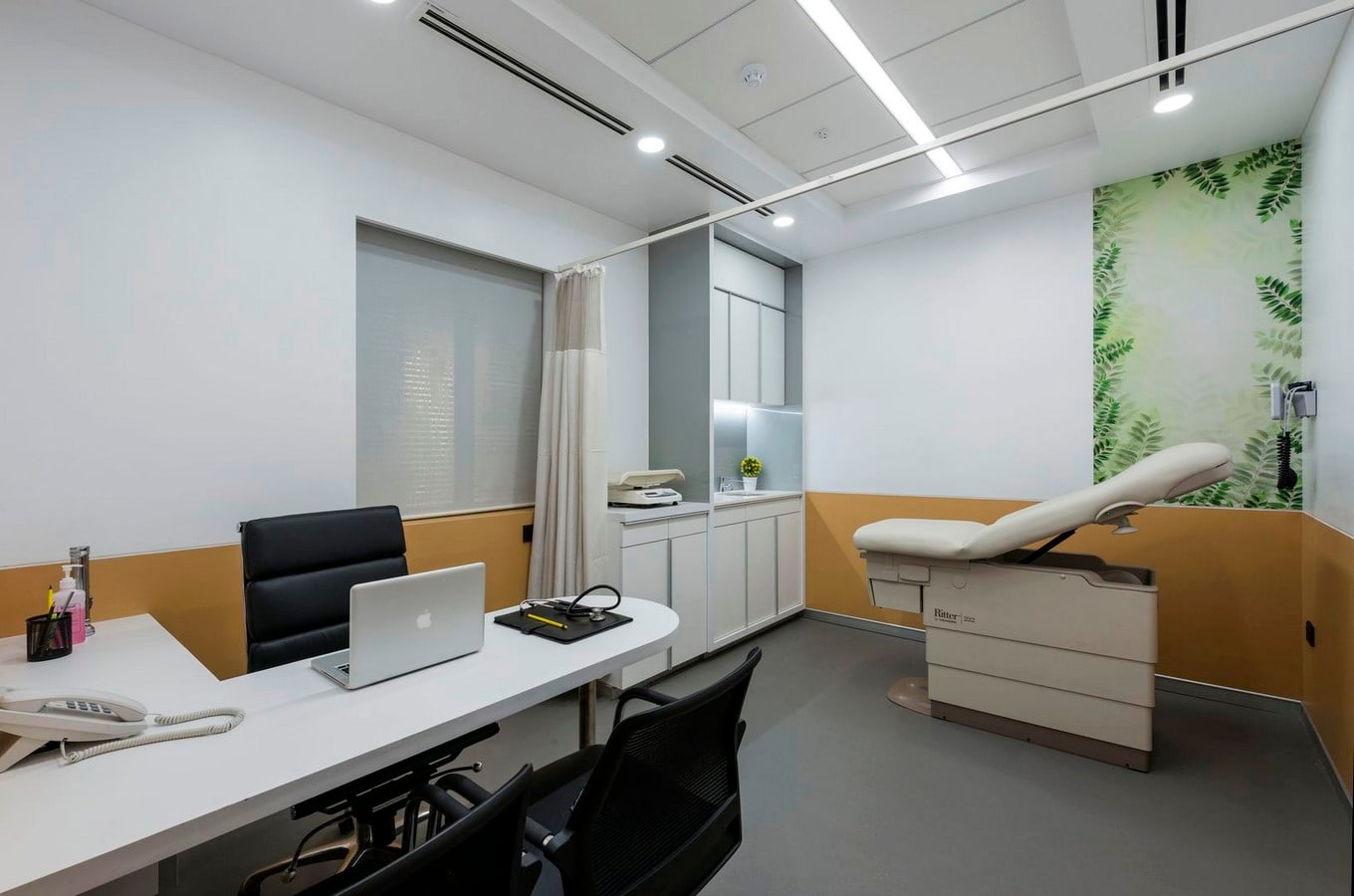
8. MGM Hospital
Designed by DIG Architects in 2018, the Mahatma Gandhi Mission (MGM) Hospital in Navi Mumbai has made a reassuring touch to the hospital concept with its design. The walnut veneers used in the waiting area have added warmth to space.
Besides, an unobstructed and understandable building design was considered. The space organization that provides directions and orientation is very clear and flow-friendly. Intuitive movement and direction-finding logic are some of the basic principles. Appealing graphics and green signs were used to find the way. It was chosen because it is visually soothing and because gray, white, mustard is a different color from the rest of the scheme.
Clinics and patient rooms have been thoughtfully thought out to achieve a design that will set an example and inspire other designs. For clinics, they spent most of the energy on a design that would use space with maximum efficiency and at the same time facilitate examination effectiveness. In this way, they were able to create evolving layouts to maximize the number of consultations. Methods such as face-to-face interviews and placing the patient’s chair away from the wall for ease of use for examination were used.
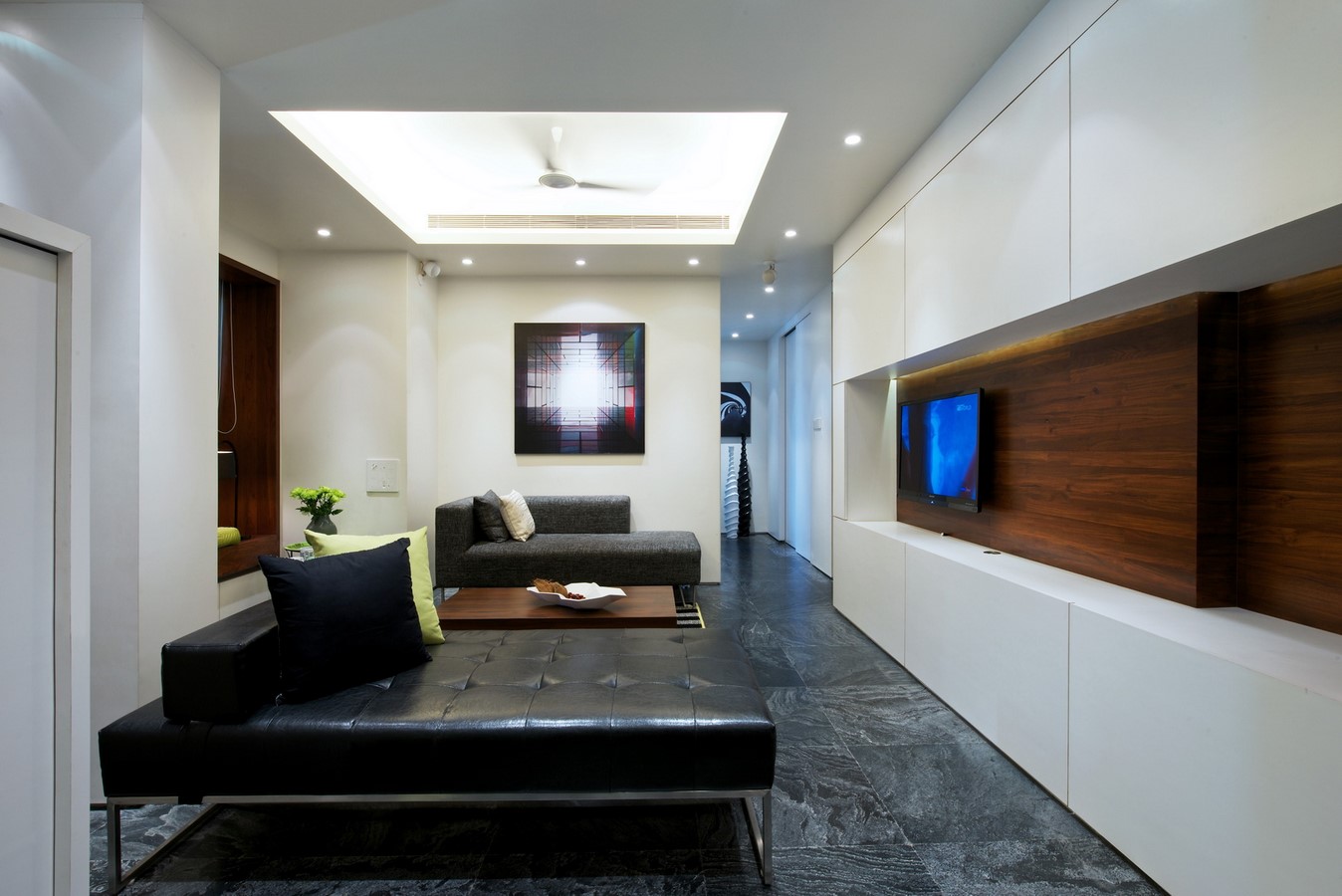
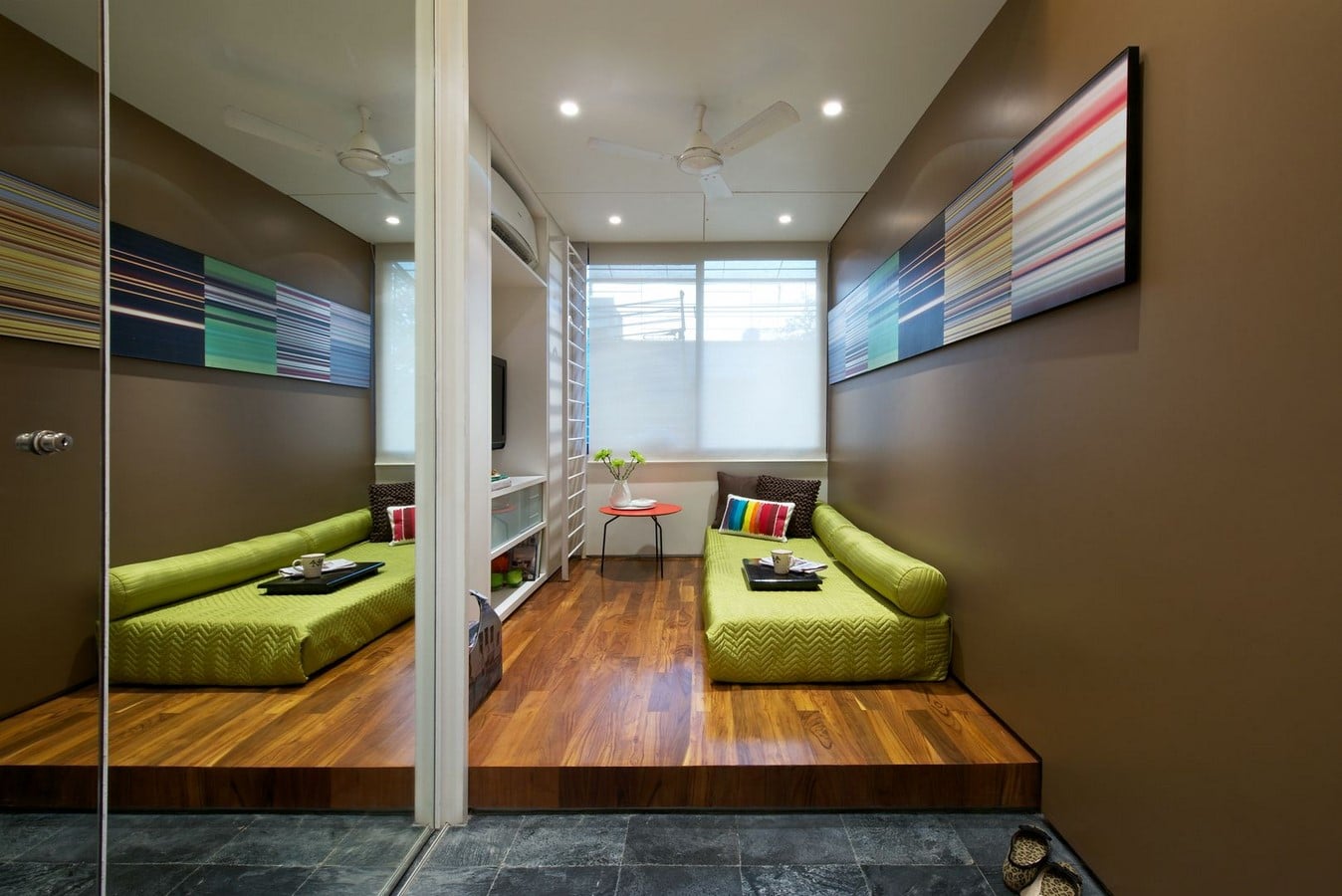
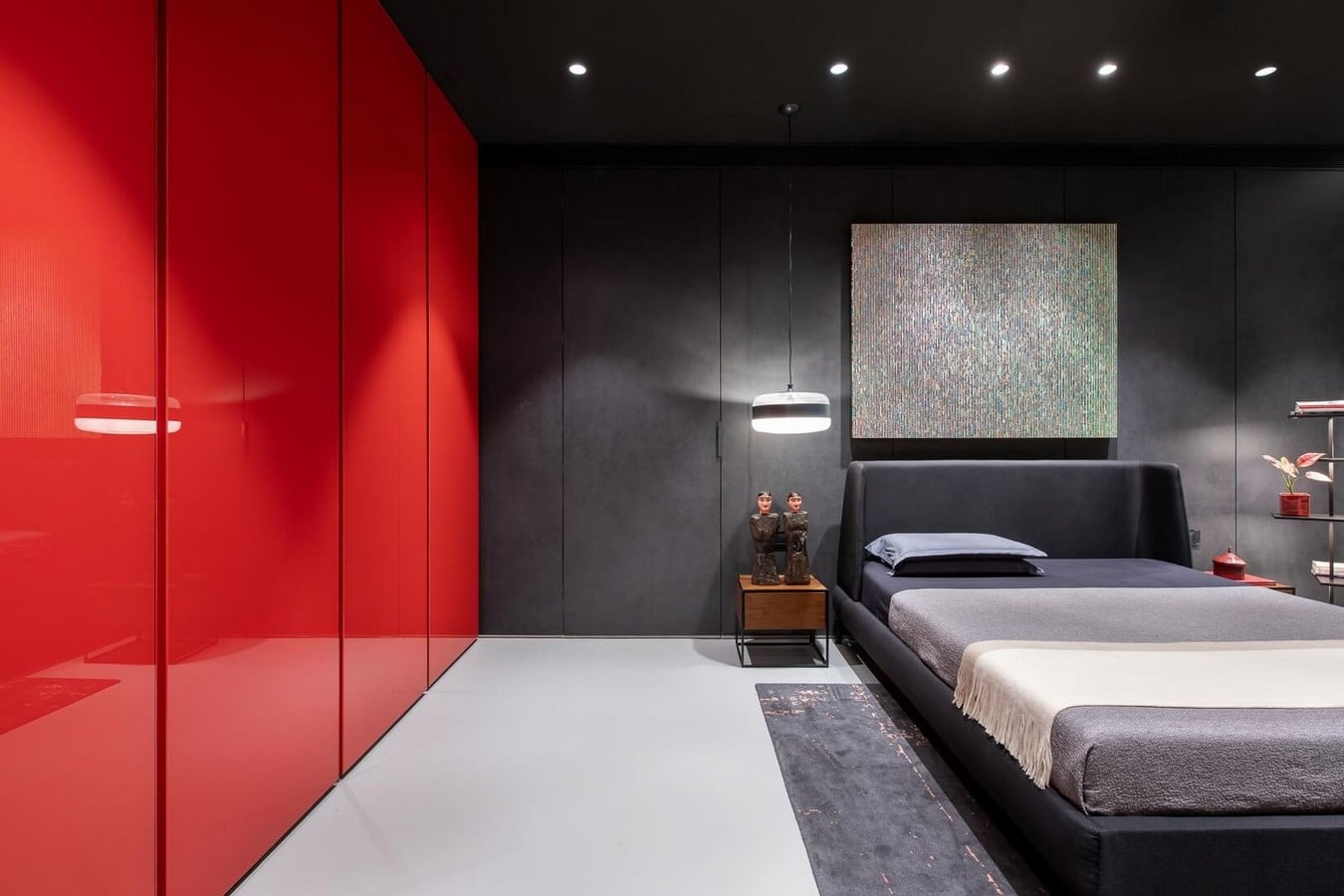
9. Narayan Residence
It is a residential project designed by DIG Architects in 2016. Designed for a banker, writer, and their younger son. This modern home should also be the library for the writer and the workspace where he found and worked for his inspiration.
Although the public areas of use are quite simple and plain, it connects the vital and food needs. Black and white walls designed for a large number of works of art in the house serve as exhibitions at some points.
10. The Light Streak House
This project of 2013 is a residential project. The main idea was to break down traditional habits that create a pictorial image in the interior. The apartment has 2 bedrooms, a combined living-dining area, 1 study room. The design proposition is called ‘Wrap’ which is a form by sloping ceilings of Living-Dining and the partition which separates the dining area from the study room.
The Wrap also made the living space bigger. An element of ‘Light Streak’ was added between two sloping ceilings. This element not only an illumination element of the outer space but also a visual connection of interior bedrooms. Both the bedrooms followed the same language as the other spaces. Although the wooden furniture was minimal it was enough to bring warmth to the house.