A customer choosing a sofa might spend an hour comparing fabrics, then call the showroom the following day to confirm the order. Another visitor arrives only to collect a purchase. Sending both through the same checkout routine can create unnecessary detours. A useful retail plan starts by recognising these different journeys.
Browser-based payment tools give designers another option when planning where transactions happen. However, the aim should not be to remove every counter or place a screen on every table. It should be to make payment fit the service, without compromising comfort, privacy or the practical work of running a shop.
Understand the Payment Method Before Changing the Plan
A virtual credit card terminal allows authorised staff to enter payment details through a web browser, including when taking an order over the phone. For a showroom handling deposits or telephone orders, that suggests a possible payment point at a consultation desk or in a staff workspace, rather than only at the main till.
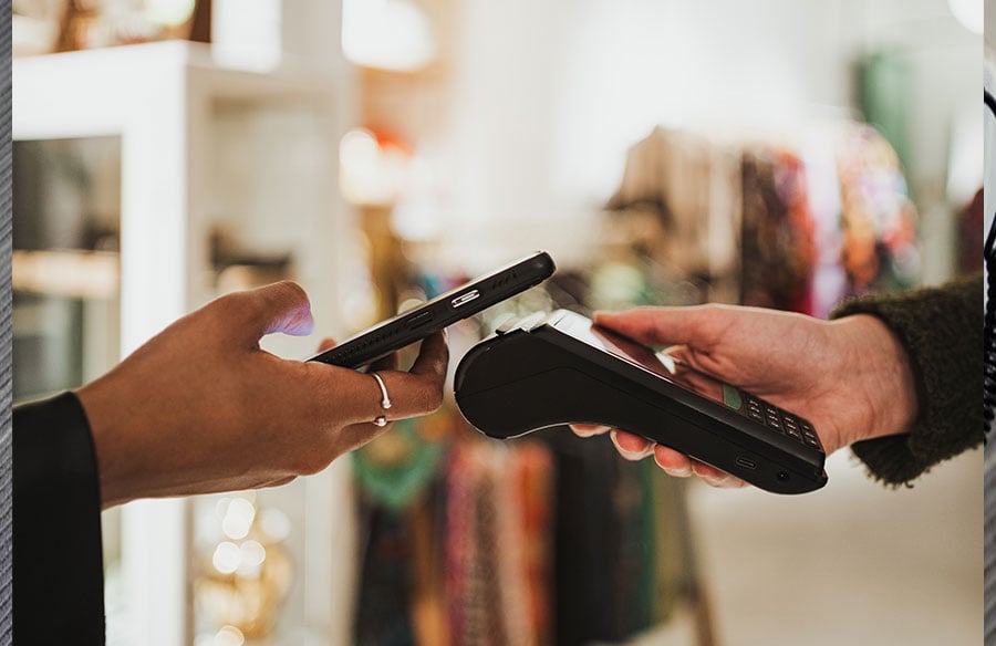
This does not make every transaction hardware-free. The documentation Finix’s documentation distinguishes manual card entry from payments sent to a connected reader. A browser screen alone is not a contactless terminal. Where customers expect to tap or insert a card, designers should retain appropriate hardware and space for using it comfortably.
The right arrangement may therefore be a combination: a conventional checkout for everyday purchases, with a quieter station for more involved orders.
Map the Work, Not Just the Customer Route
Before reducing a checkout footprint, list everything that happens there. Staff may wrap purchases, organise collections, answer calls, handle returns and store packaging. Moving payment into a browser does not remove those activities. A smaller counter is only useful when the remaining work has somewhere sensible to go.
Consider a furniture showroom. A consultation table could support fabric selection and order confirmation, while a nearby staff desk handles telephone payments. A separate collection point could serve customers picking up smaller accessories. The collection area should sit close enough to storage that staff can retrieve purchases without cutting across an ongoing consultation.
Test the arrangement against simultaneous tasks. Can one employee take a call while another retrieves an order? Does a waiting customer block the route to the displays? Keep packing and temporary storage out of circulation space, and make the service point visible enough that visitors do not have to search for help.
Design a Workstation, Not a Place to Balance a Laptop
A consultation desk needs room for both conversation and work. Draw the actual equipment into the plan, alongside samples, paperwork and the customer’s belongings. Leave a clear surface between staff and visitors rather than letting a screen become the centre of every interaction.
Lighting deserves the same attention as furniture. OSHA’s monitor guidance recommends positioning screens perpendicular to windows to help manage glare. Check the workstation under daylight and evening lighting before fixing its orientation. A position that looks attractive in a rendering may be awkward when staff need to read payment details.
Use adjustable screen supports and allow room for a keyboard without forcing staff to twist towards it. Plan accessible cable routes, ventilation and equipment storage within the joinery. Removable panels are preferable to enclosing connections behind finishes that must be damaged whenever something needs replacing. Such considerations are fundamental to architectural detailing, ensuring that the functional elements of a space are not only efficient but also contribute to the overall aesthetic and durability of the built environment.
Choose finishes as part of the wider interior rather than treating the payment desk as separate technical furniture. A timber front can continue the rhythm of adjacent display units, while a durable, matte worktop keeps the working surface practical. Keep joints and cable openings easy to clean. The desk should still look complete when the laptop is closed or removed, especially in a consultation area used for several purposes. This holistic approach to material specification and furniture integration is key to creating cohesive interior architecture, where every element, including the most utilitarian, reinforces the design narrative and user experience.
Build Privacy into the Layout
An open retail interior should not leave payment information open to view. Angle staff screens away from queues and check reflections in mirrors, glazing and polished surfaces. A small change in desk orientation may preserve visibility across the shop while preventing passers-by from looking directly at the display.
Telephone payments need particular care. Put the workstation away from loudspeakers and busy waiting areas, and provide a suitable headset rather than relying on speakerphone. Where conversations remain audible, consider a more sheltered position or an acoustic partition. These measures should support, not replace, the retailer’s payment-security procedures.
Avoid workflows that depend on writing card details on loose paper. The PCI Security Standards Council prohibits merchants from retaining card verification codes after authorisation, even in encrypted form. A drawer for order paperwork should never become an informal archive of payment credentials. Agree on how information will be handled before finalising the workstation.
Keep the Service Accessible and Easy to Understand
Flexibility is not helpful when customers cannot identify where to pay or ask a question. Keep a recognisable service point, supported by simple signage and clear sightlines. In a small shop, this may be one desk performing several roles rather than several separate stations.
Provide an approach that accommodates wheelchair users, space to manoeuvre and a service surface usable from a seated position. Check dimensions and clearances against the requirements that apply to the project. Do not assume that handing over a portable device makes an inaccessible counter acceptable.
Give customers somewhere to place a bag or inspect an order without obstructing the next visitor. Plan receipt handling too: The quickstart guide Finix’s quickstart guide describes emailing receipts and viewing them for printing. Decide which options the shop will offer, then provide the necessary equipment and storage without crowding the service surface.
Make the Layout Adaptable, Then Test It
Keep technology-dependent elements replaceable. A reusable desk with an accessible cable channel is easier to adapt than a bespoke enclosure shaped around one device. Before removing an existing counter, explore whether alterations to its storage, worktop or equipment positions could achieve the intended improvement.
Coordinate power, internet connectivity and device storage early. Agree an outage procedure with the retailer and payment provider; a browser-based station should not be treated as an offline fallback. Identify where staff can explain a delay without creating a queue across the entrance.
Also decide where unused devices will charge and who can access them. Storage should be close enough for everyday use but separate from shelves reached by customers. A flexible desk should not depend on an extension lead stretched across an aisle.
Finally, rehearse an ordinary sale, a telephone order, a return and a busy collection period using a full-size mock-up. Watch where people pause, reach and cross paths. The strongest design is not necessarily the one with the least visible technology. It is the one where staff can complete their work, and customers can understand what happens next.