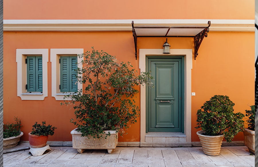
A pale grey can look convincing on a colour card and awkward beside orange roof tiles. A cream that looks soft on paper can seem too yellow next to the stonework around the front door. Choosing exterior house paint colours is easier when you start with what will stay: the roof, brickwork, windows and other finishes that the new paint must sit alongside.
Take stock of the colours already there
Walk around the house and separate the surfaces you intend to repaint from those you are keeping. Note the colours of exposed brick, stone, window frames and doors. These give you a starting palette before you open a paint chart.
Include the roofline in that assessment. Window frames, roof tiles and aluminum rain gutters all provide colour references, even when only the walls are being repainted. They can work together without matching exactly. Existing dark frames, for example, might provide all the contrast a pale façade needs.
Step back far enough to include adjoining houses and boundary walls in the view. Photographs help record how the elements fit together; make the colour comparisons at the property, where you can see the actual materials.
Look past the colour name
Two shades labelled “off-white” can look quite different side by side. One might lean towards yellow, another towards pink or grey. That underlying colour bias is the undertone. Compare neighbouring swatches, then hold them beside the brick or stone to see which differences become noticeable.
Choose colour families first, then individual shades. The following combinations give you starting points to test.
For warm red brick, compare a warm off-white with a more neutral stone shade. Look for a colour that sits comfortably alongside the brick while giving the painted walls their own identity.
Beside buff stone, try pale taupe against creamy white. If you want a stronger entrance colour, hold a deep aubergine sample beside each wall option. Assess the door and wall colours together so that the accent belongs to the scheme from the outset.
With grey roofing and dark window frames, a muted grey-green and a neutral off-white offer two possibilities. The brickwork, paving and daylight will help you choose between them.
Decide where you want contrast
A contrasting front door can draw attention to the entrance; a quieter door colour can leave the architecture or planting to lead. Decide which feature deserves that emphasis before choosing colours for every paintable detail. Outlining each sill, frame and panel can give them all equal prominence.
Assign colours a purpose: a main shade for the walls, a supporting colour for selected details and an optional accent. Keep this flexible. Existing brick, roofing and joinery already contribute variety, so a two-colour update might be enough.
For a partial repaint, compare samples beside the most conspicuous retained finish. If the windows are white, place the wall options directly alongside them. A subtle difference between two pale shades can become more noticeable when it repeats around every window.
Test the shortlist at the house
Narrow the wall options to two or three. Paint each on a separate board large enough to judge from a few steps away, following the sample product’s directions. Label the backs and allow the paint to dry according to the manufacturer’s guidance.
Move the boards beside brickwork, beneath windows and near the entrance. Check every elevation you plan to paint, including shaded areas, and return at different times of day. A colour seen in bright sunshine needs a second look where the house catches less light.
View the boards side by side to identify differences, then assess each on its own. The comparison reveals undertones; the individual view helps you judge the colour against the building.
From the pavement or garden path, look at the balance between the walls, roof and windows, and whether the entrance has the emphasis you intended. Keep brief notes, especially where a sample looks too yellow or too stark, so your decision reflects several observations.
Check the coating before you commit
Colour coordination and coating suitability are separate decisions. Masonry, timber and metal may require different products and preparation. Check guidance for each surface and its existing finish, particularly before considering changes to factory-finished components.
A sample board’s texture or sheen may differ from the finished wall. Confirm the intended exterior product and finish before ordering the full quantity.
Record the chosen colour, product and finish for each surface. A coherent repaint can leave much of the house exactly as it is.