Color Palettes of the World: Exploring Cultural Significance in Design
In the design world, colours are more than just arbitrary choices; they are potent narrative devices. Let us begin to discover the meanings behind the colors used in other cultures’ creations. Each hue’s rich stories, customs, and feelings are revealed, like removing the layers of a brilliant tapestry.
Colours have culturally specific connotations. Hence they are not universally understood. A society’s history, customs, and ideals are frequently strongly reflected in the colours used in a design. Exploring these color palettes reveals the cultural tapestry that shapes the visual language of various groups worldwide. Beyond linguistic boundaries, the range of colors ingrained in various civilizations offers tales of everything from the sun-kissed plains of Africa to the frigid depths of the Arctic.
African Hues: A Vibrant Connection to the Earth
The color palette of Africa reflects its warm and diverse landscapes, creating a visual symphony that represents a deep connection to the land. Earthy hues, such as deep browns and ochre reds, are evocative of the continent’s rich soil and represent the fertility and life-giving power of the planet. These colors, nicely balanced by vivid yellows and oranges, not only reflect the warmth of the African sun but also exude enthusiasm and vitality. These hues are deeply culturally significant, conveying stories of community, legacy, and the complex relationship between humans and their surroundings, even beyond their striking aesthetic value. These hues become storytellers in traditional African art and textiles, such as the colorful West African Kente cloth or the exquisite beadwork of the Maasai people, communicating the essence of African culture and the unbreakable relationship between its people and the natural environment. African colors go beyond just being visually pleasing, they also represent a strong connection between the culture and the varied landscapes that characterize the continent.

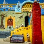
Nubian Homes: A Vibrant Tapestry of Tradition and Resilience
The resilient and adaptive nature of the Nubian people is reflected in their architecture, which has roots in a history that dates back to 2000 B.C.A riot of vivid colors, geometric patterns, and symbols covered the exteriors of many residences, turning them into canvases. The façade was ornamented with religious symbols, such as the hand of Fatima and the eye of the Islamic prophet, which functioned as defense mechanisms against malevolent entities. Nubian community architecture was also characterized by bright, cheerful colors and modern features like trains and airplanes, along with floral themes. The houses represent vibrant colors, customs, spirituality, and cultural identity.

Scandinavian Elegance: The Influence of Nature
The subtle impact of whispers from nature creates a visual masterpiece of Scandinavian grace. With its embrace of chilly and muted tones, the color scheme exudes a subtle refinement that draws inspiration from the frigid vistas of the Arctic. A symphony of harmonizing hues is created by cold blues and gentle greys that evoke the serenity of Nordic fjords and skies, along with crisp whites that capture the purity of snow-covered fields. Beyond just being beautiful, this minimalist style is a reflection of a societal love of practicality and simplicity. The deliberate use of colors in Scandinavian design creates a calming and harmonious ambiance that emulates the peaceful beauty of the natural world. It turns into a singular dance of luminous and muted colors, perfectly encapsulating the spirit of a society.

“India’s Chromatic Symphony: A Cultural Canvas of Hues”
The Holi festival is a vivid example of the deep cultural significance of colors within the kaleidoscope of Indian celebrations and culture. A visual display that surpasses aesthetics is created as jubilant revelers gleefully throw dazzling powders into the streets, creating a living canvas of hues. A deeper story, however, is hidden in the complex dance of hues, with reds signifying love and fertility, blues representing the divine, and yellows reflecting the radiance of the Indian sun. These hues become a vocabulary of emotions, deeply intertwined into the fabric of cultural expression, beyond the joyful jumble of colored powders. Beyond festivities, this rich color scheme can be seen in elaborately beaded traditional Indian textiles and colorful arts. These colors tell tales of history, community, and the enduring bonds that bind people to their varied environment, Colors become more than just paint when it comes to Indian festivals, culture, and architecture they become vivid brushstrokes that create a canvas of shared emotions and deep cultural meaning. India’s varied landscapes, from the colorful temples of the south to the vivid hues of the northeast, all find resonance in this rich spectrum. Every region justifies and exhibits a different color palette due to its own topography, culture, and architectural marvels. The colorful customs of the temples in the south blend harmoniously with the tranquil whiteness of the Himalayan north, illustrating the diversity inherent in every aspect of Indian life. India’s colors represent the country’s diverse personality and are not chosen at random, as seen in the elaborate patterns found in Rajasthani art and the vivid textiles of Gujarat. India’s colorful festivals, customs, and architecture all feature vivid colors that are more than just eye candy; they are a living reminder of the nation’s rich history and the ties that bind its citizens to the land. The wide range of colors acts as a mirror, reflecting the customs, tales, and ideals that weave India’s culture into a tapestry of unmatched depth.

South American Adobe: Architecture Inspired by Nature
A monument to the harmonious coexistence of human creativity and the natural world is South American Adobe architecture, with its color palette influenced by nature. Inspired by the soil itself, the color scheme is comprised of warm terracottas, sandy yellows, and deep browns. These earthy hues reflect a strong cultural respect for nature in addition to blending in beautifully with the surrounding scenery. The palette’s representation of environmentally friendly building methods and a desire to blend in with the surroundings is what gives it significance. Think of the ancient city of Machu Picchu, where the terracotta colors blend in perfectly with the mountainous background, producing a visual symphony that honors the Andes’ inherent grandeur. The colors used in South American Adobe architecture go beyond aesthetics to become a cultural language representing the idea of living in harmony with nature rather than subduing it. Not only is South American Adobe a building style, but it is also a cultural expression based on a symbiotic relationship with the environment, as each hue in this palette conveys a tale of the people’s deep connection to the soil.

“Chromatic Symphony: The Poetic Influence of Colour Palettes on the Human Mind”
Color palettes have a significant impact on the complex mental landscape of individuals, directing a subtle orchestration of feelings and senses. From the calming embrace of blues to the intense passion of reds, every color has a distinct resonance that speaks to the depths of human experience. Colors are more than just visual cues; they are also emotional triggers that convey emotions beyond language barriers. The serene greens convey the tranquility of nature, while the regal purples imply sophistication. Psychological signals are intertwined into the subtle dance of color; yellows convey happiness, while muted greys may represent introspection. Our moods, decision-making, and even physical well-being are all greatly impacted by this chromatic language.

Power of Pink: Painted Prison Cells to Calm Aggressive Inmates
Baker-Miller Pink, or ‘Drunk Tank Pink’, is a novel method for promoting composure and lowering aggression in the field of prison psychology. This unique color, which was made by combining a pint of red and a gallon of white paint, is very similar to the color of Pepto-Bismol. Alexander Schauss, the head of the American Institute for Biosocial Research in Tacoma, Washington, is credited for pioneering the soothing benefits of this particular pink in the late 1970s. A Swiss psychiatrist named Max Lüscher’s research connecting color choices to moods served as an inspiration for Schauss. Before doing strength tests, Schauss would expose his patients to either pink or blue cardboard to intentionally manipulate their mental and physical states.
The results were interesting: those who looked at the pink cardboard reported a significant decrease in strength (up to 26%) as compared to those who looked at the blue cardboard. Schauss claimed that this particular pink had a sedative effect, causing people to become calmer and lose energy via decreasing heart rate, pulse, and breathing. By calming hostility and fostering a calm atmosphere within prison walls, Baker-Miller Pink essentially functions as a visual sedative.

Colors, once simply pigments, morph into expressive storytellers, weaving tales of inheritance, love, and persistence. The famous artist Henri Matisse once said, “A thimbleful of red is redder than a bucketful,” which serves as a reminder that every color has a universe of stories hidden inside it that are just waiting to be discovered. Every culture in the world uses color to paint its narrative on the canvas of existence, just like a painter uses paint to create a masterpiece. It’s an invitation to consider hues as a silent language, a visual poetry symphony that speaks to all languages. Color palettes have cultural meaning that permeates our daily existence and serve as a constant reminder that every shade is a human being rather than just a paint stroke. When the stories behind each hue are revealed, a universal language that conveys volumes without the use of words a language woven into the very fabric of our common human experience becomes apparent.
References:
Christie.P (2023). The Psychology of Color: How Colors Influence Our Perception, Emotions, and Behavior, p.1. [online]. Available at https://www.printsignsquick.com/blog/the-psychology-of-color-how-colors-influence-our-perception-emotions-and-behavior[Accessed May 2023].
Meir .D (2023). “Color psychology: how colors impact human behavior and emotion”[online]. Available at https://www.wix.com/blog/color-psychology [Accessed Jan 2020].
Bishop.T (2021). “Does pink pacify prisoners? The criminal allure of Baker-Miller Pink” [online].Available at https://tombishop72.medium.com/does-pink-pacify-prisoners-the-criminal-allure-of-baker-miller-pink-4486e1773c61 [Accessed Jan 2020].
Radhwan,Ahmed. (2015).Color in Architecture is it Just an Aesthetic Value or a True Human Need?. IJERC, Volume (2015), Page 102. Available from: https://www.researchgate.net/publication/308439013_Color_in_Architecture_is_it_Just_an_Aesthetic_Value_or_a_True_Human_Need [Accessed: December, 2015].