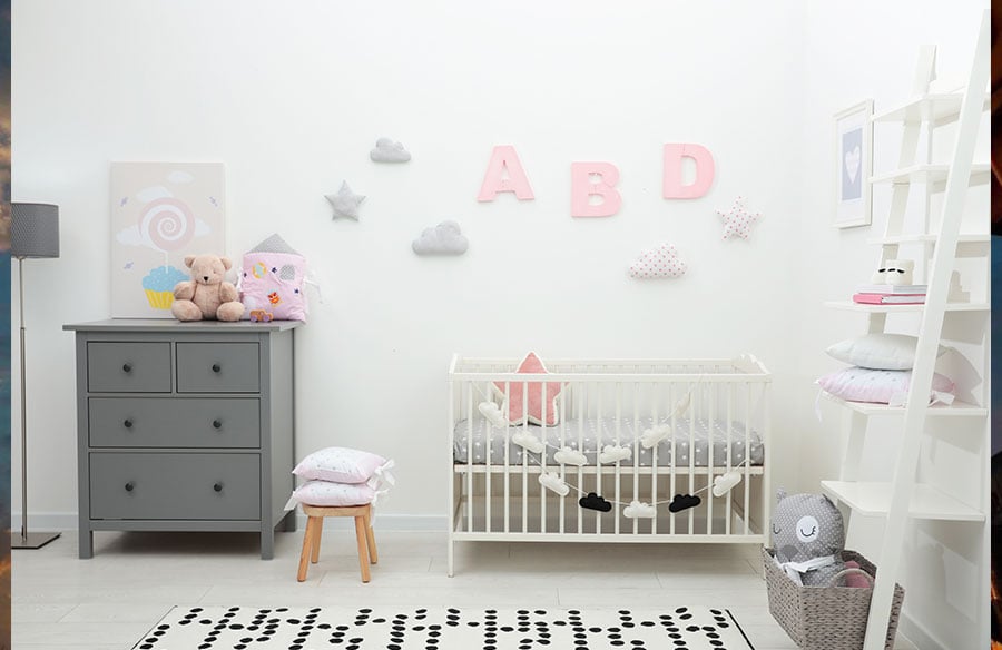
A nursery can change surprisingly quickly. The cot becomes a bed, pastel animals give way to posters, and the carefully coordinated room develops a personality of its own. Nursery wall letters are different from most baby-room decorations because the name itself never becomes outdated.
That makes them worth choosing with more than the next two or three years in mind. The question is not simply whether the letters suit a nursery today, but whether they will still feel at home in the room when its owner is seven, ten or even older.
What you will learn
- How to apply the “age-seven test” before buying wall decor
- The practical differences between fabric, wood, plastic and ceramic letters
- Where and how to mount letters in a child’s room
- Why colour matching can create problems later
- How to plan the spacing before making holes in the wall
Start with the age-seven test
Before buying any personalised nursery decoration, picture it in the room of a seven-year-old.
Letters shaped like cartoon animals may be charming during the baby years, but their appeal often has a clear expiry date. A child’s name in a simple, well-proportioned typeface has a better chance of lasting because it reads as personal rather than purely decorative.
This test does not mean every nursery needs to be neutral or minimalist. It simply helps separate the things that are likely to stay from those that will be replaced during the first room makeover.
The typeface matters as much as the material. Clean shapes generally adapt more easily to new bedding, wall colours and furniture. Highly themed lettering can work beautifully, but only if you are comfortable with the possibility that it will feel too young later.
Choosing materials for nursery wall letters
There is no universally best material. The right choice depends on where the letters will be displayed, how permanent the installation should be and how much everyday wear they are likely to receive.
Fabric and foam letters are light and usually easy to hang. They suit temporary arrangements, although textured surfaces can collect dust and softer designs may feel noticeably tied to the baby stage.
Wood and painted MDF offer more visual weight while remaining available in a wide range of styles. Before buying, look closely at the finish, particularly around the edges. Those are the areas most likely to show chips or wear if the letters are moved or regularly touched.
Plastic is practical, lightweight and easy to wipe clean. Its main limitation is aesthetic: in a room with natural materials and carefully chosen furniture, the finish may look less considered than it did in the product photograph.
Ceramic letters feel more like permanent decorative objects. They have a substantial finish and can usually be cleaned with a soft, damp cloth, but their weight and breakability make placement especially important.
One practical example comes from Letters of Clay, whose ceramic wall letters for a nursery are made by hand from white clay. According to the maker, the letters are glazed, fired a second time and produced in a 12 cm height, with pre-drilled holes available for wall mounting. This kind of construction suits parents looking for something that can move from a nursery into an older child’s room without immediately looking out of place.
Safer mounting starts with the location
It is tempting to place a child’s name directly above the cot because that is often the room’s visual centre. For hard or heavy objects, however, the safer decision is to choose another location: a side wall, the space above a low storage unit or an area near the bedroom door.
The fixing method should match both the product and the wall. Plasterboard, masonry and timber walls require different hardware, and the fittings supplied with a decorative item may not be suitable for every surface. Follow the maker’s instructions and ask a professional if the wall type or fixing method is unclear.
Adhesive mounting can be convenient in rented homes, but it should not be treated as a universal solution. Its reliability depends on the weight of the item, the adhesive itself, the wall finish, dust, moisture and even how recently the wall was painted.
Whatever method you choose, keep the letters out of reach as the child grows and the cot mattress or furniture arrangement changes. Check the fixings after moving furniture and whenever a letter begins to shift. A secure installation is not something to assume once and forget.
The colour mistake that appears during the first repaint
One of the easiest mistakes is matching the letters too precisely to nursery textiles. Bedding, curtains and rugs are often among the first things to change, leaving an expensive set of letters tied to a colour scheme that no longer exists.
Two approaches tend to age more comfortably.
The first is to take colour cues from the room’s fixed elements: flooring, wardrobes, shelving or other furniture likely to stay for several years. The second is to treat the name as a deliberate accent. In that case, the letters do not need to match everything else; they only need to look intentional.
Before ordering, place colour samples against the actual wall and look at them in daylight and artificial light. Product photographs taken in a bright studio can make a muted colour appear lighter or warmer than it will in the room.
If you are choosing the letters as a gift, ask the parents for a photograph of the wall rather than relying on the phrase “the room is beige”. Beige can mean anything from cool grey to warm sand, and those differences become obvious once the letters are mounted.
Plan the full name, not one letter at a time
Spacing is often the difference between a name that looks designed and one that appears slightly improvised. The safest method is also the simplest: trace or print each letter at full size, cut out the shapes and temporarily attach the paper versions to the wall.
This reveals problems that measurements alone can miss. A narrow “I” needs different visual spacing from a wide “M”, while round letters can appear farther apart even when the measured gaps are identical. Longer names may also need a smaller overall scale or a different wall than originally planned.
Step back and view the mock-up from the doorway, not only from directly in front of it. The name should relate to the furniture without being squeezed into the exact width of a cot or bed. Furniture changes; the wall installation may not.
Busy wallpaper creates another challenge. Letters with subtle colours or detailed shapes can disappear against a patterned background. In that situation, a calmer wall or a stronger contrast usually works better than adding more decoration around the name.
When a permanent installation is not the right choice
Ceramic or wooden letters make sense when the child is likely to use the room for years and the family is comfortable making a lasting installation. They are less practical when the family moves frequently, cannot drill into the walls or uses the nursery as a guest room.
A framed name print, removable decal or lightweight textile banner may be the more sensible option in those situations. It can still give the child a clear sense of ownership without creating problems at the end of a tenancy.
This is also worth considering when buying a personalised gift. Before ordering, confirm the spelling, colour preference and whether the family can mount the item in their home. A beautiful gift is less useful if it has to remain in its box because the chosen wall cannot support it.
Choose for the room that comes next
The best nursery wall letters do not need to predict a child’s future taste. They simply need enough material quality and visual restraint to survive the room’s next stage.
Choose the location before choosing the mounting method. Compare colours with the parts of the room that will remain, not only with the current bedding. Most importantly, look at the letters as something personal rather than temporary nursery styling.
The room will change—probably sooner than expected. The child’s name is the part that should still belong.