In 1914, a San Francisco surgeon named Harry Sherman decided his operating room was the wrong colour. Electric lighting had just arrived in hospitals, and under it, white walls threw so much glare that Sherman could no longer read the texture of a wound. So he redid the whole room in what he called spinach green: walls, floor, sheets, towels. Green sits opposite red on the colour wheel, which meant the after-images that floated across his vision every time he looked up from the surgical field simply vanished into the background.
It worked. Other surgeons copied him. A century later, most of us still walk into medical buildings painted in some descendant of that decision, and most of us assume the colour means clean.
The patient was never the client
Look at how hospital colour was justified historically and the patient barely appears. White signalled the laundry could be boiled. Green and blue reduced surgeon eye strain and hid the stains that white advertised. Stainless steel wiped down. Vinyl coved up the wall so dirt had nowhere to sit in the corner. Every one of those choices is defensible. None of them was ever asked to make anyone feel better.
Dentistry inherited this wholesale, and dentistry is the worst possible place for it. The dental patient is conscious. They are horizontal, immobilised, unable to speak, and staring at a ceiling tile for ninety minutes. Somewhere between a third and half of adults report meaningful dental anxiety. Whatever the room is doing, it is doing it to a person who has nothing else to look at and no way to leave politely.
Where the beige has to stop
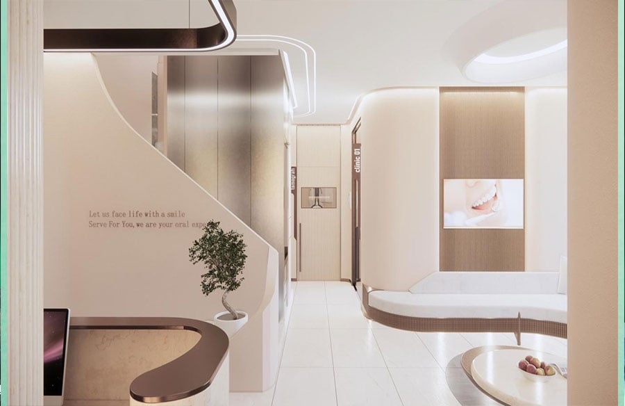
So the new clinic palette is champagne, sand, bone, warm plaster, unlacquered brass going slowly brown, oak, travertine, wool bouclé in the lounge. It reads as hotel, and the cynical reading is that this is exactly the point, yet that reading is incomplete, because the palette has a hard technical boundary that no interior designer gets to argue with.
Ceramic shade matching is colorimetry. A technician selecting the enamel translucency for a zirconia crown is making a judgement about a semi-translucent material against a background, under a light source, with an eye that adapts to whatever it has been looking at for the previous minute. Warm walls throw a warm cast. Saturated colours leave after-images. Get it wrong and the crown that looked perfect in the shade room reads yellow in daylight, permanently, for the next fifteen years.
Reception, corridors, lounges, recovery: warm, tonal, low-contrast, doing the psychological work. Shade-matching areas and the surgical suite: chromatically neutral, controlled illumination, no borrowed colour from adjacent surfaces.
Istanbul builds a type that did not exist
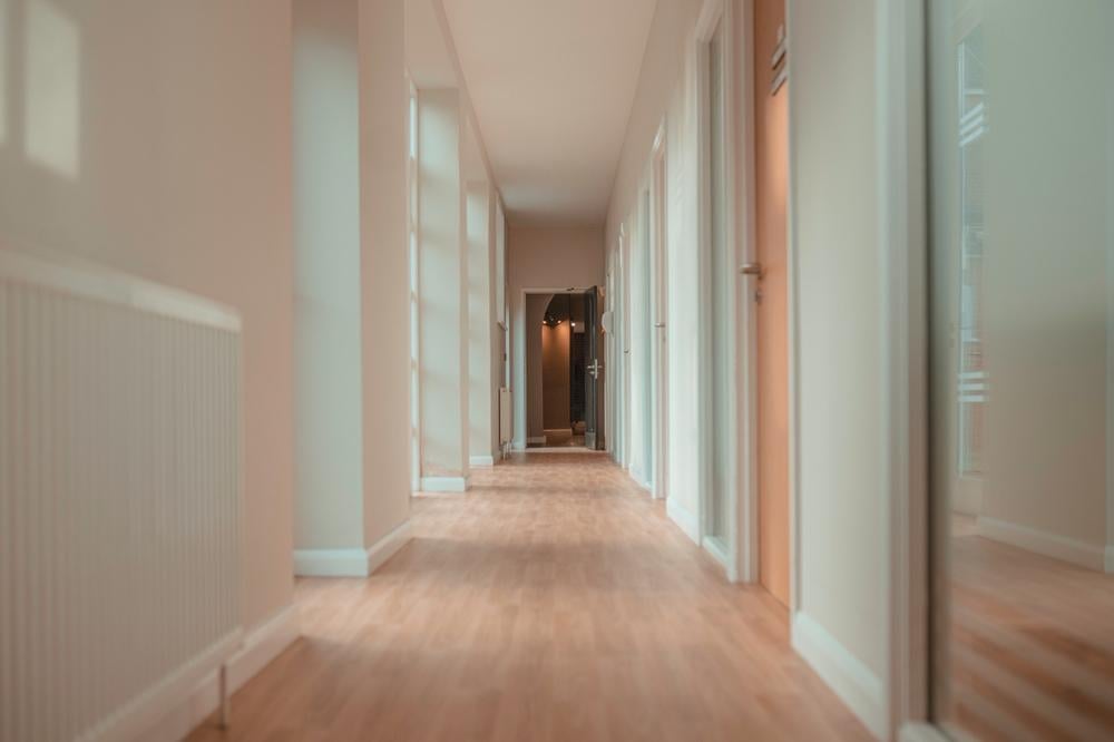 A patient flying for full mouth dental implants in Turkey is in the city for seven to ten days, returning to the same building repeatedly, in various states of post-surgical discomfort, usually accompanied. Stack that up and you get a hybrid surgical facility, CAD/CAM ceramics laboratory, and something close to a small hotel, on a constrained urban plot, usually within walking distance of the patient’s accommodation.
The beauty of this is how palette follows the geography. Warm limestone, worn marble, brass, and low filtered light are historically typical in hammams. Istanbul has spent five centuries designing spaces for people who are half-undressed, physically vulnerable, and being handled by a stranger. The material vocabulary for that condition already exists.
What nobody designs for
There is one problem the champagne palette cannot solve. The dental drill runs its worst energy somewhere around 4 to 8 kHz, which is roughly where human hearing is most sensitive.
The clinic is acoustically a bathroom. That sound travels, and it travels to the waiting room, where it does its work on somebody who has not been treated yet.
You can tell a serious clinic interior from a decorated one in about four seconds, and it has nothing to do with the colour. Stand in reception and listen. If the room went to the trouble of getting quiet, somebody was thinking about the patient. If it just went beige, somebody was thinking about the photograph.