Bauhaus Font – Fonts for Architects
The intersection of graphic design and architecture often leads to innovative outcomes, and one notable element that has stood the test of time is the Bauhaus font. Originating from the influential Bauhaus school of design in the early 20th century, this distinctive typeface has become a symbol of modernist principles, simplicity, and functionality. In this comprehensive exploration, we delve into the history, characteristics, and practical applications of Bauhaus fonts, shedding light on how architects can integrate them into their portfolios for impactful visual communication.
Understanding the Roots: Bauhaus School and Its Influence on Typography
Bauhaus School: Pioneers of Modernist Design
The Bauhaus school, founded in 1919 in Weimar, Germany, played a pivotal role in shaping modernist design principles. Led by visionary figures like Walter Gropius, the school aimed to unify art, craft, and technology, promoting a holistic approach to design. Typography emerged as a significant component of Bauhaus design philosophy, leading to the development of the iconic Bauhaus font.
The Birth of Bauhaus Fonts
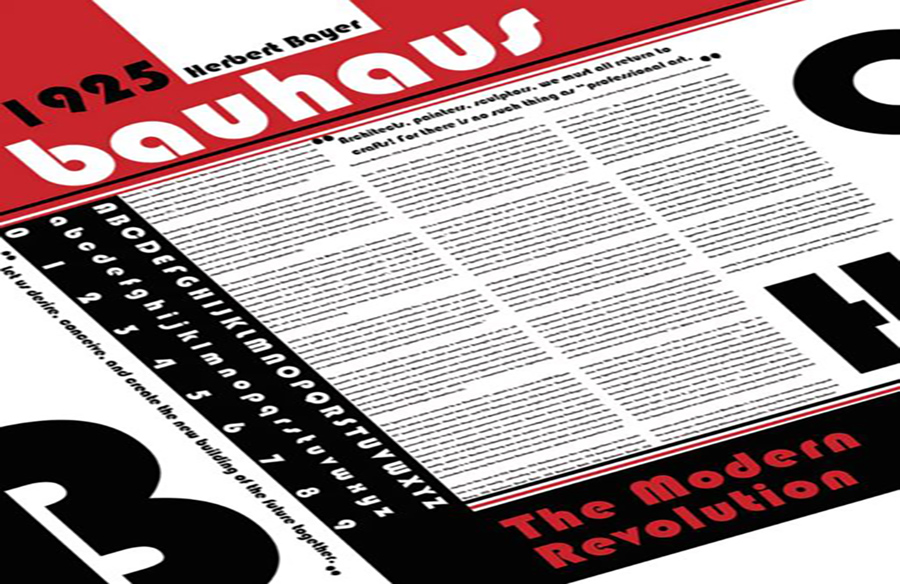
The Bauhaus font, characterized by geometric shapes, clean lines, and a minimalist aesthetic, reflects the school’s commitment to functional design. Key figures such as Herbert Bayer, a Bauhaus master, contributed to the development of these fonts. The most famous among them, the Universal Typeface, exemplifies the Bauhaus commitment to clarity and universality.
Deconstructing Bauhaus Fonts: Key Characteristics
Geometric Precision
Bauhaus fonts are renowned for their reliance on geometric shapes, particularly squares, circles, and triangles. This geometric precision imparts a sense of order and clarity to the typeface, aligning with the Bauhaus emphasis on functionality.
Minimalist Approach
Simplicity is a hallmark of Bauhaus design, and this is evident in its fonts. Stripped of unnecessary embellishments, Bauhaus fonts embody a minimalist ethos, fostering legibility and visual harmony.
Asymmetry and Balance
While maintaining geometric precision, Bauhaus fonts often embrace asymmetry to create dynamic compositions. The careful balance between asymmetry and geometric order is a testament to the nuanced design thinking ingrained in the Bauhaus tradition.
Applications of Bauhaus Fonts in Graphic Design
Brand Identity and Logos
Bauhaus fonts are widely utilized in brand identity and logo design. Their clean lines and modern aesthetic make them ideal for conveying a sense of professionalism and innovation. Companies seeking a timeless yet contemporary image often turn to Bauhaus-inspired typography.
Editorial Design
In editorial design, Bauhaus fonts are employed to enhance readability while adding a touch of modernity. Magazines, books, and newspapers leverage these fonts to create layouts that are visually engaging and intellectually stimulating.
Bauhaus Fonts in Architectural Portfolios: A Visual Language for Designers
Creating a Cohesive Visual Identity
Architectural portfolios serve as a visual representation of a designer’s body of work. Incorporating Bauhaus fonts into portfolio design can establish a cohesive visual identity, reflecting the architect’s commitment to modernist principles.
Highlighting Clean Lines in Project Descriptions
When showcasing architectural projects, the use of Bauhaus fonts in project descriptions can emphasize clean lines, drawing attention to the precision and thoughtfulness behind the designs. This not only enhances readability but also contributes to a visually unified presentation.
Infusing Modernity into Presentation Graphics
Bauhaus fonts can be seamlessly integrated into presentation graphics, elevating the overall aesthetic and conveying a sense of contemporary design sensibility. Whether used in titles, captions, or annotations, these fonts add a layer of sophistication to the visual narrative.
Real-world Examples: Architects Mastering Bauhaus Typography
Norman Foster: Embracing Modernist Typography
Renowned architect Sir Norman Foster incorporates Bauhaus-inspired typography in his portfolio, aligning with his commitment to sleek, contemporary design. The use of clean lines and sans-serif fonts complements the presentation of his iconic architectural projects.
Zaha Hadid Architects: Dynamic Typography for Dynamic Designs
Zaha Hadid Architects, known for their avant-garde designs, leverage Bauhaus fonts to infuse a sense of dynamism into their portfolio. The combination of asymmetrical layouts and geometric typography reflects the studio’s innovative approach to architecture.
Conclusion: Bauhaus Fonts as Timeless Tools for Architectural Expression
In conclusion, the Bauhaus font stands as a testament to the enduring influence of the Bauhaus school on design disciplines. Its geometric precision, minimalist approach, and dynamic qualities make it a versatile tool for architects looking to enhance their visual communication. By integrating Bauhaus fonts into architectural portfolios, designers can create a narrative that not only communicates their projects effectively but also pays homage to a rich tradition of modernist design.
Unlock the potential of Bauhaus fonts in your architectural portfolio. Embrace the timeless elegance of geometric precision and minimalist aesthetics to elevate your designs and captivate your audience.