Paper has become an integral element in books and publications due to its softness. It serves as a medium to record and convey information, allowing the audience to interact with the content.
Organizer: Design Shanghai
Project Name: Design Anthology
Location: Shanghai, China
Completion Date: 2023.6.8
Design in charge: Tommy Yu
Project Designers: valo Xiao, CoCo Lee
Animation Design: ViVi Lee
Log Customized: Benmoo
Lighting Solution: Uniimport
Graphic Design: Sac Design
Art Support: X+Q Art
Photographer: Xinghao Liu
Project Overview:
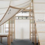
This project was invited by “Design Anthology” (referred to as “da” hereafter) and was exhibited in Shanghai for four days upon its completion in 2023. “Design Anthology” (da) is a magazine that blends design and art, akin to an archive. Embracing the theme of the invitation, “Archive,” we sought inspiration and expressed design concepts sourced from the magazine itself.
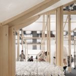
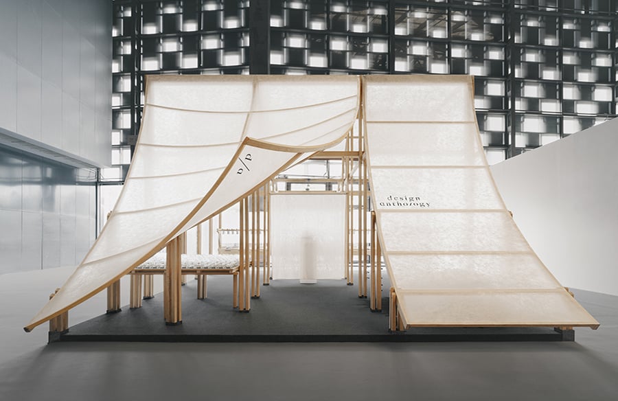
Our approach involved creating a dynamic and sustainable exhibition hall that evoked the act of flipping through the pages of the magazine.
Part 1: Exploring
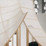
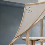
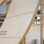
At the entrance, an elevated corner design resembles a page about to be turned, immersing visitors in a captivating “reading atmosphere.”
Peeking through the cracks fosters a sense of exploration and curiosity, harmonizing with the understated elegance characteristic of traditional Chinese architecture and culture.
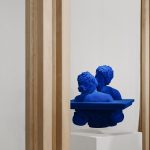
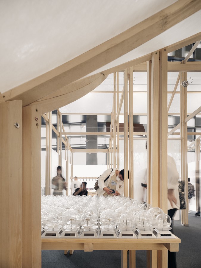
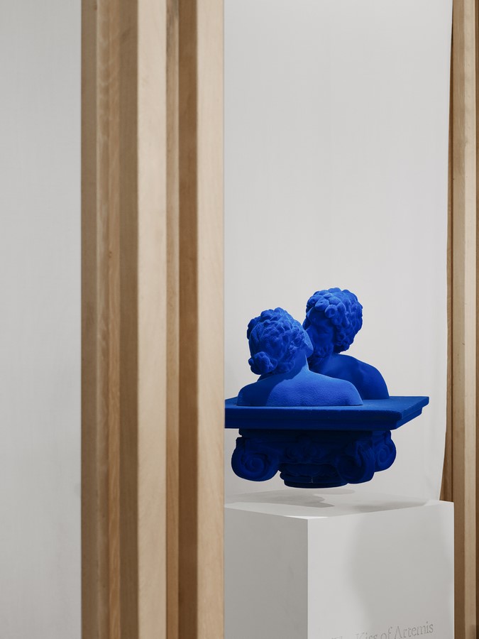
The scattered artworks throughout the area ensured that visitors experienced distinct surprises at each juncture of their journey through the exhibition.
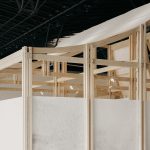
The main structure, built with sustainable natural wood, achieves a holistic construction. Blending contemporary design with traditional architectural techniques demonstrates the practicality of combining form and structure, offering a feasible approach for future flexible dismantling, swift transportation, and multiple cycles of use.
The exterior skin, wrapped in washi paper, resonates with the theme. Soft partitions, crafted from the same material, provide a sense of openness and fluidity within the space, separating active and quiet areas.
Part 2: Archive
Books and publications, like “archives,” sift through vast information, carrying creative ideas and inspiring inspirations.
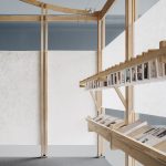
To complement the sense of lightness and transparency in the building, conventional hanging light fixtures have been replaced with light lines hidden in woodworking grooves, harmoniously blending traditional woodworking structures with contemporary design aesthetics.
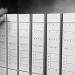
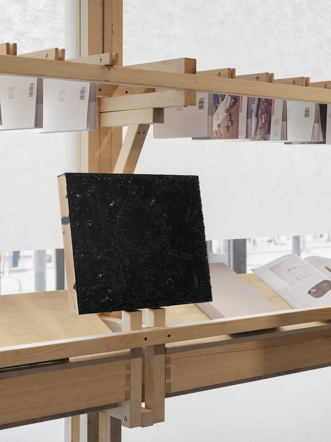
The space has been divided into various sections, each presenting different content and styles of presentation. These sections showcase artworks and exhibitions from different artists, offering an immersive experience for visitors to explore. The display of previous issues of the “Design Anthology” magazine on traditional magazine racks is clearly organized and easily accessible.
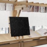
In addition to the conventional reading experience, small material board installations have been incorporated into the magazine racks, presenting different textures and facets for a multi-dimensional experience.
Various ecological combinations of art and design create a utopian environment where people can gather and communicate.
Washi paper, consistently used throughout the space to connect different modules and contents, becomes a defining element in the spatial design.
Part 3: Lift Up
Inspired by the character “翹” (qiào), which shares the same meaning as “翘” (qiào), we find inspiration in its form and phonetics.
One of the inspirations comes from the character “垚,” which derives from traditional architectural structures resembling three layers of soil, akin to the dougong structure representing the beam and column structure in Chinese architecture. Another source of inspiration is the character “兀,” derived from the shape of ancient building eaves, representing the shape of a roof. The character “羽,” derived from the sound of “yao” in ancient texts, symbolizes the long feathers of a bird and its light and graceful posture, echoed in the material used for the project. Ultimately, the character’s shape, denoting being raised high, transcends its original definition recorded in ancient books, resonating with aspiration and innovation.
Through vivid and dynamic expressions that align with ancient meanings, we seek to renew and revitalize these characters.