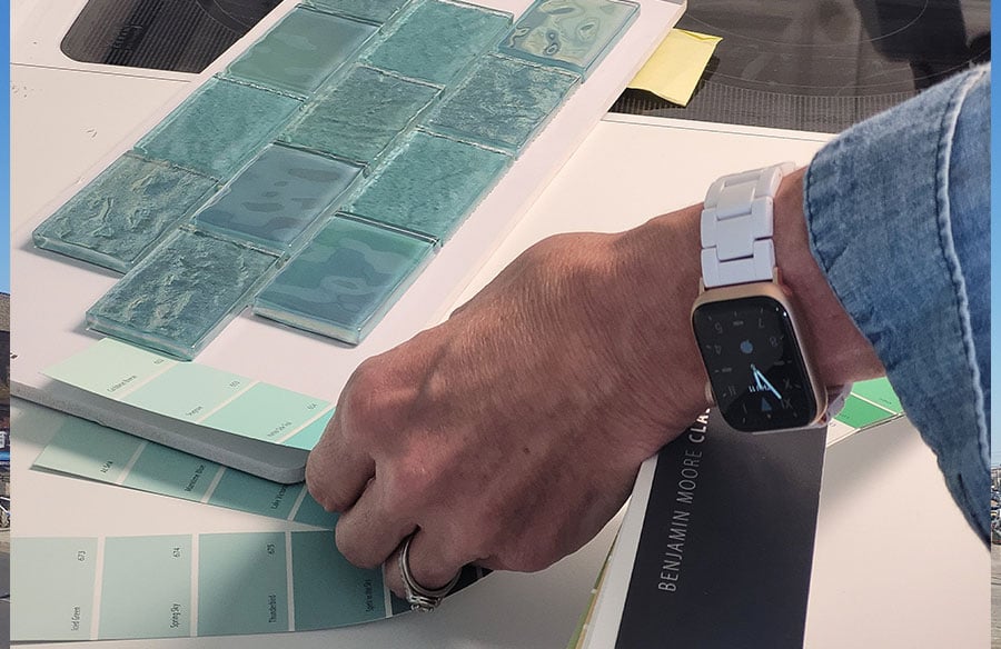
Colors have never taken a neutral stance. They were rich in meaning, identity, and significance.
Cities have historically used color to communicate identity, power, religion, climate adaptation, and social belonging.
Think of the blue streets of Chefchaouen, the painted coastal settlements of the Mediterranean, or the indigo-rich craft traditions that continue to influence contemporary design. Color functions as architecture’s silent language.
Yet modern architecture spent decades prioritizing minimal palettes. White facades, exposed concrete, black metal frames, and glass. Material honesty became the dominant conversation.
Now the pendulum appears to be moving.
Architects are increasingly using blue as a strategic design element rather than decorative surface treatment. The result is not a singular style. Instead, it appears in multiple forms, from ceramic cladding and anodized metal to tinted glass and immersive interior environments.
The objective varies, but the impact rarely does. The most important thing happens silently, and that’s people noticing the shift.
Color influences perception across many design disciplines, not just architecture. In luxury watchmaking, for example, blue has become a defining design element because it conveys elegance, depth, and timeless appeal without appearing overly dramatic.
Collectors who browse Cartier models in blue often appreciate how subtle variations in dial color transform the overall character of a watch. The same design principle applies to architecture, where carefully selected shades of blue can influence how buildings are perceived long before occupants experience the spaces within them.
The Psychological Appeal of Blue in Architecture
Blue occupies a unique place in environmental perception. Unlike highly stimulating colors that immediately demand attention, blue tends to create a sense of spatial depth. Rooms appear calmer. Facades seem less aggressive. Public spaces feel easier to inhabit for longer periods.
It is one of the reasons healthcare facilities, educational environments, and hospitality projects increasingly integrate blue into their design strategies. The relationship goes beyond aesthetics.
Many architects describe color selection as part of environmental programming. A building influences behavior long before a user interacts with furniture, signage, or technology. Color helps establish expectations.
Table 1
| Design Objective | How Blue Contributes |
| Visual calm | Reduces perceived intensity |
| Wayfinding | Creates identifiable zones |
| Cultural identity | Reflects local narratives and traditions |
| Interior comfort | Encourages relaxed occupancy |
| Urban recognition | Strengthens landmark visibility |
Blue and Climate-Responsive Design
Research in environmental psychology suggests that colour can influence how people perceive and experience built environments, affecting factors such as comfort, orientation, and emotional response. While colour alone cannot determine the success of a space, thoughtful application alongside architecture, lighting, and materials can contribute to more positive user experiences. The Interaction Design Foundation provides an overview of colour psychology and its role in shaping human perception across different design contexts.
There is another reason architects are revisiting blue, and that’s climate. Most contemporary architecture now seeks a strong relationship with their surrounding.
In this setting, you can no longer view buildings as isolated objects. Architects are increasingly focusing on designs that blend into and become part of larger ecological systems.
As a color, blue can easily create that synergy and relation with nature. Blue breathes better in relation to the sky, the water, and the seasonal changes. It also creates a positive visual impact with large developments.
Especially in the coastal region, buildings and architecture built with blue create a stronger dialogue between the natural environment and what’s man-made.
Something subtle happens when a building visually echoes its context. The structure appears less imposed and more integrated.
This does not automatically make a project sustainable. That would be an oversimplification. Still, visual harmony contributes to how communities perceive environmental responsibility and long-term stewardship.
Cultural Narratives Hidden in a Single Color
Architecture is rarely seen without its background. The color blue has meanings in various regions.
In some places, blue represents spirituality. In other areas, it stands for protection, prosperity, good craftsmanship, or a link to nature.
Modern architects often use these meanings when they turn stories into new designs.
The hard part is not just using blue for show.
Good projects do not just use paint and say they are culturally important. They look into building materials, traditional ways of building, local craft skills, and old patterns.
The architecture feels real because the color blue comes from the situation, not from trying to look a certain way. This difference is important. People can usually tell if a building truly understands and respects culture or if it is just borrowing some ideas for looks.
Buildings that thoughtfully engage with identity tend to stay relevant for a longer time.
When Blue Becomes Urban Infrastructure
A fascinating development can be observed in public architecture.
Blue is increasingly used as an urban navigation tool. Transportation hubs, waterfront promenades, parks, civic spaces, and mixed-use developments frequently employ blue tones to establish coherence across large and complex environments. The color becomes more than decoration. It operates as infrastructure.
People intuitively follow visual cues. Consistent color strategies reduce confusion and improve legibility within dense urban settings. Architects and urban designers understand this principle well. The strongest public spaces often rely on subtle visual systems rather than excessive signage.
Blue performs particularly well because it remains visible without feeling intrusive. That balance is difficult to achieve.
Material Innovation and the New Blue Palette
The definition of architectural color has changed dramatically in recent years.
Historically, blue often arrived through paint. Today, architects have access to an expanding range of materials capable of expressing blue in more dynamic ways. Ceramic panels, textured concrete additives, recyclable composites, specialized glazing systems, and oxidized metals all create distinct visual effects.
The result is greater depth.
A blue surface may appear bright in the morning, muted during overcast conditions, and almost metallic at sunset. Architecture becomes more responsive to changing environmental conditions.
Comparison Chart: Traditional Versus Contemporary Applications
| Aspect | Traditional Approach | Contemporary Approach |
| Primary medium | Paint | Integrated material systems |
| Visual behavior | Static | Dynamic and light-responsive |
| Maintenance strategy | Surface repainting | Long-life material performance |
| Design purpose | Decoration | Environmental and experiential tool |
| User interaction | Passive | Sensory and contextual |
This evolution explains why contemporary blue architecture often feels richer than earlier examples. The color is embedded into material expression rather than layered onto it.
The Risk of Overusing Architectural Color
Not every building benefits from bold chromatic expression. This is where many projects struggle.
As enthusiasm for color grows, some developments risk treating blue as a universal solution. Strong visual identities can quickly become visual noise when disconnected from site conditions, program requirements, or user needs. Architecture demands restraint.
A successful blue facade is not successful because it is blue. It succeeds because color reinforces a larger design intention. Without that foundation, even the most striking palette can feel arbitrary. Good architecture remains rooted in purpose. Color simply amplifies it.
Why Blue Is Becoming Architecture’s Quiet Power Move
Let’s face the truth. The presence of blue in contemporary architecture isn’t a passing trend. It’s a statement; it’s growing and is here to stay. The color reflects strong conversations about well-being, place-making, cultural, and environmental awareness,
As a civilization, we have learned to see buildings as more than constructions merely to shelter us. These are rather establishments that communicate our values, support communities, and respond to different contexts to create memorable experiences. That’s why colors matter more and more these days.
Blue, as a color, doesn’t demand too much attention. But it’s also not a color to overlook. It calls us in its own tranquil and natural way, and shapes perception gradually. When it comes to shaping architectural decisions, blue isn’t the loudest color. Rather, it’s an influential one with a real statement.