Architects talk about materials being honest. Brick should look like brick, timber should show its grain, and concrete is allowed to keep the marks of its formwork. Packaging designers rarely use that language, yet the same instinct decides whether a box feels considered or cheap. The colour sits on a surface, the surface has a finish, and the finish changes how light lands on the whole object. Get those three layers working together and even a plain carton reads as designed. Let them pull against each other and no logo will save it.
This piece looks at three small packaging decisions that show the idea clearly. A food box in black, a retail box in pink, and a label with a raised surface. None of them are expensive choices, and all three depend more on finish than on ink.
Why the Finish Matters as Much as the Colour
A colour swatch on a screen is a flat, lit rectangle. A printed box is a three-dimensional object under kitchen lights, shop spotlights or daylight through a window. The same black can look like velvet or like plastic depending on what is laid over it.
The three finishes most packaging printers offer are gloss, matte and spot UV, and each one treats light differently.
- Gloss reflects most of the light that hits it, which makes colours look deeper and more saturated but also shows every fingerprint and highlight.
- Matte scatters the light, so colours look softer and the surface reads as calmer and more tactile.
- Spot UV is a clear gloss applied only to selected areas, usually a logo or pattern, so a single element catches the light while the rest stays quiet.
- Soft touch is a matte variant with a slightly velvety feel, often chosen where the hand will meet the box before the eye does.
Designers who come from architecture or interiors will recognise the logic. It is the same reason a polished plaster wall and a limewashed one can share a paint colour and look nothing alike.
Black as a Food Packaging Material
Black is an unusual choice for food. For years takeaway packaging defaulted to white or brown because both look clean and cost little to print. Black breaks that habit, and the effect is strong because the food becomes the only colour in view.
The better versions of this idea keep the inside white. A black exterior gives the box a sharp, modern presence on the counter, and the white interior makes the food look brighter when the lid opens. It is the same trick a gallery uses when it paints the walls dark and lights the work.
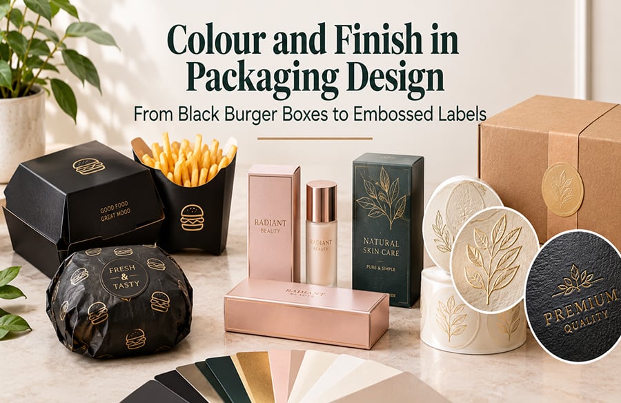
Practical details matter more here than with almost any other colour. A burger box has to cope with heat, steam and grease, so the board and its lining do as much work as the print. Well-made custom black burger boxes are typically built from white SBS card or corrugated board, with a food-safe, grease-resistant coating on the inside so oil does not seep through and mark the black surface. A standard size sits around 6 by 6 by 1.75 inches, with larger formats for stacked or oversized builds.
Finish decides how the black behaves in the hand. Gloss lamination gives a shiny, upscale look, matte lamination gives a quieter and more modern one, and spot UV lets a logo shine against a matte field. Foil stamping in gold or silver is the step further for brands that want a little metal in the mix.
Pink and the Problem of Colour Consistency
Pink carries more cultural weight than most packaging colours. Bakeries, fashion labels and event planners use it because it signals gift, celebration or care before anyone reads a word. That same weight is what makes it risky. A pink that drifts towards salmon or towards lilac between print runs looks careless, and customers notice.
This is where the print method matters. CMYK builds colour from four process inks, which works for photographs and gradients. A Pantone match mixes a single ink to an exact reference, which is the safer route when the colour itself is the brand. For a business that reorders boxes several times a year, specifying the Pantone reference once saves arguments later.
The shape and size of the box shape the colour too. A small 4 by 4 by 3 inch gift box shows pink as an accent you hold in one hand. A 14 by 10 by 8 inch shipping box turns it into a block of colour on a doorstep. Ordering custom pink packaging boxes in more than one size lets a brand use the same shade at both scales, and runs commonly start at 100 units with production taking around 7 to 10 business days.
Finishing once again shifts the result. Gloss makes pink sweeter and brighter. Matte and soft touch push it towards something more grown up. Anti-scratch coatings are worth considering on boxes that will be stacked and handled, because pale colours show scuffs quickly. Embossed logos, foil stamping and window patches are all available on these boxes, though using all three at once tends to fight the colour rather than support it.
Raised Surfaces and the Sense of Touch
Embossing moves the conversation from colour to form. A metal die and pressure push the material upward, creating a raised pattern that catches light along its edges. Even without ink, the shape throws small shadows and highlights, which is why embossing works so well on quiet, pale or single-colour designs.
There are a few distinct approaches, and they suit different moods.
| Embossing style | What it looks like | Where it tends to work |
| Blind embossing | Raised shape with no added colour | Understated luxury and professional labels |
| 3D embossing | Several levels of depth, almost sculptural | Bold retail and promotional pieces |
| Gold embossing | Raised shape combined with gold foil | Jewellery, cosmetics and gift items |
For brands that cannot justify embossing a whole box, a label is the practical way in. Small embossed stickers bring the raised effect to plain kraft or white packaging at a fraction of the tooling cost. They are made on vinyl, coated paper or specialty foils, and a matte coating is often the best partner, because a non-reflective surface lets the relief do the talking. Spot UV can pick out a single raised element for extra contrast. Minimum runs start at around 100 pieces, which makes this one of the cheapest ways for a small studio to add a crafted detail.
A Simple Process for Choosing Colour and Finish Together
Decisions about colour and finish go wrong when they are made separately, usually because the colour is chosen on screen and the finish is picked later from a price list. A better order looks like this.
- Decide where the packaging will be seen most, whether on a counter, a shelf, a doorstep or a social media feed.
- Choose the base material next, since kraft, white SBS and corrugated board all take colour differently.
- Pick the colour against that material, and fix it with a Pantone reference if it has to stay consistent.
- Choose one main finish for the whole surface, gloss, matte or soft touch.
- Add at most one accent, such as spot UV, foil or embossing, and place it where the hand or eye lands first.
- Ask for a physical sample or proof before committing, because no screen shows how a finish handles light.
The fifth step is where most designs either succeed or fall apart. One accent reads as intent. Three accents read as a sample book.
What Designers Can Borrow From Architecture
Good buildings rarely use more than a handful of materials, and each one is allowed to be itself. Packaging benefits from the same restraint. A black box with a white interior and a matte surface is a complete idea. A pink box with a single embossed logo is a complete idea. A kraft carton finished with one raised label is a complete idea too.
The urge with packaging is to add, because every extra finish seems cheap on its own. The more useful question is what the surface is already doing and how light will move across it. Answer that first and the right colour usually becomes obvious.
Restraint as a Design Choice
Colour gets the attention, but finish is what people remember when they pick a box up. The black that stays matte under a café light, the pink that looks the same on every reorder, the small raised mark that a thumb finds without looking. These are modest details, and they are exactly the ones that make packaging feel designed rather than merely printed.