
Picking a paint color feels simple until you are standing in the store holding forty near-identical strips of white. The truth is that the “right” color depends less on the shade itself and more on the room it lives in: how much light it gets, which way the windows face, how the space gets used, and what finish will survive daily life there. A color that looks calm and elegant in a north-facing bedroom can turn flat and grey in a dim hallway.
This guide walks through how to choose paint colors room by room, starting with the three factors that decide everything, then moving through each space in the house with practical color and finish recommendations. And if you would rather not gamble on the decision at all, professional interior painting hands the color call to someone who does it daily — though you will steer that conversation better once you know the fundamentals below.
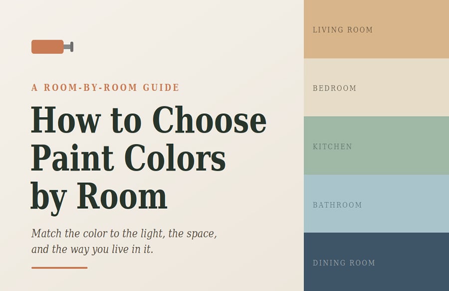
How to choose paint colors by room — a room-by-room guide to color, light, and finish
Start Here: The 3 Things That Decide Your Paint Color
Before you fall for a swatch, work through these three. They matter more than any trend.
- Natural light and window direction. This is the big one. North-facing rooms get cool, blue-toned light all day, so warm colors keep them from feeling chilly. South-facing rooms get warm light, so they can carry cooler blues and greens without going cold. East rooms are warm in the morning and cool by afternoon; west rooms do the reverse.
- Room size and how dark it is. Lighter colors bounce light around and make small or dim rooms feel bigger. Deeper colors add coziness but eat light, so they work best where you already have plenty of it.
- How the room gets used. A kitchen wall gets splashed and scrubbed. A bedroom wall barely gets touched. Usage decides your finish, which we cover at the end.
One rule ties all three together: never commit to a color from the strip alone. Light changes it more than most people expect.
How to Read the Natural Light in Any Room You Paint
Natural light is the single biggest reason a color looks different at home than it did in the store. Window direction sets the tone of that light, and the tone shifts what your paint does on the wall.
The quick version: cool light needs warm color to balance it, and warm light gives you room to go cooler. Here is how that plays out by direction.
| Window Direction | Quality of Light | Best Color Approach | Watch Out For |
| North | Cool, muted, blue-grey, steady all day | Warm whites, soft greiges, warm neutrals | Stark whites read grey and dingy |
| South | Bright, warm, abundant | Cooler blues, greens, crisp whites all work | Very warm colors can feel overly toasty |
| East | Warm at dawn, cooler by afternoon | Soft warm neutrals; pick for when you use the room | Colors feel cold in late-day light |
| West | Cool morning, warm intense evening | Balanced neutrals, muted tones | Strong warm light amplifies reds and oranges |
If a room has windows on two sides, focus on the larger window or the exposure with better light and choose for that. And whatever the direction, good artificial lighting matters just as much once the sun goes down.
The Best Paint Colors to Use for Every Room at Home
Here is where light, size, and mood come together space by space. Treat these as starting points, then sample before you buy.
Living Room Colors: Warm, Flexible, and Welcoming Tones
The living room is where flexibility pays off. Warm neutrals such as soft greige, warm white, or a gentle taupe give you a backdrop that shifts easily with your furniture and the seasons. If the room has strong natural light and you want more character, a muted sage green or a soft blue-grey adds depth without overwhelming the space.
Bedroom Paint: Calm Colors That Help You Rest Well
Bedrooms reward restraint. Soft, low-saturation colors help the room feel restful: think muted blues, warm greys, gentle greens, or a creamy off-white. Blue tones in particular tend to read as calming, which suits a space built for winding down. Save the bold, energizing shades for rooms where you want to feel alert.
Kitchen Colors: Clean, Bright, and Hardworking Walls
Kitchens do well with bright, clean colors that keep the space feeling fresh: crisp whites, warm creams, soft greens, or a pale grey-blue. Because the walls take a beating from grease, steam, and frequent wiping, the finish you choose matters as much as the color here, which is why kitchens lean toward more durable, washable sheens.
Bathroom Paint: Fresh Colors That Handle the Moisture
For bathrooms, light and airy usually wins: soft blues, spa-like greens, warm whites, and pale greys all make a small, windowless room feel cleaner and larger. Moisture is the constant here, so a moisture-resistant finish is non-negotiable. A well-ventilated bathroom gives you more freedom; a windowless one needs both good extraction and a durable sheen.
Home Office Colors: Focused Without Feeling Sterile
A home office should help you concentrate without feeling like a cubicle. Soft greens and muted blues are easy on the eyes for long stretches, while a warm neutral keeps video calls flattering. If you want a little energy, a single deeper accent wall gives focus without tiring you out over a full workday.
Dining Room and Entryway: The Place to Go Bolder Still
Dining rooms and entryways are used in short bursts, which makes them the safest place to be bold. A deep navy, a warm terracotta, or a rich green can feel sophisticated and inviting in a dining room, especially by evening light. Entryways set the tone for the whole home, so a confident color here makes a strong first impression.
Match the Paint Finish to the Room, Not Just Color
Color gets the attention, but the sheen decides how the paint performs and how the color actually reads on the wall. The same shade looks richer in a flat finish and brighter in a satin one. More importantly, higher-sheen paints are tougher and easier to clean, which is why wet and high-traffic rooms need them.
Here is the formula most professional painters follow, drawn from manufacturer guidance:
| Room / Surface | Recommended Finish | Why |
| Living room, dining room | Matte or eggshell | Rich color, hides wall flaws, low traffic |
| Bedroom | Flat, matte, or eggshell | Soft, calming, low-contact walls |
| Kitchen | Satin or semi-gloss | Scrubbable, handles grease and steam |
| Bathroom | Satin or semi-gloss | Moisture-resistant and washable |
| Hallways, kids’ rooms | Satin | Takes scuffs and frequent cleaning |
| Trim, doors, cabinets | Semi-gloss or high-gloss | Durable, wipeable, defines edges |
| Ceilings | Flat | No shine, hides imperfections |
A safe default for most homes: eggshell on walls, satin in kitchens and baths, semi-gloss on trim, and flat on ceilings. Sherwin-Williams and Behr both publish room-by-room sheen guides if you want to check a specific surface, and both are linked at the end.
How to Test Your Paint Colors Before You Commit to One
This is the step most people skip, and it is the one that prevents expensive mistakes. Follow it every time.
- Buy sample pots rather than relying on the paper strips, then paint a square at least two feet across so you see the true color at scale.
- Test that square on more than one wall, because light hits each wall differently and a color can look warm on one and cool on another in the same room.
- Check your samples in the morning, at midday, in the evening, and again under your lamps at night. The color shifts every single time.
- Always paint two coats before you judge it. A single thin coat reads false on both color and coverage.
- Live with the samples for a few days. First impressions of a color mislead, so give your eyes time to adjust.
When It Is Worth Bringing in a Professional Painter
Choosing color is genuinely hard, and there is no shame in getting help, especially when a whole-home repaint or an awkward open-plan space is on the line. A professional painting service does more than apply the paint. A good design consultant reads your room’s light, factors in your furniture and how the space gets used, and steers you away from the color that will disappoint you in six months.
Part of the trouble is the chip itself: a square the size of a business card can’t show you how a shade will behave across a full wall in your light. Previewing the color in the actual room first — with a tool like RoomView™, which drops your chosen color onto a photo of your own space — takes out most of that guesswork.
Final Thoughts
Choosing paint by room comes down to three questions asked in order: what is the light doing, how big and how used is the space, and what finish will hold up there. Answer those before you fall for a swatch and the color choice gets far easier. Start with the light, sample generously on real walls, and match your finish to the room’s daily life. Do that, and the strips at the store stop being intimidating and start being useful.