The Impact of Colour in Hot Dry Climate Architecture – Things to remember while designing in Hot & Dry climate
In the realm of architecture, colour is a potent tool that extends beyond aesthetics, influencing the microclimates and thermal comfort of a space. This article delves into the intricacies of using colour effectively in architectural designs tailored for hot and dry climates. From temperature regulation to psychological effects, each aspect underscores the expertise of architects in creating vibrant yet functional environments.
1. Understanding Solar Reflectance: Light Colours for Heat Mitigation
Architects in hot dry climates must prioritize solar reflectance when selecting colours for building exteriors. Light-coloured surfaces, particularly whites and light pastels, reflect a significant portion of solar radiation. This reflective quality minimizes heat absorption, contributing to cooler indoor temperatures. By embracing light hues, architects harness the power of solar reflectance for effective heat mitigation.
2. Cool Roofs: Reflecting the Sun’s Intensity
The concept of cool roofs aligns seamlessly with the need for heat reduction in hot and dry climates. Architects can opt for roofing materials and coatings with high solar reflectance and infrared emittance. Cool roofs not only enhance energy efficiency by reducing the need for air conditioning but also contribute to the overall thermal comfort of the building and its occupants.
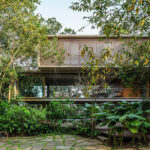
3. Harmonizing with the Surroundings: Earthy Tones for Integration
In the vast landscapes of hot dry climates, architects can draw inspiration from the natural surroundings when choosing colour schemes. Earthy tones, such as warm browns and sandy hues, allow structures to harmonize with the desert environment. This integration fosters a sense of connection with the landscape while creating a visually appealing and contextually relevant architectural presence.
4. Psychological Impact: Cool Blues and Greens for Perceived Comfort
Beyond the physical implications, colour plays a crucial role in shaping the psychological perception of temperature. Cool blues and greens evoke a sense of freshness and coolness, creating the illusion of lower temperatures. Architects can strategically incorporate these calming hues in outdoor spaces, interiors, and landscaping to enhance the perceived comfort of occupants.
5. Shading Strategies: Darker Hues for Sun Protection
Architects can utilize darker colours strategically to enhance shading features in hot dry climates. Dark hues, such as deep greens or rich blues, can be employed in canopies, pergolas, or exterior elements to absorb and dissipate heat. This shading strategy not only provides relief from direct sunlight but also adds an aesthetic dimension to the architecture.
6. Facade Design: Reflectivity and Texture for Visual Interest
The use of colour extends beyond the selection of hues; it encompasses the reflective properties and textures of materials. Architects can experiment with reflective surfaces, creating facades that respond dynamically to changing sunlight. Additionally, textural variations in materials can enhance the visual interest of the architecture, contributing to a nuanced and engaging exterior.
7. Water Elements: Blues and Greens for Cooling Effects
Incorporating water elements into hot dry climate designs introduces opportunities to play with colour. Blues and greens around water features not only evoke a sense of tranquility but also contribute to cooling effects. Reflective surfaces of water amplify the impact of selected colours, creating a refreshing and visually appealing oasis within the architectural composition.
8. Adaptive Landscaping: Seasonal Changes in Colour Palette
Architects can adopt an adaptive approach to landscaping by considering seasonal changes in the colour palette. Drought-resistant plants with varying bloom cycles introduce shifts in colour throughout the year. This dynamic landscaping strategy ensures that the environment remains vibrant and engaging, responding to the ebb and flow of nature in hot dry climates.
9. Heat-Absorbing Materials: Dark Accents for Thermal Mass
Architects can strategically incorporate dark accents in materials with high thermal mass, such as stone or concrete. These materials absorb and store heat during the day, releasing it gradually at night. Darker hues in selected areas enhance the heat-absorbing properties, contributing to the overall thermal performance of the building.
10. Local Cultural Influences: Vibrant Accents for Identity
Drawing inspiration from local culture, architects can infuse vibrant accents into the design palette. Bold colours that hold cultural significance can be incorporated in elements like doorways, trimmings, or decorative features. This not only adds a distinctive identity to the architecture but also pays homage to the rich cultural tapestry of the region.
11. Reflecting Sustainability: Greenery and Eco-Friendly Colours
As sustainability takes center stage in architectural discourse, greenery and eco-friendly colours gain prominence. Architects can use shades of green to symbolize environmental consciousness. Additionally, eco-friendly materials often showcase natural tones, aligning with a commitment to sustainable and responsible design practices.
12. Monitoring Urban Heat: Light-Coloured Pavements and Streets
In urban planning, architects can contribute to mitigating the urban heat island effect by advocating for light-coloured pavements and streets. Lighter surfaces reflect more sunlight, reducing heat absorption and lowering overall temperatures in urban environments. This strategic use of colour on a city-wide scale addresses the broader challenge of urban heat in hot dry climates.
Conclusion: The Art and Science of Colour in Architecture
In the canvas of hot and dry climates, architects wield the palette of colour as both an art and a science. From solar reflectance to psychological effects, each hue and tone plays a role in shaping not just the visual identity but also the thermal performance and occupant comfort of architectural spaces. By understanding the nuances of colour in this context, architects can craft environments that resonate with the climate, culture, and sustainability goals, showcasing the profound impact of colour in the realm of architecture.