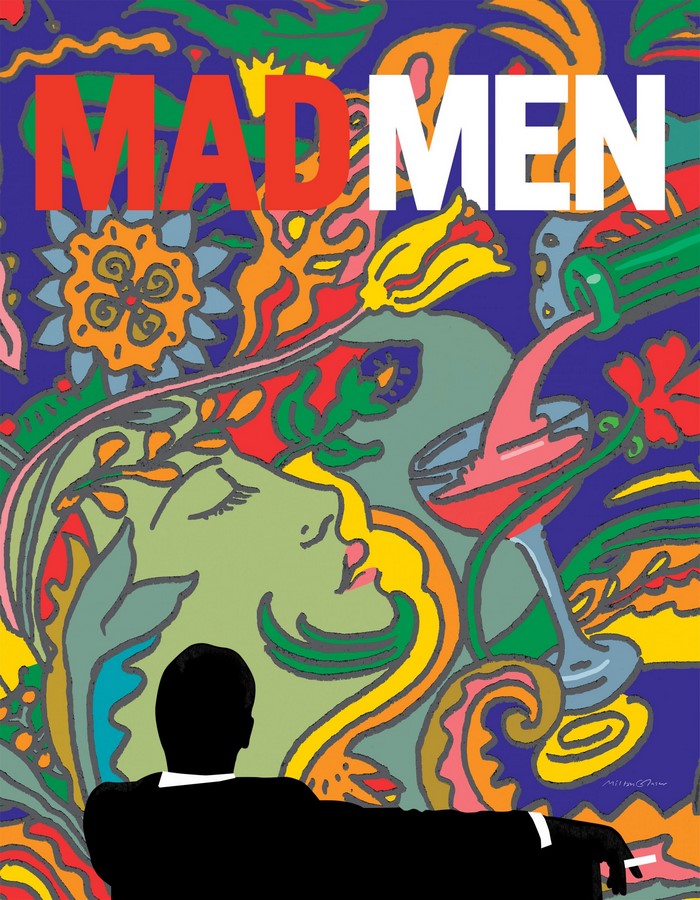
Born in 1929, Milton Glaser is the embodiment of graphic design across global frontiers; his impact and presence being close to formidable. His work is unique, inventive, and creative, and it is always combined with a deep understanding of the diverse richness of the visual language.
His world-renowned I Love New York symbol, expressed his pride and love for the city where had spent most of his life. Milton Glaser is also recognized for his psychedelic poster for the singer Bob Dylan, and his poster that marked Vincent van Gogh’s centenary.

He co-founded the novel Pushpin Studios in 1954, and New York Magazine, which dealt with the city’s lifestyle and culture. In an era where Swiss rationalism conquered hearts, Pushpin Studios’ style celebrated the eclectic design of the past, while combining it with a new, contemporary outlook to design.
Milton Glaser’s range of work included posters, logotypes, font designs, and book covers. Up until the last days of his life in June 2020, he continued to passionately create graphics, his last project aimed at creating a collective spirit during the COVID-19 pandemic.
His philosophy and ideology reflect his years of experience as a self-described child of modernism’, in a fruitful career.

Simple, Yet Powerful Messages, Etched in Nostalgia | Milton Glaser
Milton Glaser believed that unless one had an affectionate relationship with the client or a strong connection with the project itself, the result would never be meaningful or significant. This was in contradiction with the view of professionalism, which required you to maintain a social distance from the client. This ideology is visible in Glaser’s popular I Love New York logo.

The image was conceptualized as a petit puzzle, where the only complete word was ‘I’. This simple emotion of love was conveyed through the iconic, red heart symbol, and the initials NY represented the city where he spent most of his life.
These three mental adjustments to understand the whole picture, wouldn’t have been possible if Milton Glaser didn’t directly connect with the client, in this case, New York City. The idea of this minimal logo was so powerful, that it is still plastered across every conceivable piece of merchandise, even today.
Innate Ability to Repurpose Visual Ideas
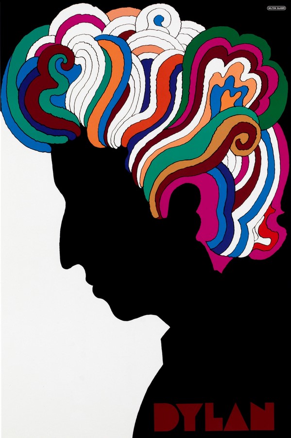
The I Love New York project was just one project that beautifully reflected Milton Glaser’s ability to merge words and images to send a powerful message. He was far from being labeled a plagiarist, but he was always aware of the many languages of design. He based his famous Bob Dylan poster, on a self-portrait by Marcel Duchamp.

The poster also exhibited his painterly skills and was designed to be used as a slip-in piece of art, inside the cover of the Greatest Hits album in 1966—the first of its kind. The poster portrays a monochrome silhouette of Bob Dylan, which is subverted by psychedelic tendrils of hair in complementing colors. The masterpiece is tied together by the word ‘Dylan’ in a unique typeface plastered at the base of the silhouette.
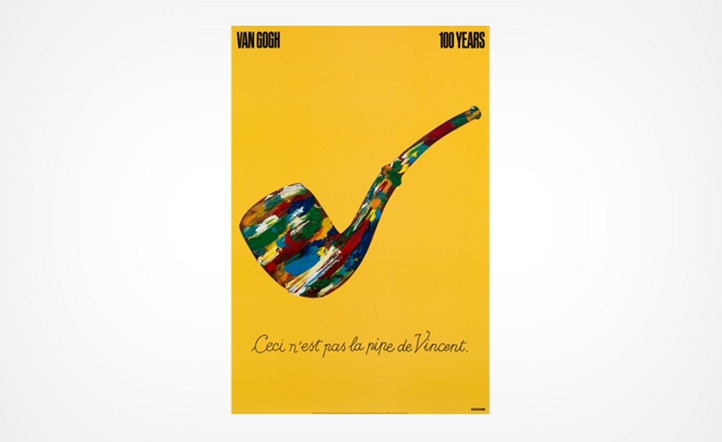
Glaser’s poster to mark Vincent van Gogh’s centenary reflected the Belgian surrealist artist, René Magritte’s painting ‘The Treachery of Images’. The painting would take shape based on the viewer’s knowledge of René’s work. This poster too displayed Milton Glaser’s psychedelic use of colors, with which he filled the pipe, much like a mix of colors on a palette, against a bright yellow-orange background. The paints symbolized Van Gogh’s painting style.

A Designer’s Responsibility Did not Depend Upon Money
The iconic New York poster reflected Milton Glaser’s philosophy that every designer’s responsibility was much higher than simply getting paid. In fact, he donated this idea and never earned a single penny from it, even as the concept of licensing and royalty grew over the years.
For him, the I Love New York campaign was simply a love letter to a city that at the time was riddled with crime and an economic crisis. The simple, minimal logo was an ode to the place that allowed him to go to college without tuition fees, and where he had lived and worked for most of his life, be it for the New York Magazine, or Pushpin Studios. It became a symbol of hope, and in a tiny yet powerful way, the image of the city.
Style Is Not to Be Trusted | Milton Glaser
Glaser’s flourishing career lasted long enough for him to understand the cycles that reputations went through. As a student, he was a modernist, but he made his reputation as a postmodernist, and later, when modernism returned, he took a renewed interest.
As the years progressed, Milton Glaser became a voice of reason in social and environmental issues. He felt that as a designer he was in the business of persuasion and could bring about change. He aspired to put his powerful, emotive skills towards a worthy cause, even if success was not guaranteed.
The notion that style could not be trusted, struck him when he was looking at an illustration by Picasso for The Hidden Masterpiece by Balzac. The illustration was that of a bull, in 12 different styles—from a naturalistic rendition to a reductive, single-line abstract version.
From the illustration, Milton Glaser concluded that it was absurd to be loyal to a particular style and that it was important to respond to changes in the zeitgeist, to avoid fatigue, and propagate the passion for design for years. But the response has to be in such a way, that it doesn’t change the designer’s integrity and purpose.

Milton Glaser’s playful graphic style, incorporated lively, humorous vocabulary with psychedelic colors. His illustrations were oriented towards contemporary culture, and historic styles. From the cover of Tom Wolfe’s first edition of The Electric Kool-Aid Acid Test to Dick Gregory and The Lovin’ Spoonful, his images evoke powerful emotions of the time in which they were created.
Even if they outlive their original purpose, Milton Glaser’s work has the quality to transcend time and space.


